Almost certainly when I received this ‘prompt’ from WordPress.
Almost certainly when I received this ‘prompt’ from WordPress.
[This was written in December 2025 and never got published, no idea why]
Gunung Api, or lewerani in the local language, is the volcano outside our window, just for this week. We are spending a week in the Banda Neira group of island in the eastern Molucca province of Indonesia.
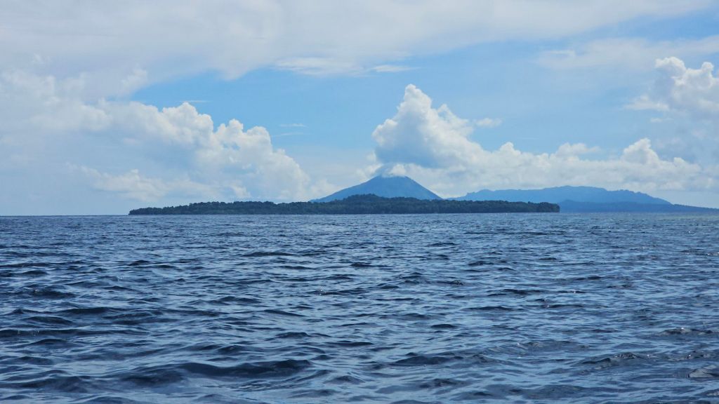
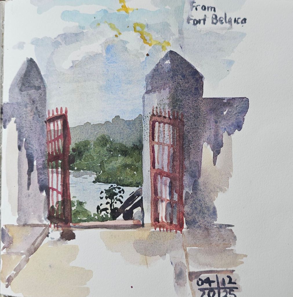
Not surprisingly the volcano is the major landmark for the area, visible for miles around. Also prominent on the island of Banda Neira is the Dutch built fort, Benteng Belgica.
On the afternoon of our arrival we climbed up to the fort to sketch. I was fascinated by the rapidly changing late afternoon light, along with sweeping rain showers. I could only get part of the sketch completed, because I had to take cover from the rain. The white shape at the bottom of the sketch is the outline of the fort that was never completed in my sketch.
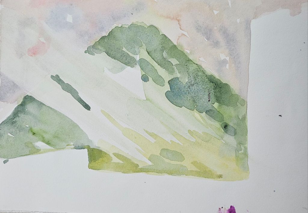
While sheltering inside the entrance to the fort. I did make another sketch of the view out through the entrance gate across the channel to the nearby island of Banda Besar.
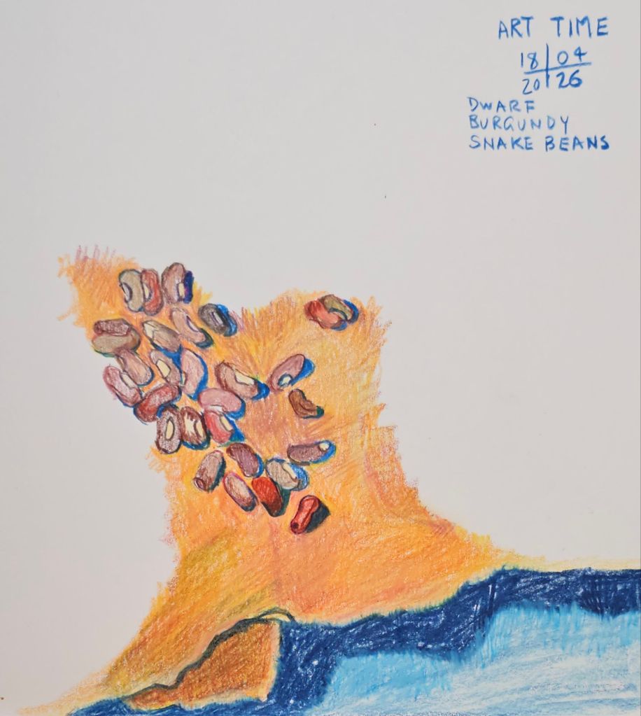
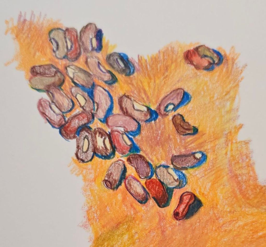
Now we are moving into Autumn my drawings of the vegetables in our garden are transmogrified into seed sketches. You can see some previous sketches here.
This week’s offering is of our Dwarf Burgundy Snake Beans. Alas, these few beans are the sum total of this year’s crop. They really didn’t enjoy our summer weather at all.
This video, (link at the bottom of the post), was made for our YouTube gardening channel – however the sentiments remain the same.
Have a Merry Christmas and I look forward to catching up with you in the New Year!
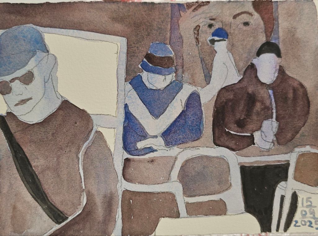
[This post was originally written on 15 September, but for some reason I forgot to post it. Oops.]
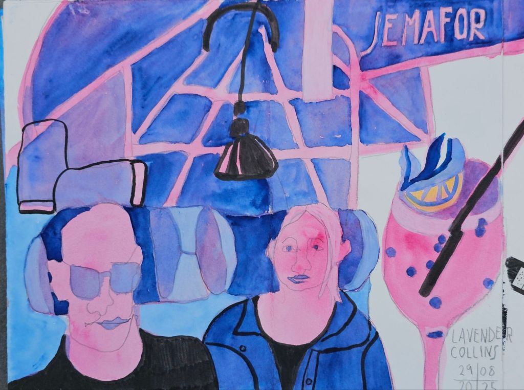
I recently went to the Urban Sketchers Symposium in Poznan, where I did a workshop with French artist Olivia Markus. She was teaching, amongst other things, an interesting approach to colouring sketches. The point of which, in part, was to reinforce a sense of depth of field in your sketch.

I think the simplified colour choices deliver exciting results. Of course, they also challenge your use of tonal contrast. So far, I’ve mainly used them for scenes with people in them. The limited colour selection imposes a unity, which is often missing from my regular sketches.
Now, I’m taking the next steps of testing out what I learned and then trying to integrate the process into my practice.
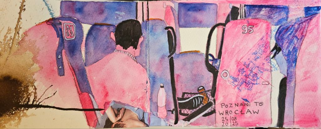
I use watercolour as my main medium, so that does yield different results to the inks that Marcus uses. To be fair, I really haven’t tried the process with ink yet.

I’m also experimenting with which colour combinations work most effectively together.
I find the stark black pen a bit strong, and it tends to overwhelm the watercolour’s subtle tones. Lately, I have been using less black, instead choosing to use a more intense pigment.
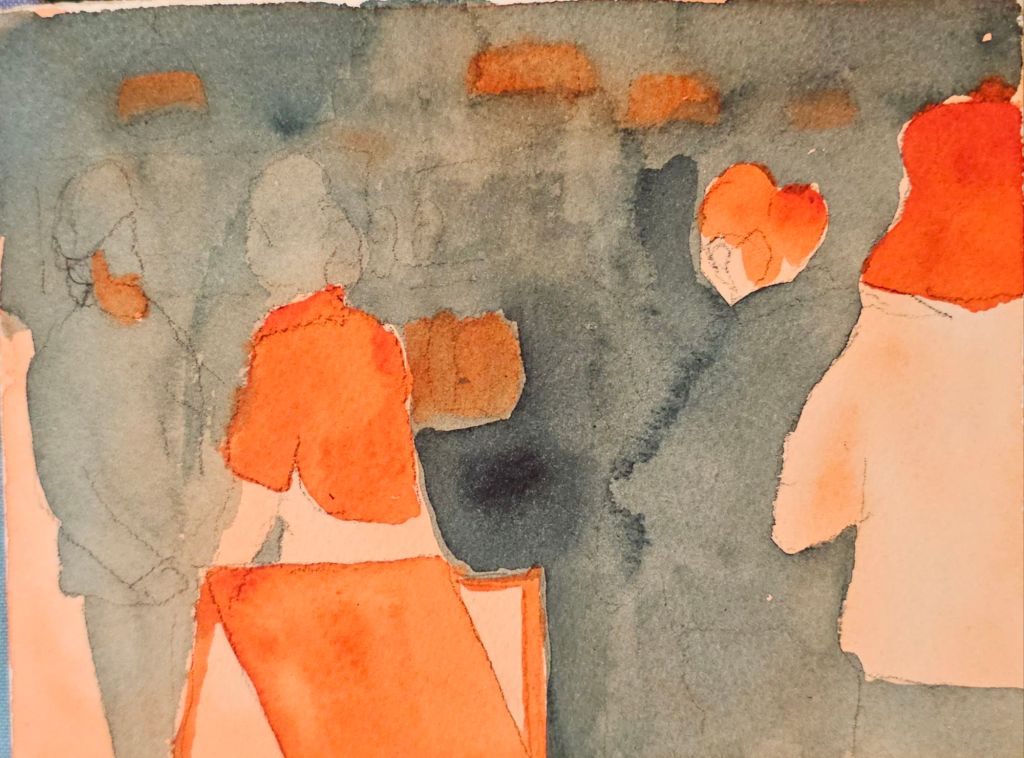

I’m still ‘not there’ yet in terms of the outcomes, but as today’s sketch show, there is some progress.