I spent Saturday at a workshop on colour monotype with Peter McLean at the Megalo Print Studio. It’s been quite a while since I tackled monotype printing (muttering indistinctly about high school), but I am drawn to the prospect of printing processes that are on the loosely disciplined side of things. The other spark for my interest was seeing the Degas monotypes at the Impressions of Paris exhibition held at the National Gallery of Australia in 2014. If my memory serves me correctly Degas made monotypes on an almost daily basis, using both the initial print and the ‘ghost’ or second print from the same plate which he often re-worked. But enough of that, I don’t think my prints are quite there just yet!
We were working on three individual ‘plates’ of polycarbonate sheeting. One for each colour red, yellow, blue to create our colour print. My first efforts were very sadly reminiscent of my high school efforts, not least because we were making prints by drawing through the back of the paper onto the plate. I was struggling with getting my head around three colour printing and registration which, as usual, came a distant last.

Thankfully I took a break at this stage which allowed some mental re-grouping. It became apparent that other people’s prints were looking much better when they were run through the press. Duh! If you want to see the difference just look at the two prints below. I deliberately set up my three plates and printed them manually. I then modified the plates plates using tarleton and cotton buds to remove some ink I ran the plates through the press. What a difference.
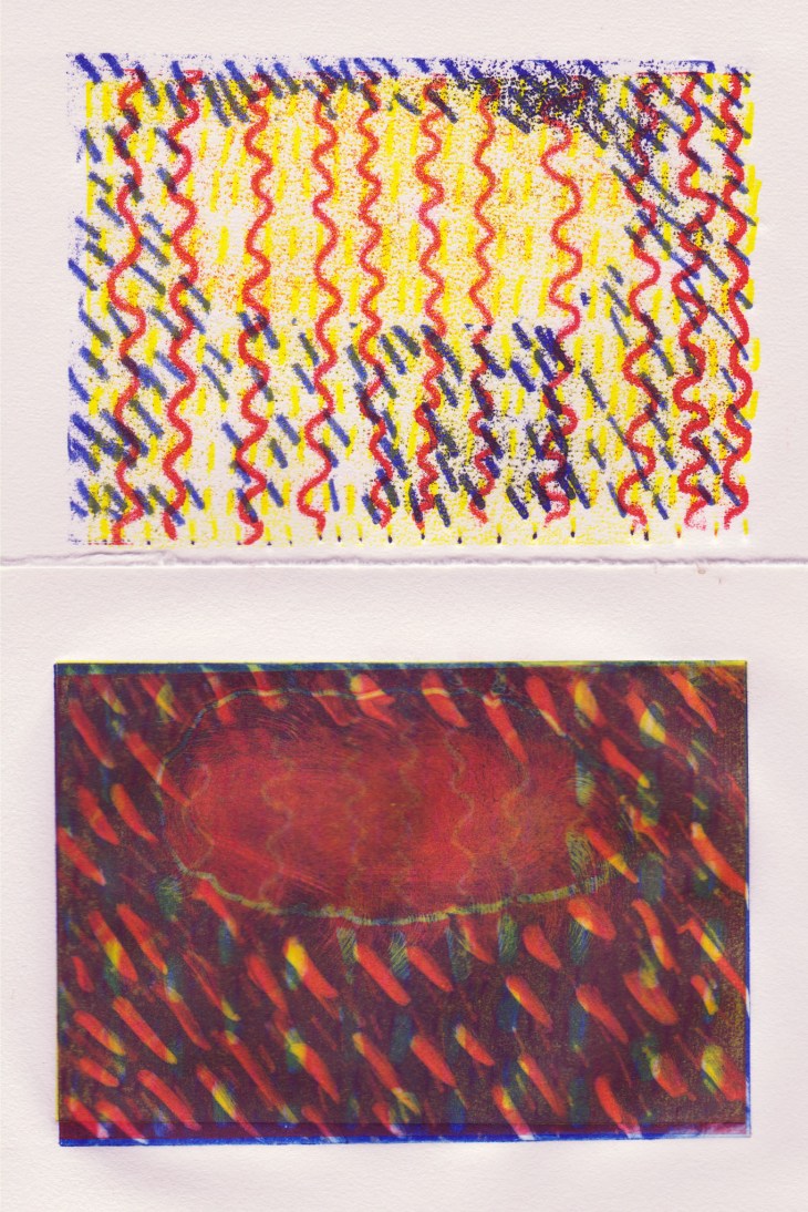
I also made a ghost print of the plate which I’m tempted to work further on, but I think I need to keep as it is so I can complete my workshop notes. You can see the ghost print, it is the first one in the photo below.
The second print below was made after lunch when we swapped to making additive prints, using multiple colours on the same plate. No registration required (cheering happily), particularly as I chose not to use the full size of the plates.
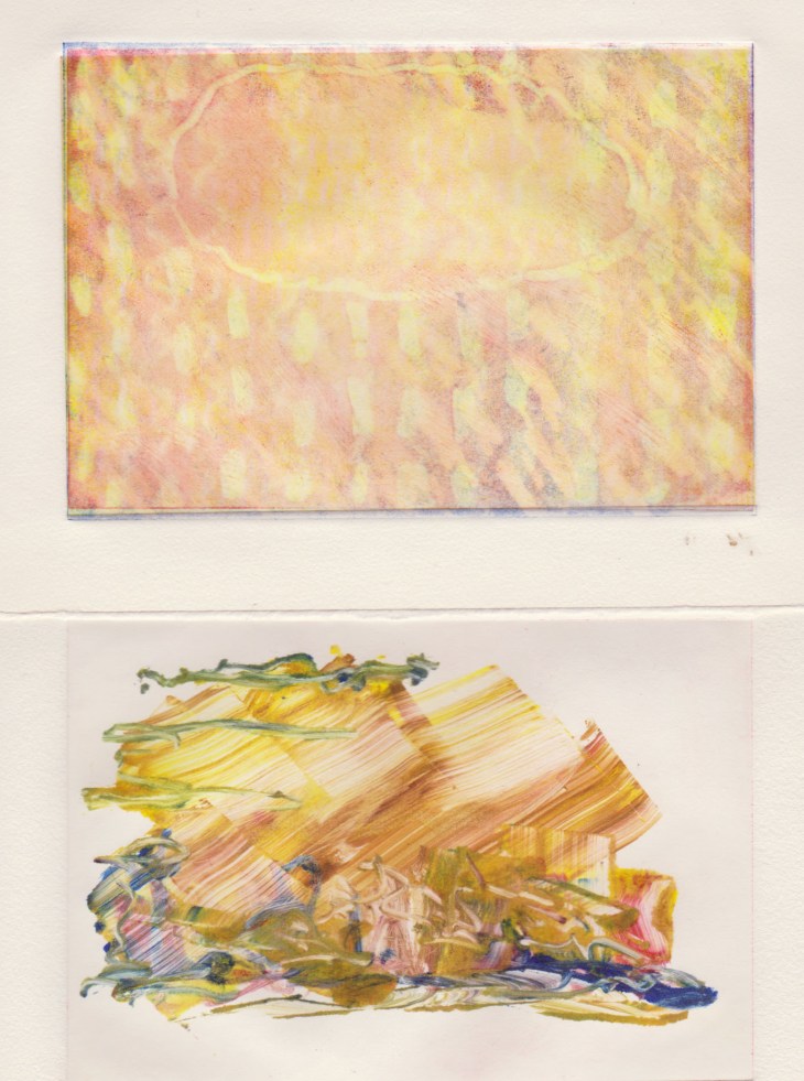
This very rough approach, which I think of as a ‘landscape’, was much more to my liking.
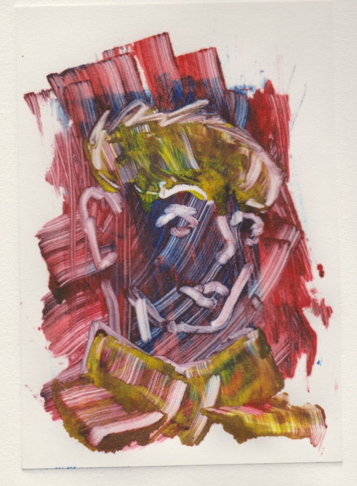
My final print on the day combined the roughly applied ink with drawing with a cottonbud. I think this was the most successful print of the day.
For those interested in technical matters we were printing with oil-based inks on Hannemuhle proofing paper.