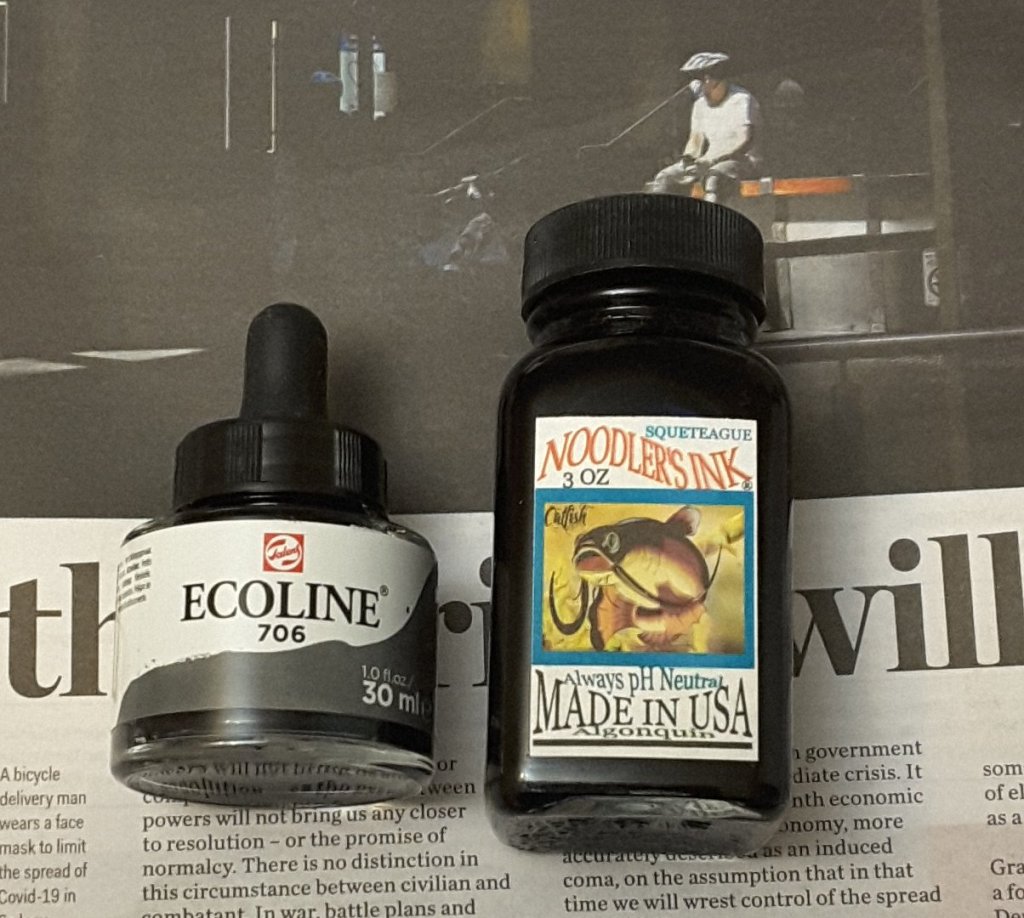
I’m not sure if ink is the latest “thing”, but it certainly seems to be on trend at present. Wherever I turn there is a new range of inks and new companies to discover. Alas I am a frail spirit and I easily succumb to the enticement of new art products.
This time it’s ink from Van Dieman’s Ink in Tasmania (Van Diemans Land being the Dutch name given to the island after they ‘discovered’ it several tens of thousands of years after the indigenous Palawa people got there). But I digress. I hadn’t heard of the company but the inks looked interesting and I was able to buy 2ml sample size bottles which inspired me to try 4 colours.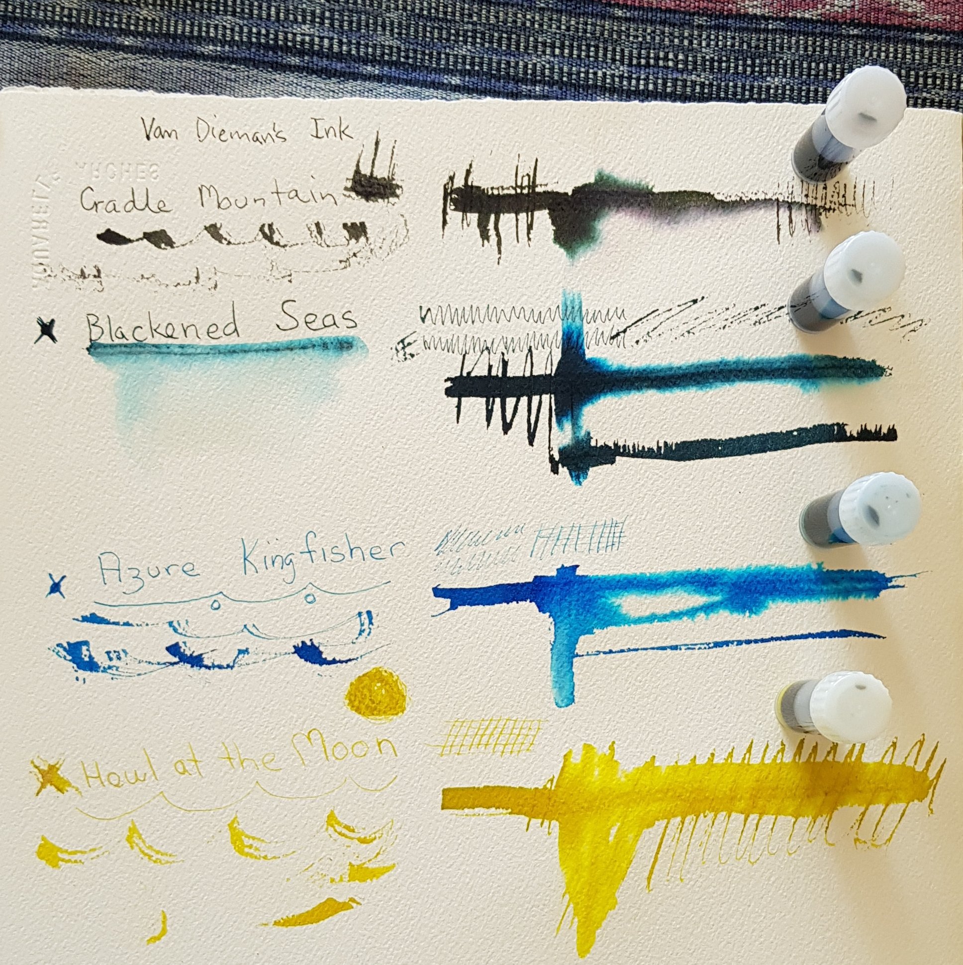
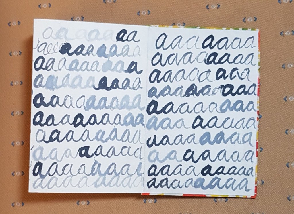
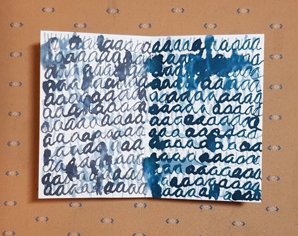
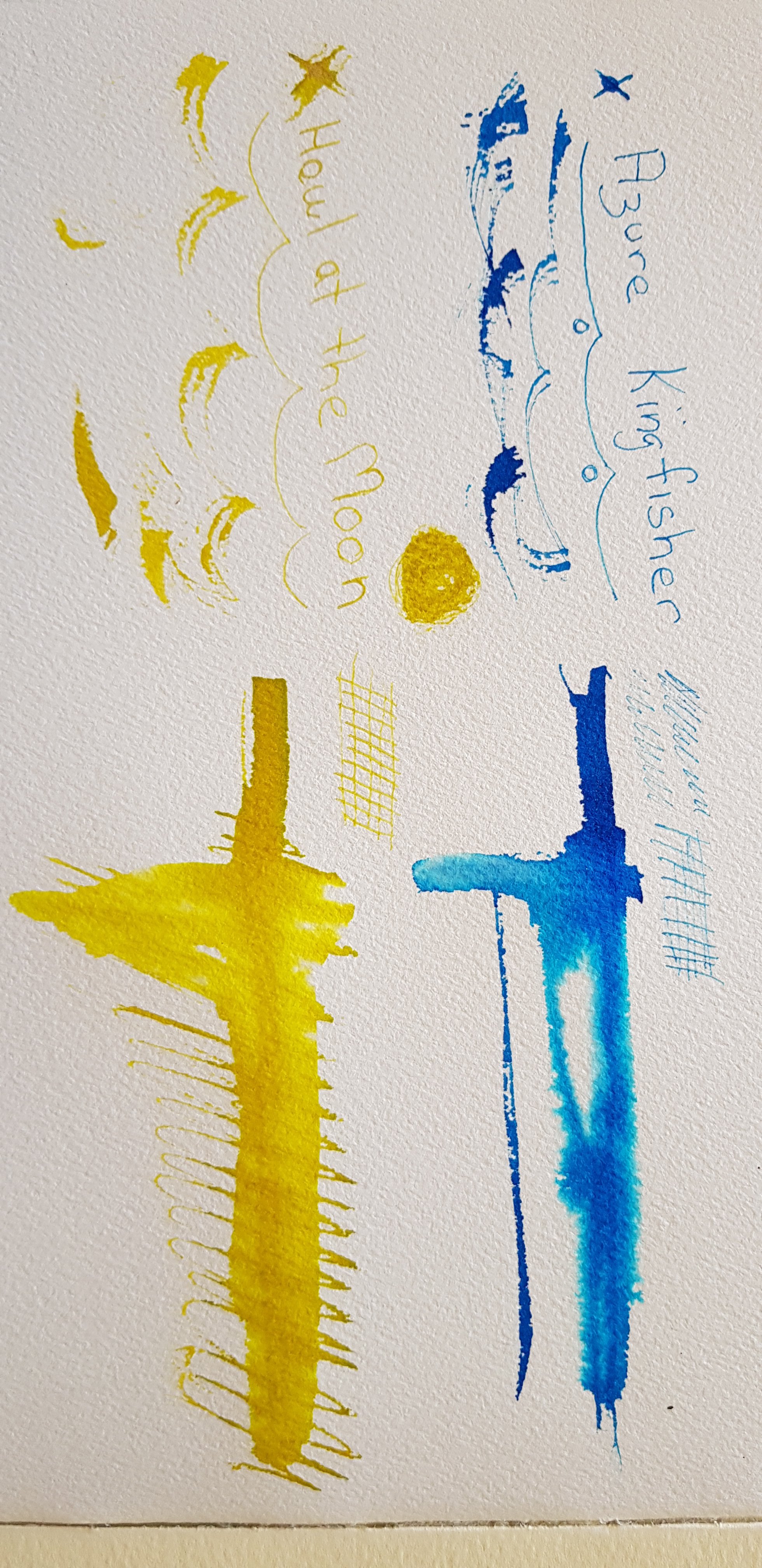
I chose Cradle Mountain Grey, Blackened Seas, Azure Kingfisher and Howl at the Moon. The last two are ‘shimmer inks’, that is they have tiny fine particles of glittery stuff in them. None of these inks is waterproof. The company does list them as light and age resistant. As I am most likely to use these in my sketchbooks that shouldn’t be an issue for me. I have tried the inks out on my 300 gsm cold pressed Arches watercolour paper. Although the nibs that I tested them with really don’t do well on the toothed surface I wanted to see the initial colour and whether bleeding on damp paper would yield secondary colours. You can see the results below.
The Cradle Mountain Grey is the colour I find the most versatile of these inks. It also has some interesting secondary colours when drawn out with water. I really dislike the definite-ness of the black ink line and watercolour approach that many sketchers use. This grey backs off a fraction from that dark insistent line. It will be interesting to see how it goes when I am sketching with it in my fountain pen. The Blackened Seas is also an interesting colour, that I could see myself using.

The two shimmer colours I will likely only use with a dip pen and brush as there is no guarantee that I can fully clean them out of a fountain pen. I can see the silver shimmer in the Howling at the Moon colour, but there wasn’t much obvious gold shimmer in the Azure Kingfisher. It might be that I didn’t shake the sample up sufficiently well, or perhaps my sample didn’t containmuch gold in the first place. If you look at the photo you can see how the shimmer inks settle out after sitting for a while.
The 2ml samples give me plenty of ink to play with. I am looking forward to further expermentation.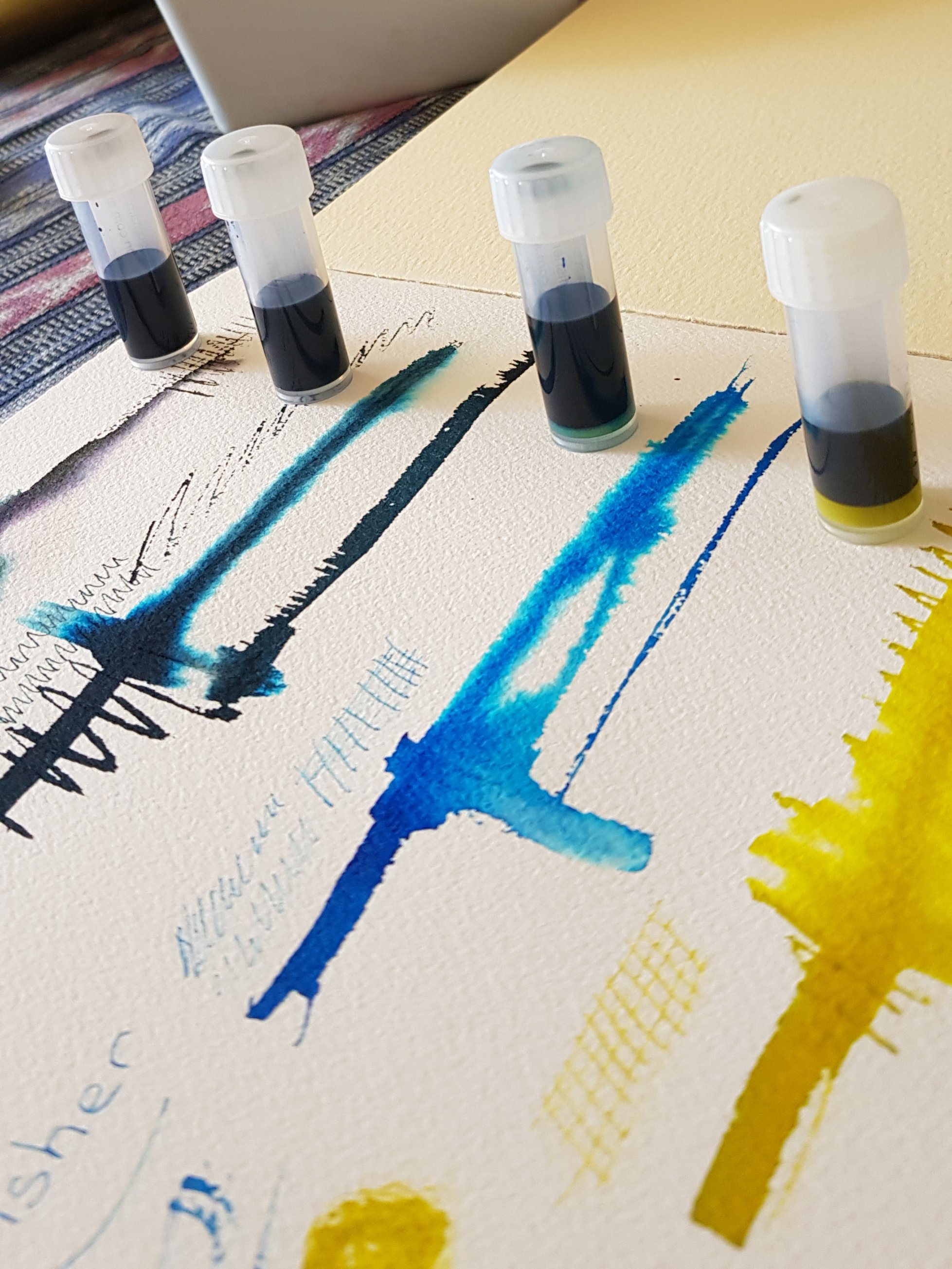
Further information about the inks and the full colour range can be found here.