Turner’s blues and a few others

I am currently reading Anthony Bailey’s biography of JMW Turner, Standing in the Sun, (2013 paperback edition). So having just posted about Smalt Blue, I was very interested to read the following lines from Henry Syer Trimmer’s account of Turner’s studio, after Turner’s death, ” … and cobalt to be sure there was, but also several bottles of ultramarine of various depths and smalts of various intensities, of which I think he made great use.” Trimmer goes on to report, “I was told by his housekeeper [Hannah Danby] that ultramarine was employed by him sparingly, and that Smalt and cobalt were his usual blues.” ( pps 87-88).

In this case Trimmer is referring to Turner’s oil paints, rather than his watercolour paints. I am trying to find out whether Turner used the same pigments in his watercolours. It seems quite likely, as it is a matter of selecting the relevant binder for your pigment and ensuring that the particles are ground down to the correct specification that are the key. I need to do some more research!

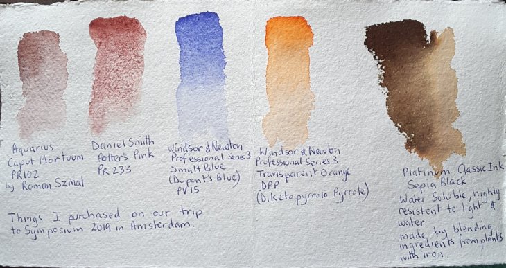
To give you some idea of the colours Trimmer is referring to, above, I have swatched out the three blues referred to, Ultramarine, Smalt Blue and Cobalt Blue, in watercolours. In addition I have also included three other blues, Indanthrone Blue (AKA Delft Blue), Mayan Blue Genuine and Pthalo Blue (green shade) for comparison.

Most interesting of all these pigments to me is Mayan Blue which, according to Wikipedia is “a composite of organic and inorganic constituents, primarily indigo dyes derived from the leaves of añil (Indigofera suffruticosa) plants combined with palygorskite, a natural clay which, mysteriously, is not known to exist in abundant deposits in Mesoamerica.

Indanthrone Blue, PB 60, also goes by more than one name, including Delft Blue and sometimes indigo blue. I would be wary of using the latter common name as the indigo blues I have looked up on line are made from a varying range of pigments. White Nights Indigo (Nevskya Palitra) is a blend of PBk 7, PB 15 and PV 3; Windsor and Newton Indigo is a blend of PBk 6, PV 19 and PB 15.

When choosing a watercolour to add to your palette the general advice is to select a paint made from a single pigment. This will generally give better results when mixing colours. If you are selecting a multi-pigment paint you are more likely to mix a muddy colour. This is because some of the pigments may work well in the mix and others may not thereby cancelling each other out and making mud.

Some purchases in the Netherlands

Wherever I travel I like to find art materials as momentoes of my trip. As I was going to an Urban Sketchers Symposium I was well aware that an art supply goody bag would be waiting for me there. The market stalls at Symposium are also great places to find well-priced items. None the less I still managed to find some items that I knew wouldn’t be in the bag.

It turned out that I had set myself up to buy, without even really trying. Our hotel in Rotterdam, where we spent the first week of our trip, was directly across the road from two art shops!

To make it easy for myself I have made a visual record of my purchases.

First purchases handmade Khadi paper, a bone folder used in bookbinding, a new fountain pen (of course I need another one!) and some new ink to go with it. And a ring in , my windmill-shaped biscuit cutter.

By way of explanation this fountain pen has one of the biggest reservoirs on the market, which makes it very useful for lots of sketching without having to frequently refill it. This KWZ ink was purchased on the basis that it was waterproof. Unfortunately there was a mis-understanding and it turns out that the green-gold ink is not waterproof. The company makes another green which is water- resistant, but this isn’t it.

My new paints, with the exception of Potters Pink which was only a replacement. A second new ink also with some odd properties.

I seem to be attracted to the blues these days. I was intrigued by the Smalt Blue (AKA Dumont’s Blue). This is a very old form of blue pigment made by grinding glass coloured by smaltite, a cobalt salt, into a fine powder. I assume it was one of the less expensive options than ground lapis lazuli. From some of the reading I have done it has, in oil paint, tended to fade over time, but not all paintings show this fault. It has a purplish tinge which I really like. I expect it will be appearing in my ‘skies’ in the not too distant future.

Much as I am a devotee of Pyrrol Orange (it is one of those irreproducible colours), I do sometimes find it a bit pink. This Transparent Orange, above, is a synthetic pigment with an industrial automotive history, it looks like it fits the bill for a truly orange, orange. I swatched it out, below, with some of my other orange-y paints for a comparison.

As you might decipher in my notes on the page above my Platinum Classic ink (an iron gall ink), is listed as both water soluble and resistent to water. Mmmmm?? A bit of research indicates that while some of the ‘apparent’ colour of the ink may be water soluble, over time the ink gall element should not only resist water, but darken with age. I’m not sure that I will be happy with this latter development, as the solubility of the ink has resulted in some quite pleasing effects. I used it in my workshop with Ròisin Curé, where were were channelling Rembrandt’s use of sepia ink. Here is a sample.

Sepia Black ink, line and diluted ink, part of the sculpture version of the Night Watch on the Rembrantplein in Amsterdam.

Sketches from Utrecht

Here are the sketches l made during my stay in Utrecht.

Sculpture from the Dom of St Martin of Tours cutting his cloak in half to give to a beggar. (At first I thought it was a strange image for a church, quite threatening with the drawn sword, until a passer by explained the story). The City of Utrecht also derives it’s diagonally slashed two colour red and white coat of arms to this story.

Some roofline and details of a building near the Dom.

The canals of Utrecht are distinguished by their lower level storage areas, now largely used as restaurants and cafes.

Next to the Dom are the cloister gardens, which are owned by the university. Each arch has a different tracery. I could have sketched in there for ages. While the gardens are generally open to the public they can be closed for university events. In that case they can be seen from the Dom cafe, inside the cathedral.

The character of Miffy was created by Dick Bruna, a Utrecht native. In 2014 a statue to Dick and his creation Miffy was made by Jacques Tange. The sculpture has two sides, one featuring Dick and the other Miffy.

Just outside Utrecht station, in the middle of the canal sits this whale made of 5 tonnes of plastic reclaimed from the ocean. It’s called Stranded and it was made by Studio KCA. I understand that the sculpture is travelling the world and will only be in Utrecht for a few more months.

The Rietveld Schröder House, Utrecht

While in Utrecht I visited the Rietvelt Schröder House. Such a fascinating building, so well designed by the widow and the furniture maker. Neither was architect.

After she was widowed Truus Schröder asked Gerrit Rietvelt to help her find a house. Failing to find anything suitable, rietvelt suggested she build. A block of land was found on the then outskirts of Utrecht. In an interview Truus said that the small block of land they found was where all the truck drivers stopped to pee, “it was quite disgusting”. But what it did have was views over the countryside. Sadly, now it has a motorway right next to it.

The house was designed by deciding on what was needed in each room, before designing the exterior. Rietvelt wanted to build in concrete but the budget was too small.

The ground floor is built fairly conventionally, to help with building approval. Each ground floor room had a wash basin and it’s own door so the occupants could come and go as they pleased.

Once the Schröder children had left home the lower level of the house was rented out while Truus Schröder lived on the upper floor. For many years Rietvelt has his office in one of the ground floor rooms.

Below is a picture of one corner of the upper floor, originally the bedroom of Truus Schröder’s son. Each sleeping area could be enclosed by sliding panels and the windows were covered by wooden shutters in the evening.

This is a truly fascinating house and unlike many other ‘iconic’ buildings is extremely functional. As Truus Schröder said to one of her former lodges, “you need to respect the house, but you don’t have to worship it.”

Put this on your ‘must see’ list for Utrecht. Buy your tickets in advance as the tour size is limited and operates on selected days only. Easy access by public transport, signposts from the bus stop direct you to the house.

Amsterdam

I realise that I need to do a dump of my sketches from Amsterdam now, or l may never find time to share them. So here they are. Almost all of these were done at the Urban Sketchers Symposium which was held here this year.

Sketching the wonky houses along the Herengracht in Amsterdam.

A quick sketch of a bicycle with a child carrying module.

All the goody bags lined up at the registration desk this afternoon for all the Urban Sketchers Symposium workshop participants.

Final, unfinished sketch from the Marion Rivolier workshop on capturing the flow of sky and water with watercolour.

Final sketch of statues based on Rembrandt’s The Night Watch, Róisin Curé workshop using sepia ink.

Extending your page to include the images that are important to you in a scene. Karen Sung workshop, 1st piece.

Creative use of line and including people, Karen Sung workshop, 2nd piece.

My favourite bit of graffiti on the way to Rokin Metro station (sorry I was very bad at writing down location names).

Sketching from the ‘Drink and Draw’ location on Amstelhoek

NEMO, the science museum, final Sketchwalk of Symposium.

The canal next to our hotel, sketched at night, trying to capture the light reflections.