We took advantage of the post-Christmas airline sales to grab a cheap flight to Brisbane during the week to make a flying visit to the Gold Coast City Art Gallery and the Queensland Art Gallery and Gallery of Modern Art. The first because I wanted to see the Gold Coast Art Prize that my piece Paperboat for an Inland Sea was selected into and then to spend a day at APT8 in Brisbane. And yeah, my work in the Gold Coast Art Prize has been sold!
Anyway back to APT8. It’s a really big exhibition to take in in one day. Spread across both the Gallery of Modern Art (GOMA) and the Queensland Art Gallery (QAG) we had a lot of works to cover. As is often the way with these big shows there are many works that take up a lot of space – and that’s about as exciting as some of them get. Then there are lots of video works – for the most part they don’t really float my boat. So finding the good stuff can take time. Thankfully the first place we headed, on the ground floor of GOMA, had one of my favourite pieces and it was BIG.
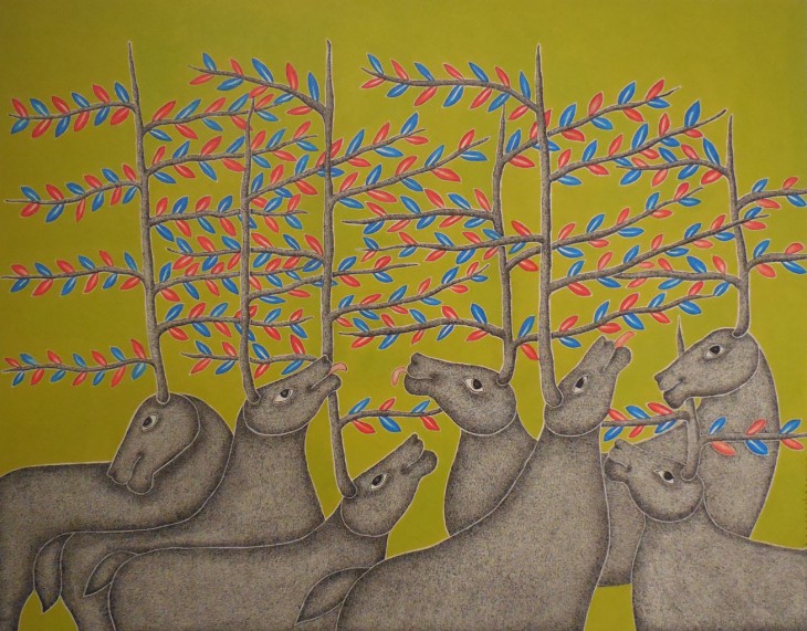
Min Thein Sung‘s Another Realm (horses) 2015, is a giant puppet of three horses that hangs against a background of two walls of comic book pages.

Min Thein Sung, Another Realm (horses) 2015, my sketch, graphite and chalk on grey toned paper
I didn’t want to ‘spoil’ my first sketch, so I did another focusing on the detail of one of the horses head and using one of my Koh-i-noor Magic pencils to indicate the comic book pages behind.
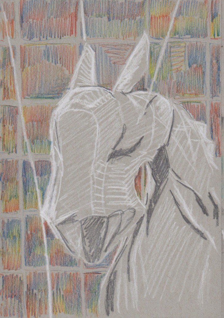
Detail of the head of one of the horses, Min Thein Sung Another Realm (horses), 2015, my sketch graphite, white chalk and coloured pencil on grey-toned paper
We made it through two floors of GOMA before deciding to have an early lunch. While we were waiting to eat we had fun watching the Sacred Ibis scrounging for food around the outdoor tables of the cafe. I know they can be a nuisance but it was quite amusing to see them negotiate the polished concrete floors, which clearly weren’t suited to their large spreading toes. Each step was taken with a small skid. No bird ever slipped too badly but they clearly have had to learn to skate their way around.

Sacred Ibis, white chalk, pen and ink.
After lunch we went to the Queensland Art Gallery (just a short 150 metres away) where I was thrilled to find the section of APT8 in Gallery 4 called Kalpa Vrishka: Contemporary Indigenous and Vernacular Art of India. This whole gallery was, for me, by far the best part of APT 8.
Key works for me were the Warli paintings of white on cow-dung coloured paper.

Detail of Diwali, by Rajesh Chaitya Vangad
The central screened area with sculptured Rajwar figures and objects.

Figures by Bhagat Ram Rajawar
Not to mention the beautifully detailed paintings of the Pardhan Gond artist Venkat Raman Singh Shyam.
Under the Tree, 2015, Venkat Raman Singh Shyam
That’s the thing with the Asia Pacific Triennial, you never know just what unknown artist/s work will just grab you by your imagination and take you somewhere unexpected in the world. Always worth the visit – see it if you can, otherwise you can check out this video link.