Federation Rocks

It would have to rank as one of the weirder birthday presents, but when the city of Canberra turned 100, in 2013, we got a set of boulders, one from each state and territory in the Commonwealth of Australia. They are collectively known as the Federation Rocks. We stumbled across this place when we followed a small stub of a road to see what was there.

Each boulder, with the exception of the ironstone from WA, has a small ‘window’ where the surface has been polished so you can enjoy the beauty of these rocks. They also have a descriptive plaque attached to them, hence the odd rectangle in the painting below.

23Dec2015a

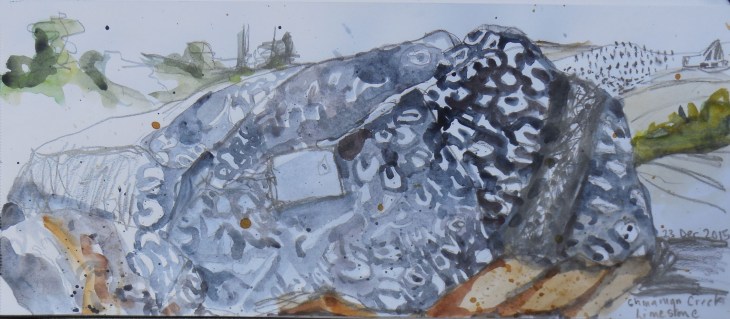
Queensland’s contribution, a limestone boulder from Chinaman Creek, studded with marine fossils, 23 December 2015, graphite and watercolour

While the Chinaman Creek boulder from Queensland is the most dramatic of these boulders, I do enjoy the way they have been placed in a graceful arc.

23Dec2015

From foreground to the rear, Chinaman Creek limestone (Queensland); My Goyder Syenite (Northern Territory); and Canberra Limestone, (Australian Capital Territory). 23 December 2015, graphite and watercolour 

The ironstone boulder from Western Australia is the oldest in the collection coming in at nearly 2.5 million years old. The colours in it are so beautiful.

Ironstone

Brockman Formation ironstone, 2490-2450 million years old. Now that’s ageing gracefully!

At present these boulders grace a turning circle and small parking area which appears to be home to every spare road sign in Canberra. While I was drawing the boulders one of my sketching companions had lots of fun capturing the absurdity that is that turning circle.

There are plans for greater usage of this area. It is to be the entry point to the National Rock Garden, a relative to the National Arboretum which is located up the hill from this area. If you like quirky tourist destinations then I suggest you give this one a go.

The Federation Rocks are located at the corner of Lady Denman Drive and Barrenjoey Drive, (close to the National Arboretum), just drive the two hundred metres to the end of Barrenjoey Drive to find them.

My Pretty Little Art Career

This is a ‘drawing the exhibition’ post but between my title and that of Grayson Perry’s exhibition at the Museum of Contemporary Art in Sydney I thought you might lose interest before you even started.

We went to see My Pretty Little Art Career on the day it opened. This is the largest retrospective of Perry’s work which has been seen to date and it doesn’t disappoint. If Perry is unfamiliar to you then it’s probably easier to let him introduce himself. anybody can enjoy art and anybody can have a life in the arts – even me! For even I, an Essex transvestite potter, have been let in by the artworld mafia.”

Perry has a broad career spanning his initial work making ceramics and sculptural works up to his recent appearances on television where he has produced machine-woven ‘tapestries’ based on the English class system, and a series on the contemporary portrait. If you are a fan of the shows then the pieces you see on the TV are all here, as well as more recent works.

Map of truths

detail, Map of Truths and Beliefs, 2011, tapestry, 290 x 690 cm

What I really wanted to see are the pots that Perry makes. Subversive and sometimes shocking in their explicit language and images, they transcend the stereotype of a ‘decorative’ pottery and are a deliciously pointed response to people who look askance at the ‘minor’ arts. (Apologies for all the quotes, but this is a man / transvestite who likes to demolish art world stereotypes).

Precious Boys

detail, Precious Boys, glazed ceramic 53 x 53 cms

I was thrilled to see one of my all-time favourites,  Dolls at Dungerness in the room. There is also a place where you can watch a time-lapse sequence of Perry hand building and decorating a number of these pots. I liked that he had a small sign sitting next to his wheel reminding him to turn the camera on.

I was disappointed that there were no places to sit in the early rooms of Perry’s work, because I had to skip drawing those pots so artfully arranged in their individual display cases. There wasn’t enough room to move other than to circle around each cabinet to read all the details incised or printed on the pot’s surfaces.

The one place you can get a seat is in the large tapestry rooms. One of these rooms included a very large pot called What’s Not to Like, on which Perry’s teddy, Alan Measles, glazed in gold, surmounts a pot covered with a plethora of desirable consumer goods.

What's not

What’s Not to Like, glazed ceramic, 2007, pot 0 x 60 x 90 cms , lid 40 x 40 x 62 cms. My sketch Koh-i-noor Magic pencil on Leuchtturm 1917 Whitelines Link book

As always I really enjoy seeing an artist’s sketchbooks and process displayed. Perry’s notebooks were fascinating to look at. Here’s just one page.

sketchbook

Sketchbook, Grayson Perry

Perry says of his sketchbooks that “Drawing in my sketchbook is an almost daily activity …. When I put an idea down I take it very seriously. I don’t waste ideas and there will come a point when I will make a work from the drawing. I have a backlog of categories of objects I want to make.” I look at my own practice and think about this statement. I have many sketchbooks and rarely re-visit them. How many of my ideas are going to waste? All guilty parties please raise their hand.

Perry’s teddy, Alan Measles and his alter-ego Claire appear in many works. I was particularly taken by these two small sculptures.

Alan Gold

Prehistoric Gold Pubic Alan Dogu, 2007, glazed ceramic, two parts; left 12.5 x 10.5 x 5.5 cm and; right 12.8 x 10 x4 .8 cm

And just because I can here is the X-92 that Claire has been photographed with.

X92

X-92, glazed ceramic, 1999, 84 x 58 x 18 cms

This exhibition is highly recommended as is the accompanying catalog . (Rest assured I’ve given up rote buying of exhibition catalogs).

If you would like to read some other views of the exhibition I can recommend Paint Later’s post. If you want to read some more you can read Jacky Klein’s 2009 monograph Grayson Perry, (Thames and Hudson).

Drawing the exhibition: Painter in Paradise

(Warning a very long, rambling post follows)
Away from my usual home turf you can often find me checking out the local art galleries. My home town of Newcastle (NSW) has always been a bit of an arty place and its favourite son for most of the 20th century was Bill Dobell, (or Sir William if you want to be formal). Of course he’s more correctly a Lake Macquarie artist, having lived at Wangi for a fair bit of his life. So its fitting that the Lake Macquarie City Art Gallery has been hosting Painter in Paradise: William Dobell in New Guinea. (For the geographically challenged Lake Macquarie, now a city in its own right, is on the southern outskirts of Newcastle, part of the greater Newcastle area).
I was having a hard time deciding whether to see this show or not. It would be fair to say that while Dobell remains a significant Australian artist of the 20th century, he’s no longer as popular these days as other artists of his era. Dobell certainly figured in my earliest art memories.

Apart from the ubiquitous portrait of HM the Queen, (by William Dargie, the only other portrait I recall hanging in our primary school was Dobell’s 1957 portrait of the poet Dame Mary Gilmore. In high school our teacher took our art class to Sydney on excursion. Two things about that day stick in my mind – the ‘shock’ of recognition when I saw one of Henry Moore’s Helmet Head sculptures in the flesh, (so to speak) at the Art Gallery of NSW and my first visit to a commercial art gallery. At Rudy Komon’s gallery in Paddington I saw, casually leant against the wall, the recently rediscovered Wangi Boy (aka Boy on the Beach). The intense gaze of the boy made quite an impact on me. So I was pre-disposed to visit this exhibition.

The show covers work inspired by Dobell’s two visits to Papua New Guinea in 1949 and 1950. This is a large body of work, covering everything from photographs and sketches to studies and finished paintings. The gallery was full. Dobell is best known for his many strong portraits, thick with gesture and paint, so the delicate miniatures that formed a significant portion of the initial work coming out of these PNG visits came as a surprise to me. They are exquisite. Coming in at 16 x 20 cms their almost enamelled surface and delicately painted lines are a revelation.

image

Another thing that stood out for me was Dobell’s conflation of mythological themes with local culture. He takes a subject, such as local men thatching a roof and transforms it into a mythic undertaking.image

Continue reading →