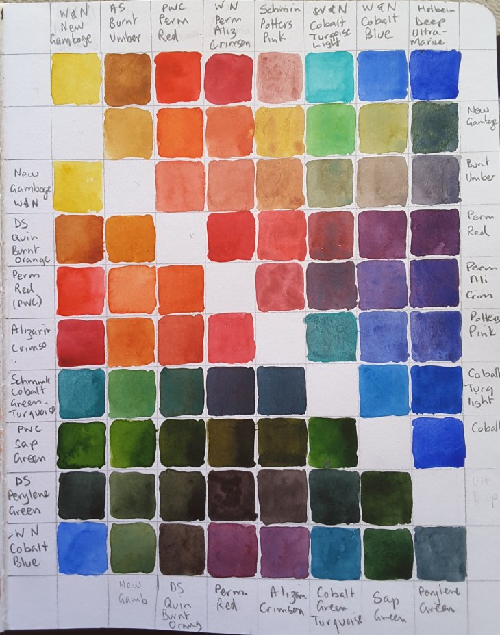
Behold my beautiful colour swatch! If you look closely you will see that this is two colour swatches, with some slightly different colours in each.
I can’t say that I am very good at making ‘proper’ swatches. Indeed I think this is the first time I have done this since going to art school.
l was spurred on to paint this chart while watching one of Teoh Yi Chie (aka Parka) Parka blog’s videos where he demonstrated that one of the uses of a colour swatch was to work out if two ‘similar’ colours were worth keeping in your palatte.
Given my inability to stop adding new colours to my palette I thought a bit of testing might be in order.
In this case Cobalt Light Turquoise (3rd from the top right) and Cobalt Turquoise Green (4th from the bottom left), looked similar in the tube but gave different results when mixing. In contrast Burnt Umber (2nd from the left on the top row) and Quinacridone Burnt Orange (2nd down on the left hand side), mixed almost identical colours, the burnt umber being less intense.
Painting this took ages, really. Keeping the colours in the correct order nearly drove me crazy, however I found the result was worth it. The downside is having finished the book I painted it in I now have to resort to checking a photo in my smart phone gallery if I want to refer to it.
If I remember correctly Parka shows, in the video, a number of swatches he has created over his years of reviewing all sorts of art materials. If you aren’t familiar with his reviews and video channel I can highly recommend them. You can find his website here, including all the relevant links.
