I made my second visit to the Encounters exhibition this weekend past (click here for my previous post). Post knee surgery I was able to take advantage of the Museum’s free electric scooters to get around, rather than relying on my crutches for the duration. This also meant that I had a seat wherever I needed one to draw the various artefacts on display.
The day before I went to the Museum I heard a panel discussion about the exhibition on Radio National (click the link to hear the podcast). Towards the end of the discussion Richard West (Founding Director and Director Emeritus of the Smithsonian Institution’s National Museum of American Indian and President and CEO of the Autry National Centre of the American West) discussed his interest in Cheyenne shields. The nub of his observation was that these shields – and probably those of other first nations people – were both intensely personal objects but also representative of their community. This reminded me of a shield in the exhibition that had a hand stenciled on the reverse side. I don’t think it’s too much of a stretch to think that this is almost certainly the hand print of the owner/maker. You can read more about this shield here.
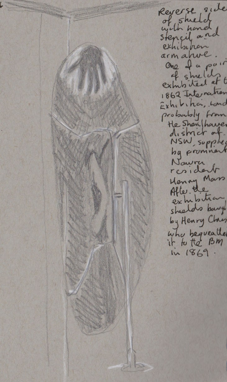
Reverse of a shield with hand stencil, probably from the Shoalhaven region of New South Wales. Exhibited at the 1862 International Exhibition, London. My sketch graphite and white chalk
I got quite waylaid by some other shields on show, stopping to draw two more. This one is a most elegant design. A slender 16 cms in width and just under a metre long, it is decorated with a series of carved grooves. The grooves change from the vertical to the diagonal, around the middle of the shield and then revert back to the vertical on the bottom section of the shield. As you might be able to make out from my scrawled notes I couldn’t decide whether the optical effect of the face of this shield was enhanced by the use of one or two coloured ochres or not. When I checked the notes it says that pigment was used but doesn’t go into further detail.

A shield collected from the hinterland near Derby in Western Australia, in late 1884. My sketch graphite on grey tone paper and coloured pencil
The other carved shield that caught my attention was covered in bands of diagonal grooves, which really made a dazzling optical effect. In my sketch I used white chalk and graphite to highlight the way the light reflected off the carved grooves, but as far as I could tell there was no pigment on the face of this shield. The light reflections reminded me of the ‘dazzle’ camouflage patterns that were used to distract and obscure ships in WWI.
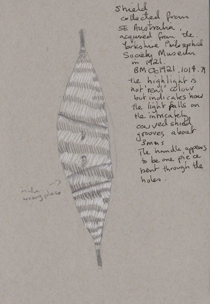
Wooden shield with pattern of grooves, collected from South eastern Australia (which covers quite a bit of land!) and acquired by the British Museum in 1921. My sketch graphite and white chalk on grey-toned paper
My final sketch of the morning was quite different. It is a marriage ornament owned by a woman which was collected from Mer (Murray Island, in the Torres Strait) by Alfred Cort Haddon in 1888-89. On a series of hand-spun string a series of objects including shells and a variety of other ornaments have been strung. It wasn’t explained whether these were purely ornamental or whether some had a practical purpose. In his catalogue of Haddon’s collections, David Moore (1984:72) noted that the pendants ‘Would have formed part of marriage ornaments worn by bride’. Haddon noted that the number and variety of the pendants was dependent on the wealth of the bride’s parents. ‘They were worn for one or two months before the wedding feast. The older married women also wore many of these objects on special occasions, but never during widowhood’.
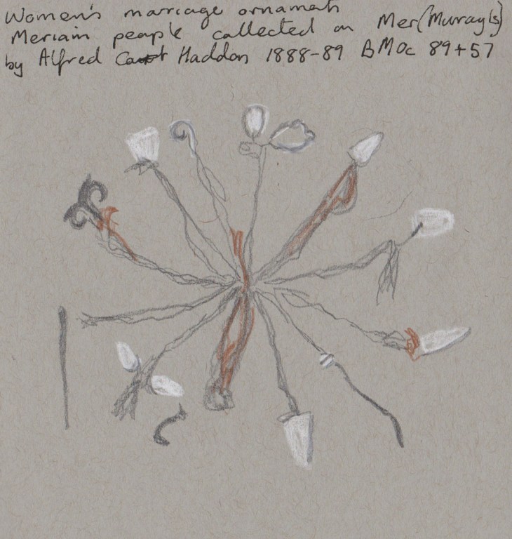
Women’s marriage ornaments, Mer, late 1880’s. My sketch graphite, white chalk and coloured pencil on grey-toned paper
I think that such an item has a similar symbolic function to the chatelaines, worn by wealthy European women.