Turner’s blues and a few others

I am currently reading Anthony Bailey’s biography of JMW Turner, Standing in the Sun, (2013 paperback edition). So having just posted about Smalt Blue, I was very interested to read the following lines from Henry Syer Trimmer’s account of Turner’s studio, after Turner’s death, ” … and cobalt to be sure there was, but also several bottles of ultramarine of various depths and smalts of various intensities, of which I think he made great use.” Trimmer goes on to report, “I was told by his housekeeper [Hannah Danby] that ultramarine was employed by him sparingly, and that Smalt and cobalt were his usual blues.” ( pps 87-88).

In this case Trimmer is referring to Turner’s oil paints, rather than his watercolour paints. I am trying to find out whether Turner used the same pigments in his watercolours. It seems quite likely, as it is a matter of selecting the relevant binder for your pigment and ensuring that the particles are ground down to the correct specification that are the key. I need to do some more research!

To give you some idea of the colours Trimmer is referring to, above, I have swatched out the three blues referred to, Ultramarine, Smalt Blue and Cobalt Blue, in watercolours. In addition I have also included three other blues, Indanthrone Blue (AKA Delft Blue), Mayan Blue Genuine and Pthalo Blue (green shade) for comparison.

Most interesting of all these pigments to me is Mayan Blue which, according to Wikipedia is “a composite of organic and inorganic constituents, primarily indigo dyes derived from the leaves of añil (Indigofera suffruticosa) plants combined with palygorskite, a natural clay which, mysteriously, is not known to exist in abundant deposits in Mesoamerica.

Indanthrone Blue, PB 60, also goes by more than one name, including Delft Blue and sometimes indigo blue. I would be wary of using the latter common name as the indigo blues I have looked up on line are made from a varying range of pigments. White Nights Indigo (Nevskya Palitra) is a blend of PBk 7, PB 15 and PV 3; Windsor and Newton Indigo is a blend of PBk 6, PV 19 and PB 15.

When choosing a watercolour to add to your palette the general advice is to select a paint made from a single pigment. This will generally give better results when mixing colours. If you are selecting a multi-pigment paint you are more likely to mix a muddy colour. This is because some of the pigments may work well in the mix and others may not thereby cancelling each other out and making mud.
More ‘colour cows’ join the herd

There’s not much that I like better than buying art supplies. Visiting another country, in my experience, is an excellent excuse to explore new brands and our new friends at USk Paris were most helpful in directing us to local art suppliers.

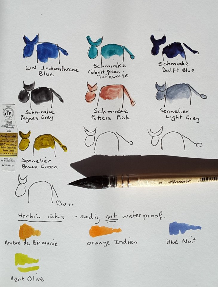
Here are the latest colours, mainly from Schmincke and Sennelier. I also have a new brush, whose name is Leonard no. 3, made by Gerstaecker (a brand I am unfamiliar with).

Down the bottom of the page are some Herbin inks that I also got in Paris at Galleries Lafayette. They come in 10 ml as well as 30ml bottles, all the better to encourage you to buy multiple bottles (see, it works). The most disappointing thing is that these inks are not waterproof. That hasn’t stopped me from using them, but I would be using them a lot more if I could be sure they wouldn’t run.

New colour cows: top row – Idanthrone blue (WN), Cobalt green turquoise (Schk), Delft blue (Schk); middle row – Payne’s grey (Schk), Potters pink (Schk), Light grey (Sen), Brown Green (Sen)

The other day I took Leonard no.3 out painting. He was a very good brush indeed. He holds lots of water and also has a good fine tip. This was the brush I used for the painting/ collage below, on the Canal St Martin.

The lock at Parc Eugene Varlin, Canal St Martin. Watercolour, pencil and collage.

Today I filled my favourite Sailor Fude nib pen with the Herbin Orange Indien and used it in my sketch of the Tropical Glasshouse at the Jardin des Plantes. When used in conjunction with watercolour you can get away without seeing too much ink bleeding.

Inside the Tropical House at the Jardins des Plantes, Paris

Shades of grey

I’ve just finished working my way through my Strathmore Toned-Grey sketchbook, some 50 pages, most of which both back and front have been drawn on with coloured pencils. I’ve used coloured pencils since childhood, but as an adult I’m discovering these materials anew.

Unlike watercolours it’s hard to satisfactorily mix new colours using pencils. I wished I had a range of more subtle colours on many occasions. So my recent pencil buys have been of greys and neutrals, colours which are not strongly represented in the pencil box.

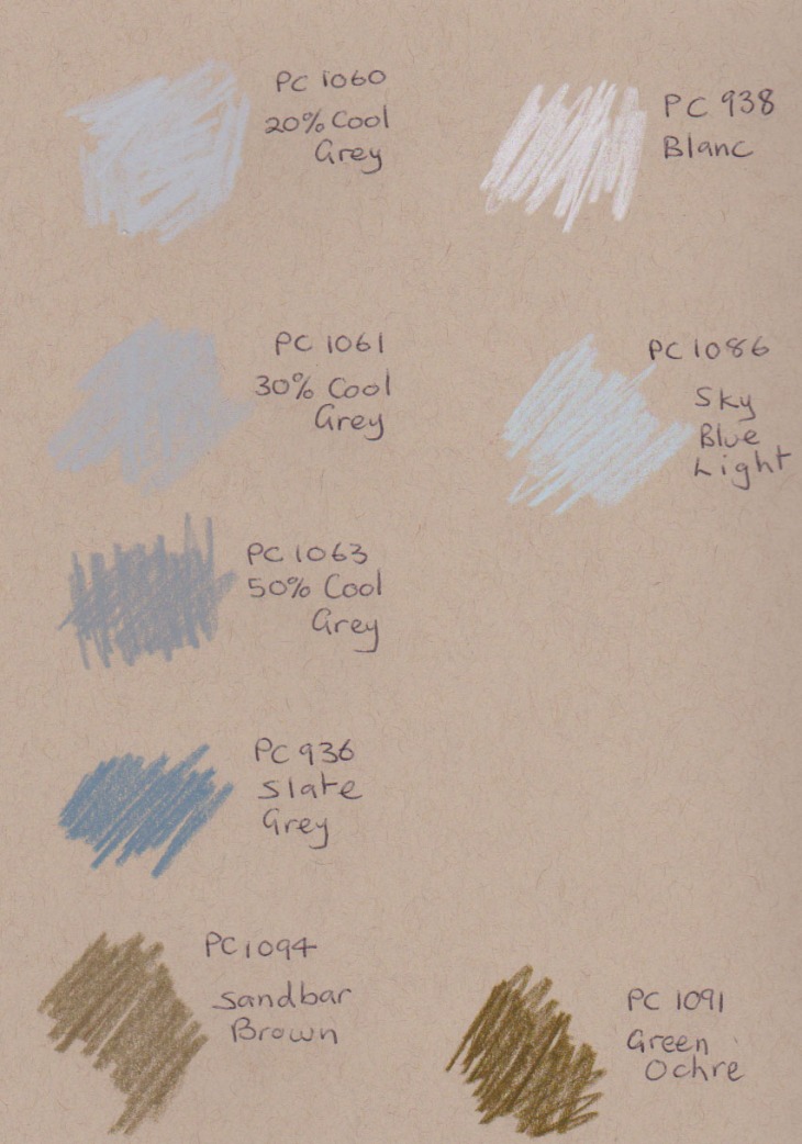
From left to right are: Green Ochre, Sandbar Brown, Slate Grey, 50% Cool Grey, 30% Cool Grey and 20% Cool Grey. On the right hand side of the pictures are the Sky Blue Light and White which I’ve been using for some time, but which fit also into this colour range.

New pencils, ohh goody!

New pencils, ohh goody!

I’ve drawn them onto Strathmore Toned Tan paper below. I had started using them in my previous sketchbook but I don’t have any spare pages to show them on the Toned Grey paper.

I already find these colours incredibly useful additions to my palette. Having now swapped to the Toned Tan sketchbook I’ll be interested to see how they go on the warmer background.

test colours on toned-tan paper, greys and neutrals

test colours on toned-tan paper, greys and neutrals

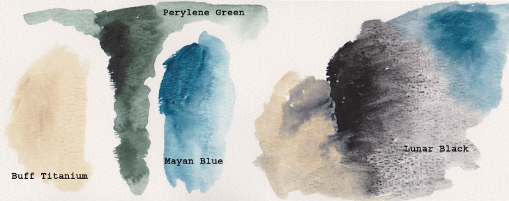
And just because I can , I’ve forced myself to buy even more watercolours that I’ve seen written about by several artists whose work inspires me. All the colours are from the Daniel Smith company.

These paints have been tried out on watercolour paper with a medium tooth. I love the granulation of the Lunar Black and I think the Buff Titanium is the sort of colour I’ve been after for some time. The Perylene green is for my partner who was after something dark for shadows in vegetation and the Mayan Blue is just because I like it.

Testing new watercolours

Testing new watercolours