Travels with my paintbox

It’s been a year since my big European sketching adventure, so I decided it was time to take a look at my paintbox and see what I have and haven’t used, paint-wise, over that time.

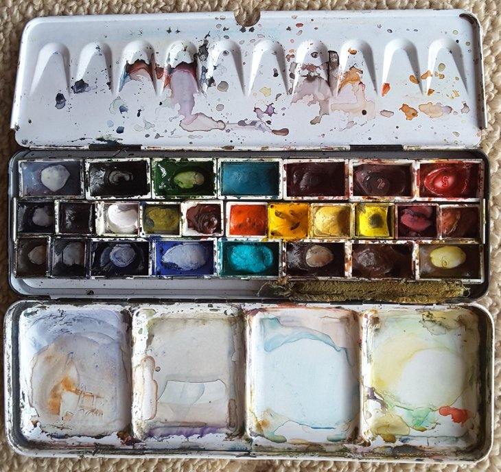
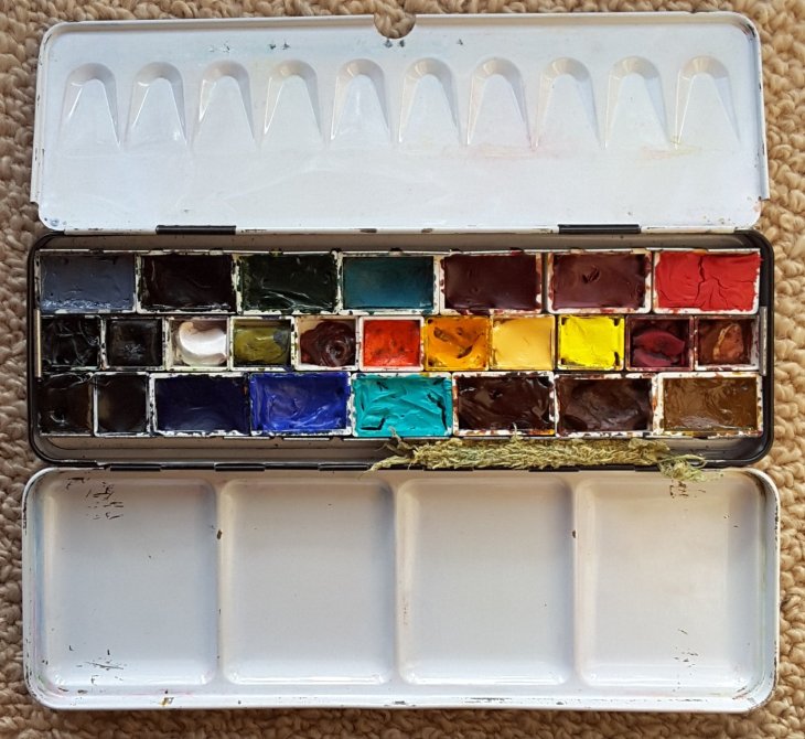
The paintbox after one year’s use.

I bought this set in Paris about this time last year, but it no longer resembles the Sennelier set that I purchased, nor does it have many Sennelier paints in it anymore.

My biggest issue is that the Sennelier paints use honey as a binder, which is fine in moderate climates but doesn’t do the job in high temperatures. It was quite an alarming experience to be sitting, a few weeks later, in the streets of Cordoba realising that all my paints were liquid under a thin top skin. It was awful for painting and even worse when they started running together across the box.

So having started out using the kit as purchased, this paint box has been modified as I have gone along. The original set only had pans in half of the box, so I immediately started filling the empty spaces with extra half pans I bought as I travelled.

Longer term I also added full pans, all of which are filled by tube paint. It took me a while to appreciate that using full pans made it easier to get juicy colours onto my palette and paintings, without unnecessarily wearing down the hairs on my good brushes. When travelling using full pans also means less refills.

Sorting out what I have ready for re-filling.

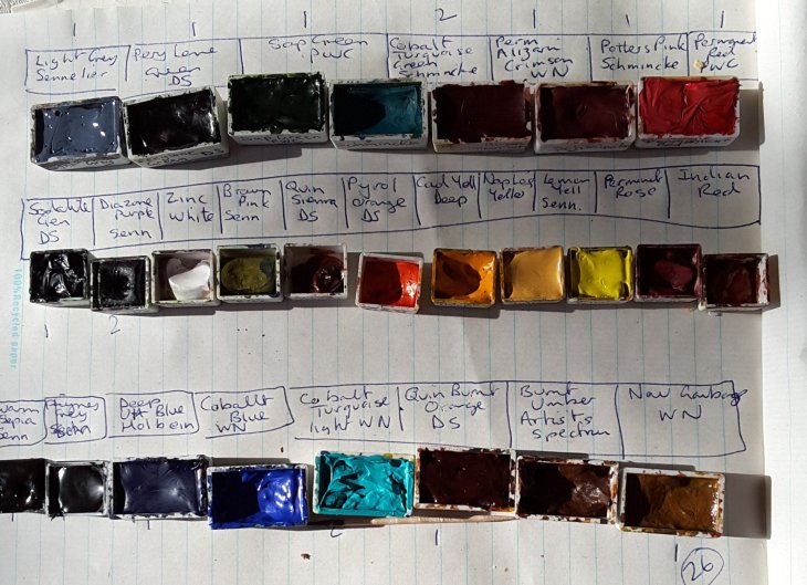
In the middle of the box sits a row of colours that get used at a lesser rate than others. Some, such as pyrol orange and diazine purple that are almost impossible to mix from scratch and for me at least, are absolute necessities in some sketches.

I can’t resist trying new colours and no kit I have seen holds all the colours that I want to use. I am also a firm believer that art supplies make excellent souvenirs, particularly as so many brands are hard to get (other than online) in Australia. Included in my box are paints I got in Japan, France, Singapore and Portugal. Brands include Windsor and Newton, Daniel Smith, Artist’s Spectrum, Holbein, Schmincke, Sennelier, Mission Gold and PWC. My latest purchases made in Taiwan last year, haven’t found a space in the box yet, even though I am desperately attached to the Mission Gold Red Brown.

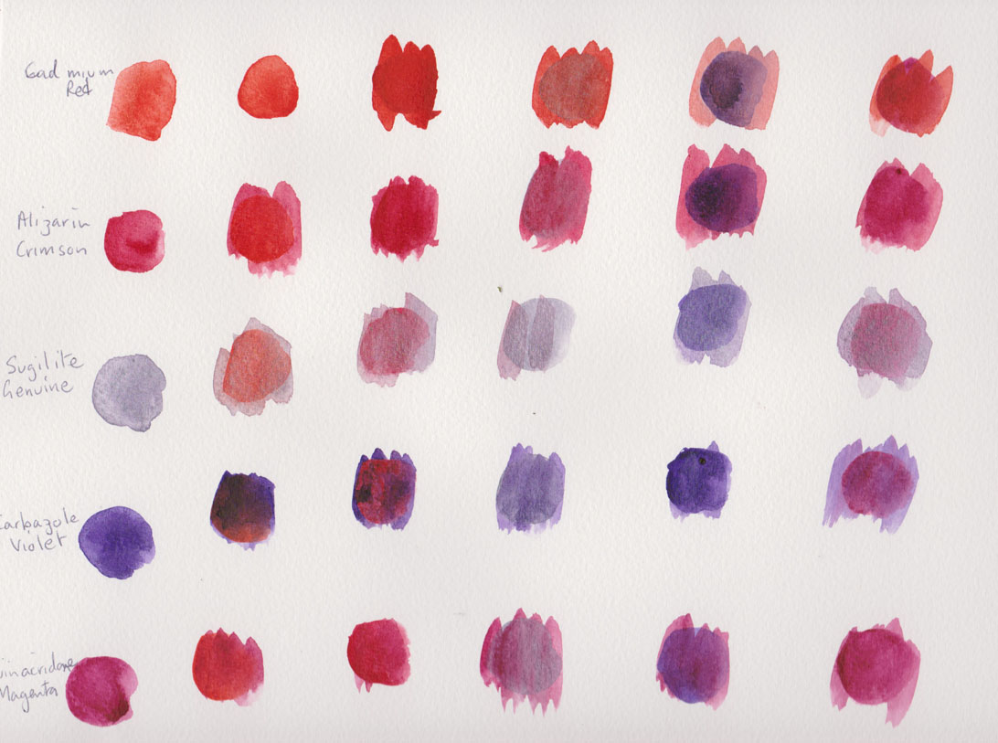
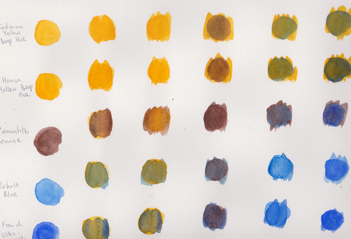
Comparing colours between what I had at home (the paints at either end) and replacements bought while travelling, when I ran out or couldn’t find the right colour.

I am looking forward to travelling again so it will be interesting to see what new paints I find! Here’s to my re-filled palette.

My shiny clean paintbox , not for long!

Face Painting

Here are some more watercolour sketches of faces of people in cafes.

26Jun2017b

My first sketch, which also included some pen and ink (note to self I find the ink lines rather distracting, even though they give ‘definition’)

As part of my ongoing strategy to disrupt lazy habits I decided to use only a Daniel Smith test palette for my colours. This palette includes a number of colours that I don’t have in my paint selection. The other benefit using this card is that it’s a lot easier to carry if you are traveling light.

Untitled-1

The John Orlando Birt colour palette for Daniel Smith

I was happier with my results when I ditched my pen and just stuck to the watercolours.

26Jun2017a

Man in a puffa jacket, 26 June 2017, watercolour

I think that this head of a small boy was the most successful on the day.

26Jun2017

26 June 2017, small boy, watercolour

Another day and another cafe, same watercolour palette. Three people who were sitting at the same table.

4Jul2017

Three portrait sketches, 4 July 2017, watercolour

Shades of grey

I’ve just finished working my way through my Strathmore Toned-Grey sketchbook, some 50 pages, most of which both back and front have been drawn on with coloured pencils. I’ve used coloured pencils since childhood, but as an adult I’m discovering these materials anew.

Unlike watercolours it’s hard to satisfactorily mix new colours using pencils. I wished I had a range of more subtle colours on many occasions. So my recent pencil buys have been of greys and neutrals, colours which are not strongly represented in the pencil box.

From left to right are: Green Ochre, Sandbar Brown, Slate Grey, 50% Cool Grey, 30% Cool Grey and 20% Cool Grey. On the right hand side of the pictures are the Sky Blue Light and White which I’ve been using for some time, but which fit also into this colour range.

New pencils, ohh goody!

New pencils, ohh goody!

I’ve drawn them onto Strathmore Toned Tan paper below. I had started using them in my previous sketchbook but I don’t have any spare pages to show them on the Toned Grey paper.

I already find these colours incredibly useful additions to my palette. Having now swapped to the Toned Tan sketchbook I’ll be interested to see how they go on the warmer background.

test colours on toned-tan paper, greys and neutrals

test colours on toned-tan paper, greys and neutrals

And just because I can , I’ve forced myself to buy even more watercolours that I’ve seen written about by several artists whose work inspires me. All the colours are from the Daniel Smith company.

These paints have been tried out on watercolour paper with a medium tooth. I love the granulation of the Lunar Black and I think the Buff Titanium is the sort of colour I’ve been after for some time. The Perylene green is for my partner who was after something dark for shadows in vegetation and the Mayan Blue is just because I like it.

Testing new watercolours

Testing new watercolours

Testing, testing – Daniel Smith Watercolours

The range of paints on offer to watercolour artists these days makes me feel like I’m stuck between being a ‘kid in a candy store’ or caught in an expensive minefield. With the cost of tubes of paint so high, experimentation can come with a big price tag. I was trained to mix my paints from a standard set of colours so selecting from the 195 colours on offer in the Daniel Smith range, excluding the 48 Luminescent™ watercolors also available, is a daunting prospect. With all that in mind I recently sent for a free sample card of watercolours, The Georgia Mansur Palette, from Daniel Smith Extra Fine Watercolor.

The Georgia Mansur palette, a modest 16 colours, is fairly close to what I normally paint with. Although is does include colours such as Quinacridone Gold,  Pthalo Turquoise, Indanthrone Blue and Carbazole Violet that I don’t normally use. I was keen to see how these paints would stack up against my usual Windsor and Newton (W&N) colours.

The Georgia Mansur Palette, from Daniel Smith

The Georgia Mansur Palette, from Daniel Smith

I started by making a series of colour tests, mixing the 16 paint samples in a matrix, just as they came on the sample card.

Reds and violets

Reds and violets

The paints were painted on a Canson 200gsm cold pressed Montval Aquarelle block.

Yellows and blues

Yellows and blues

Green, blue and earth tones

Green, blue and earth tones

My initial assessment is that I couldn’t see much difference between the standard colours in the Daniel Smith (DS) range eg Cadmium Red,  French Ultramarine etc, to those I use already. The one exception was the DS Burnt Sienna which seems particularly ‘thin’ in comparison to the Windsor and Newton version of the pigment. I have no idea why this is the case.

Many of the painters I’ve seen on online  video tutorials and DVDs are using new classes of pigments, such as the quinacridone’s, that provide a greater intensity and lightfastness than more traditional pigments. I wasn’t sure about how these would work in my palette, but I’ve been pleasantly surprised by the Quinacridone Gold that I sampled. It mixed in a beautiful way with many of the other pigments, particularly with the natural pigment paints such as Sodalite and Bloodstone Genuine, (see below).

Trying to get a wider range of mixes on one page

Trying to get a wider range of mixes on one page

I found the Pthalo Turquoise and Carbazole Violet to be a very intense colours, that are of little relevance to the landscapes I normally paint. I could see these paints being used in a tropical setting, but at this stage they are not colours that I’d buy.

What did come as a revelation were the four PrimaTek® Colors included in the palette. As the enclosed information said these are “made from naturally occurring pigments. …Most have a natural luminosity and many granulate.” The Sugilite Genuine has a silver sheen that I first mistook for a synthetic additive (it’s the 3rd colour down on the chart of ‘red’ colours), unfortunately I don’t think the scan clearly shows its natural luminosity. I was particularly taken by the Sodalite Genuine and the Bloodstone Genuine, whose ‘aged’ colour really appealed to me. I’m also a girl who loves granulation in a pigment!

Now the good news is that if you’re interested in sampling the Daniel Smith paints you can purchase samples of Paint It Colour Cards, at $A7.95 for 66 colours or the full range of 238 colours at $A33.65. That’s a lot of testing to do! If you are in the market for 15 mml tubes of paint you are looking at prices between $A20-$A40, depending on the pigment you are selecting. I think it’s definitely worth exploring the colour card option to help you decide what you do and do not like.

My top picks from the Georgia Mansur Palette were Quinacridone Gold, Sodalite Genuine and the Bloodstone Genuine. I’ll be adding these to my regular colour palette.