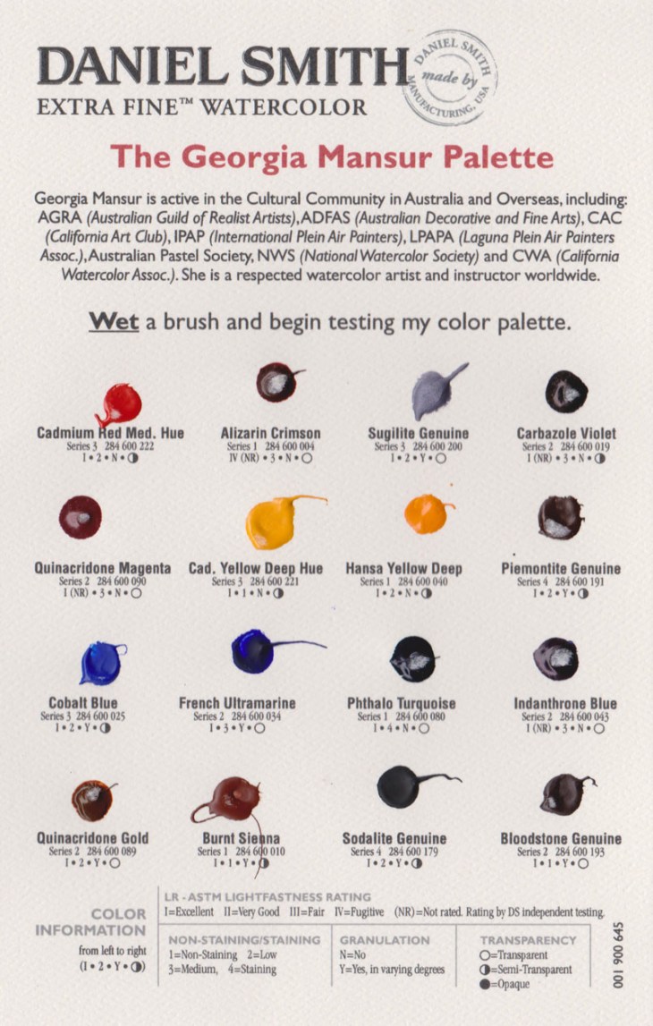
The range of paints on offer to watercolour artists these days makes me feel like I’m stuck between being a ‘kid in a candy store’ or caught in an expensive minefield. With the cost of tubes of paint so high, experimentation can come with a big price tag. I was trained to mix my paints from a standard set of colours so selecting from the 195 colours on offer in the Daniel Smith range, excluding the 48 Luminescent™ watercolors also available, is a daunting prospect. With all that in mind I recently sent for a free sample card of watercolours, The Georgia Mansur Palette, from Daniel Smith Extra Fine Watercolor.
The Georgia Mansur palette, a modest 16 colours, is fairly close to what I normally paint with. Although is does include colours such as Quinacridone Gold, Pthalo Turquoise, Indanthrone Blue and Carbazole Violet that I don’t normally use. I was keen to see how these paints would stack up against my usual Windsor and Newton (W&N) colours.

The Georgia Mansur Palette, from Daniel Smith
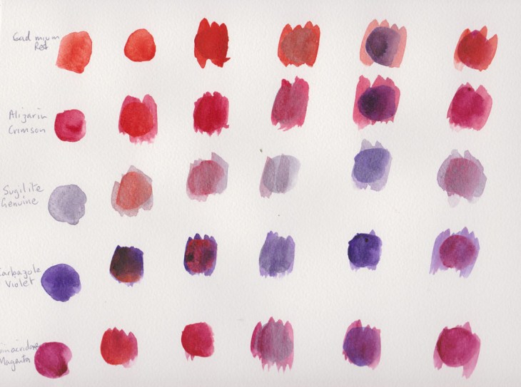
I started by making a series of colour tests, mixing the 16 paint samples in a matrix, just as they came on the sample card.

Reds and violets
The paints were painted on a Canson 200gsm cold pressed Montval Aquarelle block.

Yellows and blues

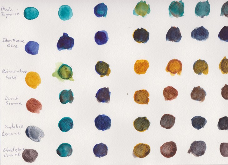
Green, blue and earth tones
My initial assessment is that I couldn’t see much difference between the standard colours in the Daniel Smith (DS) range eg Cadmium Red, French Ultramarine etc, to those I use already. The one exception was the DS Burnt Sienna which seems particularly ‘thin’ in comparison to the Windsor and Newton version of the pigment. I have no idea why this is the case.
Many of the painters I’ve seen on online video tutorials and DVDs are using new classes of pigments, such as the quinacridone’s, that provide a greater intensity and lightfastness than more traditional pigments. I wasn’t sure about how these would work in my palette, but I’ve been pleasantly surprised by the Quinacridone Gold that I sampled. It mixed in a beautiful way with many of the other pigments, particularly with the natural pigment paints such as Sodalite and Bloodstone Genuine, (see below).

Trying to get a wider range of mixes on one page
I found the Pthalo Turquoise and Carbazole Violet to be a very intense colours, that are of little relevance to the landscapes I normally paint. I could see these paints being used in a tropical setting, but at this stage they are not colours that I’d buy.
What did come as a revelation were the four PrimaTek® Colors included in the palette. As the enclosed information said these are “made from naturally occurring pigments. …Most have a natural luminosity and many granulate.” The Sugilite Genuine has a silver sheen that I first mistook for a synthetic additive (it’s the 3rd colour down on the chart of ‘red’ colours), unfortunately I don’t think the scan clearly shows its natural luminosity. I was particularly taken by the Sodalite Genuine and the Bloodstone Genuine, whose ‘aged’ colour really appealed to me. I’m also a girl who loves granulation in a pigment!
Now the good news is that if you’re interested in sampling the Daniel Smith paints you can purchase samples of Paint It Colour Cards, at $A7.95 for 66 colours or the full range of 238 colours at $A33.65. That’s a lot of testing to do! If you are in the market for 15 mml tubes of paint you are looking at prices between $A20-$A40, depending on the pigment you are selecting. I think it’s definitely worth exploring the colour card option to help you decide what you do and do not like.
My top picks from the Georgia Mansur Palette were Quinacridone Gold, Sodalite Genuine and the Bloodstone Genuine. I’ll be adding these to my regular colour palette.


