Cursive ‘a’

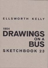
Thank you, thank you, thank you Rachel Hazel (aka thetravellingbookbinder) for your latest inspiration.  It is just what I needed today. I had hit a slump and didn’t know what to do with myself, until I recalled Rachel’s blog post from a few days ago on making an alphabet sketchbook.

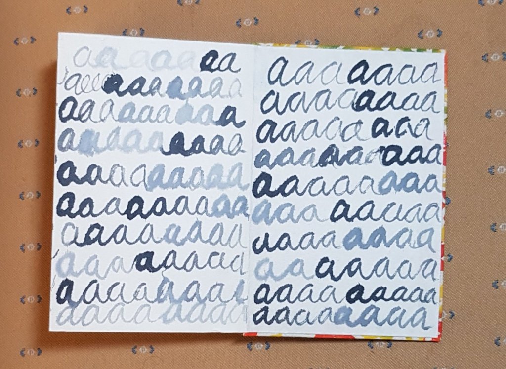
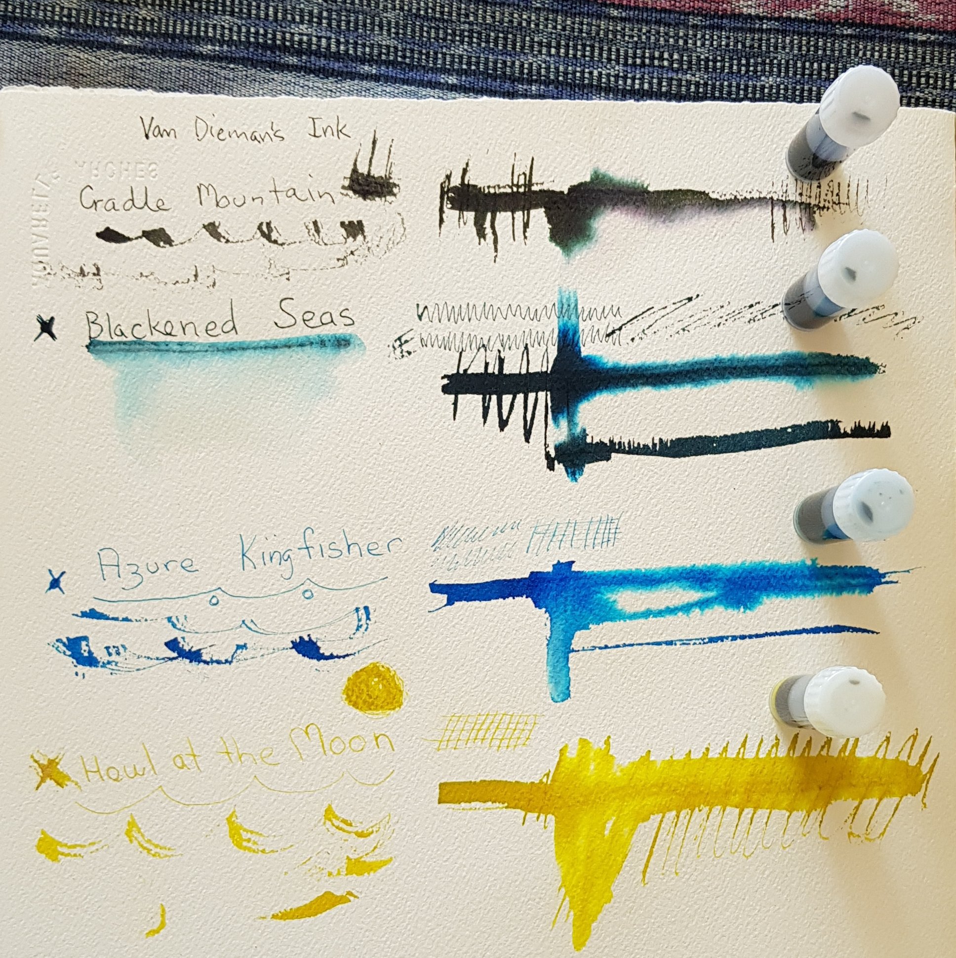
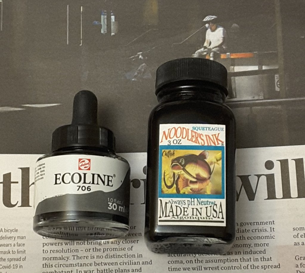
This is such an uncomplicated project that it almost seems too easy … and yet it is just the thing to jog you out of a malaise. The idea is to take your book and some ink and just start writing the same letter across the page. Rachel suggests using a stick and some ink, which I duly did. I used two products: Ecoline Liquid Watercolour by Royal Talens, in Deep Grey; and Noodlers Ink in Squeteague. The stick I picked up in our garden.

Two liquid media that I used for my alphabet book.

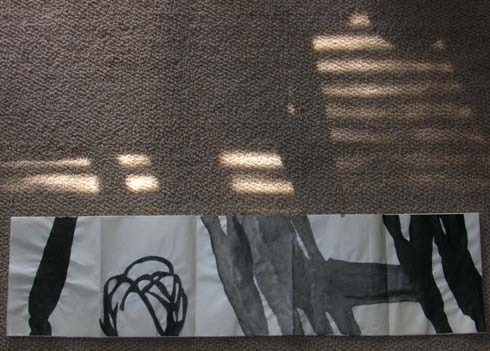
I am working into a Japanese accordion book which has just been waiting for such a project. I think that I bought it nearly 10 years ago.

The process of writing is quite absorbing. After a while it is hard to recognise the letter, the shape instead comes to the fore. It feels a bit like that thing you do when you repeat a common word over and over until it ceases to mean anything and dissolves into a jumble of sounds.

This is my favourite page so far. I made a whole lot of random marks on the page and only let it partially dry before working back into it.

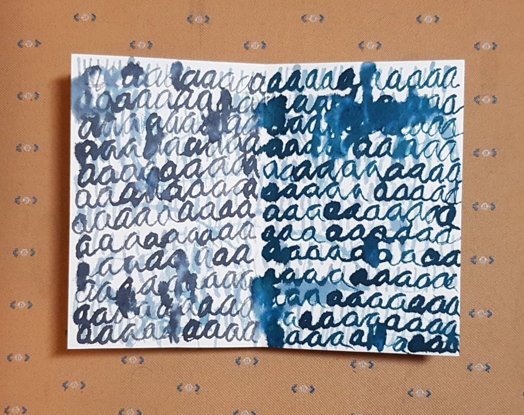
As you can see from my photos I didn’t stop at one page. At my current rate expect that this will probably end up as the book of ‘cursive a’.

Only part way through and I can’t see it stopping anytime soon.

I suggest that you take a look at the fantastic images on Rachel’s blog. She at least has managed to get past the letter ‘a’ and shares some very beautiful pages and a short flip through of her book as well.

Inky Fingers

I’m not sure if ink is the latest “thing”, but it certainly seems to be on trend at present. Wherever I turn there is a new range of inks and new companies to discover. Alas I am a frail spirit and I easily succumb to the enticement of new art products.

This time it’s ink from Van Dieman’s Ink in Tasmania (Van Diemans Land being the Dutch name given to the island after they ‘discovered’ it several tens of thousands of years after the indigenous Palawa people got there). But I digress. I hadn’t heard of the company but the inks looked interesting and I was able to buy 2ml sample size bottles which inspired me to try 4 colours.

I chose Cradle Mountain Grey, Blackened Seas, Azure Kingfisher and Howl at the Moon. The last two are ‘shimmer inks’, that is they have tiny fine particles of glittery stuff in them. None of these inks is waterproof. The company does list them as light and age resistant. As I am most likely to use these in my sketchbooks that shouldn’t be an issue for me. I have tried the inks out on my 300 gsm cold pressed Arches watercolour paper. Although the nibs that I tested them with really don’t do well on the toothed surface I wanted to see the initial colour and whether bleeding on damp paper would yield secondary colours. You can see the results below.

The Cradle Mountain Grey is the colour I find the most versatile of these inks. It also has some interesting secondary colours when drawn out with water. I really dislike the definite-ness of the black ink line and watercolour approach that many sketchers use. This grey backs off a fraction from that dark insistent line. It will be interesting to see how it goes when I am sketching with it in my fountain pen. The Blackened Seas is also an interesting colour, that I could see myself using.

The two shimmer colours I will likely only use with a dip pen and brush as there is no guarantee that I can fully clean them out of a fountain pen. I can see the silver shimmer in the Howling at the Moon colour, but there wasn’t much obvious gold shimmer in the Azure Kingfisher. It might be that I didn’t shake the sample up sufficiently well, or perhaps my sample didn’t containmuch gold in the first place. If you look at the photo you can see how the shimmer inks settle out after sitting for a while.

The 2ml samples give me plenty of ink to play with. I am looking forward to further expermentation.
Further information about the inks and the full colour range can be found here.

Paint marker practice

Yes I have gone out and bought myself several more paint markers. I’m pretty much sticking to the tried and true colours, including a cadmium yellow, cerulean blue and yellow oxide. I’ve also selected a bright green, a lighter blue and two greys.

Liquitex paint markers, testing for colour and opacity.

Liquitex paint markers, testing for colour and opacity.

The two colour patches were done using wet over dry and as you can see these colours are quite opaque. There are several colours in the range which are transparent but I haven’t tried any of those yet. The other aspect I like about these markers is that they are very quick drying. So that is a plus for my sketching.

I thought I’d better try the colours out in a ‘real’ drawing, so I did the following sketch of my stainless steel teapot, sitting on a table outside.

Teapot using Liquitex paint markers and ink, 18 March 2014.

Teapot painted using Liquitex paint markers and ink, 18 March 2014.

I don’t plan to use so much colour in my regular sketches, but I’m pleased with how they worked in this quick sketch.

Concrete pergola – three ways

I didn’t intend to do this drawing 3 times, but while I was sitting at one of the local libraries I saw this intriguing piece of architecture – an outsized concrete pergola. The structure itself is two stories high, each of the horizontal blades looks to be at least a metre high.

Firstly I tried drawing it with my fountain pen. I found it hard to control my tonal values and got rather lost somewhere between the vegetation and the structure.

Concrete pergola outside Woden Library, 24 February 2014.

Concrete pergola outside Woden Library, 24 February 2014.

The second attempt, from a slightly different perspective. This drawing shows a much better grasp of the structure, as I started by drawing the negative spaces. I also decided to skip most of the vegetation.

Second version of the concrete pergola outside Woden Library, 24  February 2014.

Second version of the concrete pergola outside Woden Library, 24 February 2014.

My last version was done on my phablet using PS Touch. I decided that one of the most attractive aspects of this scene were the colours of the concrete against the clear summer sky. So I ditched the vegetation and just stuck to the architecture. I quite like this one.

Third view of the pergola outside the Woden Library, 24 February 2014.

Third view of the pergola outside the Woden Library, 24 February 2014.


Drawing Shadows

“While riding the bus, I noticed that the shadows of the window frames falling across my book changed as the bus moved. With my use of drawing by chance I quickly marked many pages with outlines of the changing shadows. Later in my studio I inked in the drawings in the sketchbook, several of which I developed into paintings.” (Ellsworth Kelly writing about his sketchbook 23, 1954, (Drawings on a Bus), 9 October 2006).

The theme ‘shadows’ and this passage in particular, was used as starting points for the latest design excercise for the textile group I belong to. From our subsequent discussion it was clear that we all discovered that drawing shadows was a more complex process than  Kelly’s work implied.

We all tried the obvious, putting a sheet of paper down and tracing the shadow thrown on the page. We observed that shadows weren’t always uniformly dark, or uniform in strength, or one colour (gosh those Impressionists were right after all). Often they didn’t stay still for long.

Shadowink_6sep12lr

ink on paper of shadows in my house

After a frustrating time down the coast trying to trace shadows in the face of a stiff sea breeze I found that photogrphing the shadows falling on the page was far more effective.

Juneb2012

a page of shadow photographs

In the end the strength of Kelly’s work really spoke to me so I made a very literal translation of a number of his drawings with ink onto three pieces of cotton, placed on top of each other. The fabric was cut to the same height as his book (which is obtainable in facsimile), although I left the full length of the fabric as it came.

I wanted to take this a bit further, so I cut some of the top layer of the fabric and wove it into a small tapestry. I had hoped that the ink ‘shadows’ might make patterns that were more obviously related to the original drawings, but it wasn’t the case. I subsequently tried weaving one of Kelly’s drawings into the tapestry.

Kelly_tapestry

small tapestry made from torn fabric

I then re-inked what I had left of the fabric, over the original drawing. Kelly’s images still remain strong.

Inkonfabric2_6sep12lr

re-inked drawing on cotton

This idea is still very unresolved for me. I have two more pieces of fabric to play with.

Kelly2

image from the facsimile edition of one of Ellsworth Kelly’s Drawings on a Bus, 1954.

Kelly1