I’m in the process of making myself some new sketchbooks, playing around with different types of paper and formats.

Some of the paper I’m recovering from long abandoned sketch pads, so not everything is a standard size. As a result I’m making some tiny sketchbooks from the leftovers.
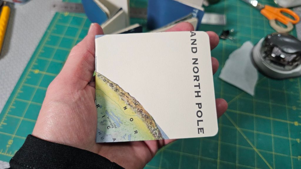
So far I’ve made seven of these. One is for a friend and I’m thinking of randomly giving the others away when I’m out sketching.

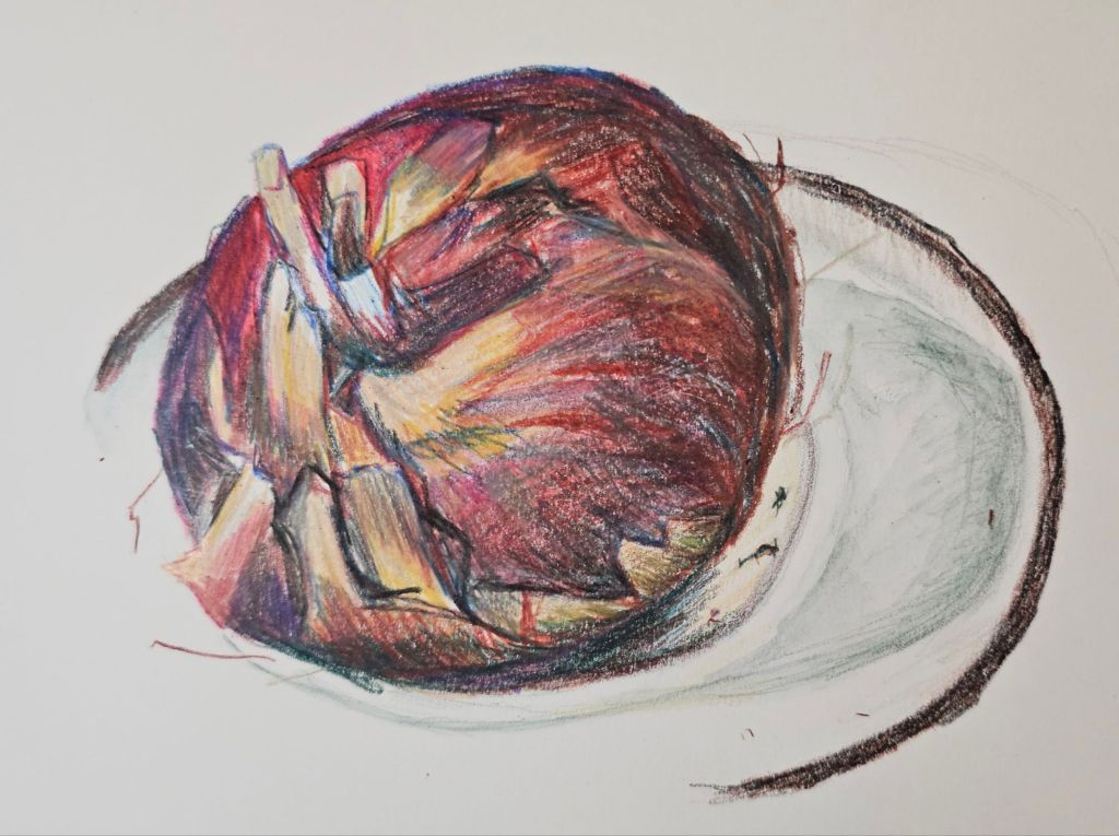
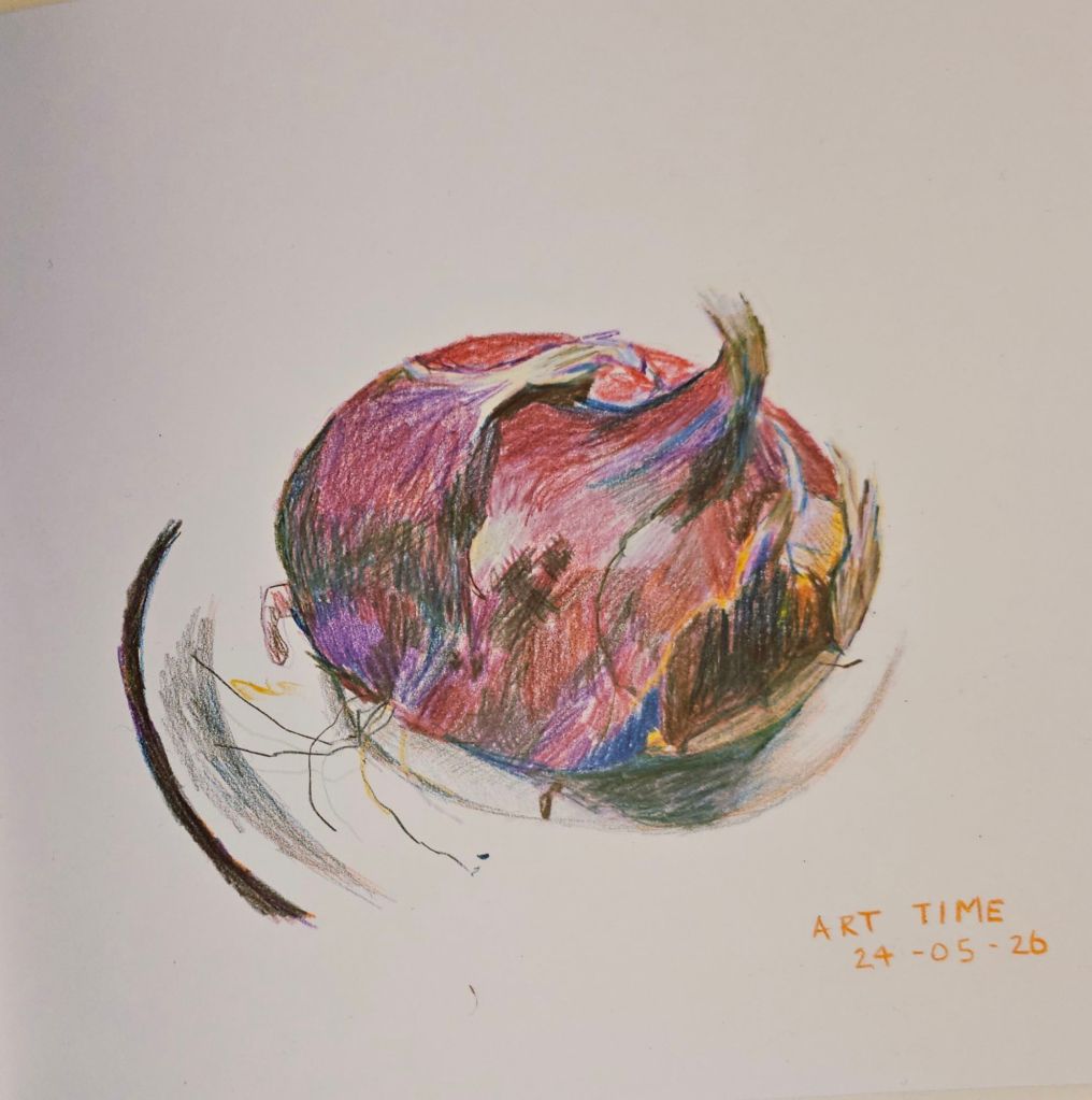
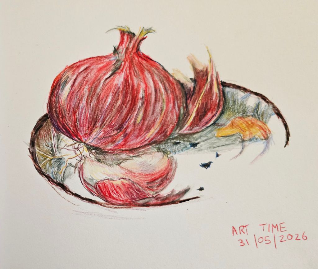
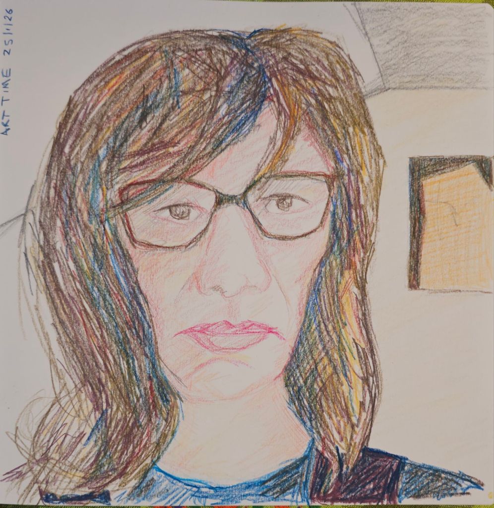
Of course I also needed a subject to sketch for our Sunday Zoom session. You can guess what I used as my subject.