Now we are moving into Autumn my drawings of the vegetables in our garden are transmogrified into seed sketches. You can see some previous sketches here.
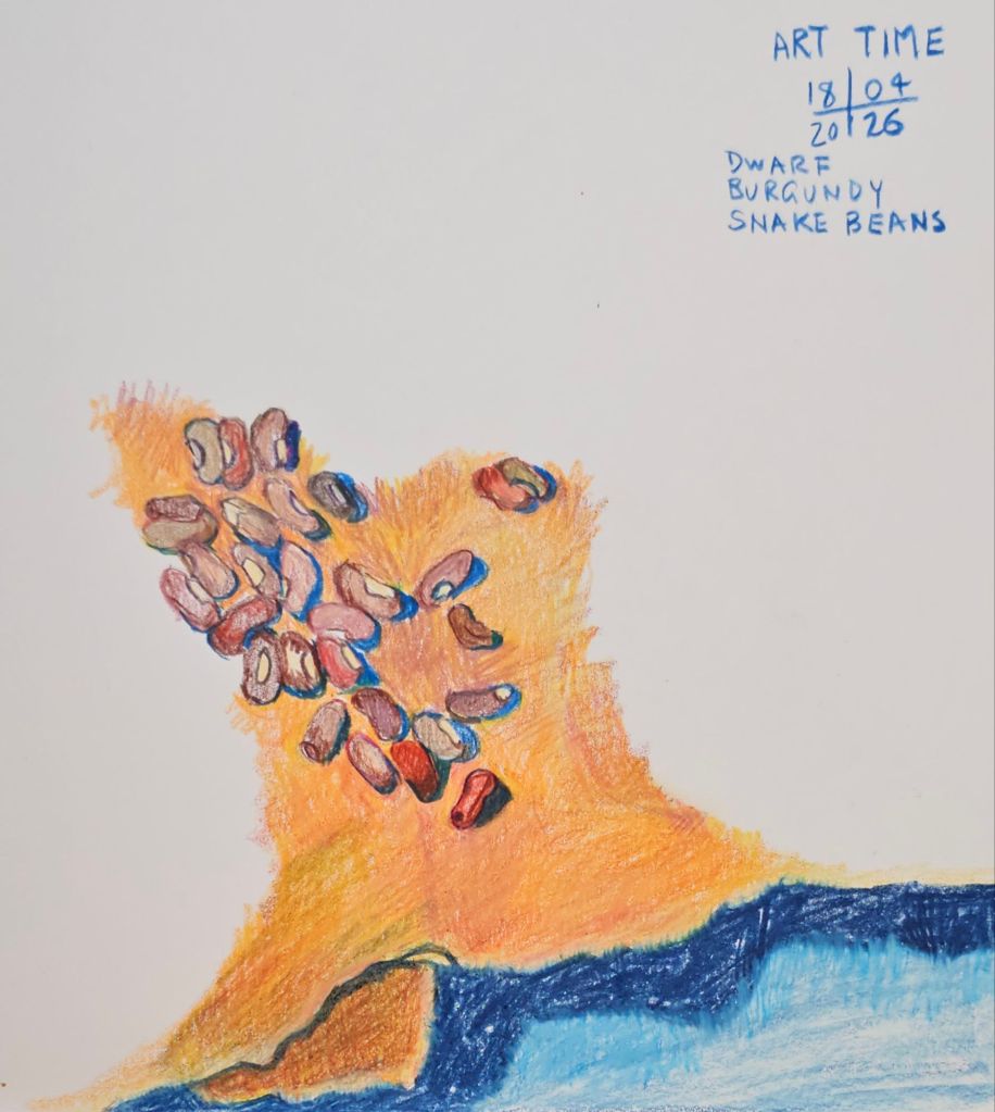
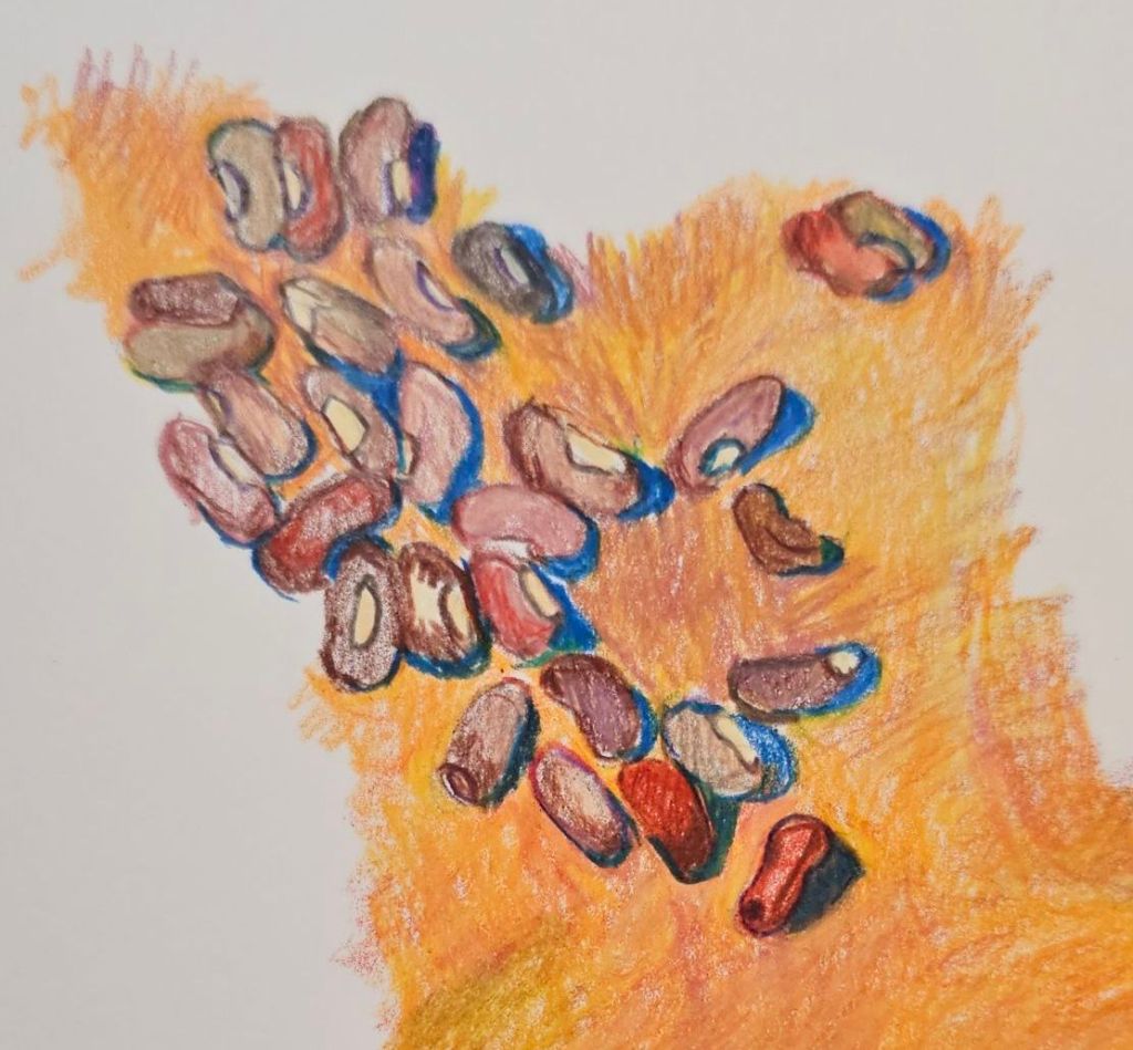
This week’s offering is of our Dwarf Burgundy Snake Beans. Alas, these few beans are the sum total of this year’s crop. They really didn’t enjoy our summer weather at all.
Coloured pencil on paperCaran d’Ache Luminance pencils
It started last year and now I’ve done two more sketches of the vegetables we grow in our garden.
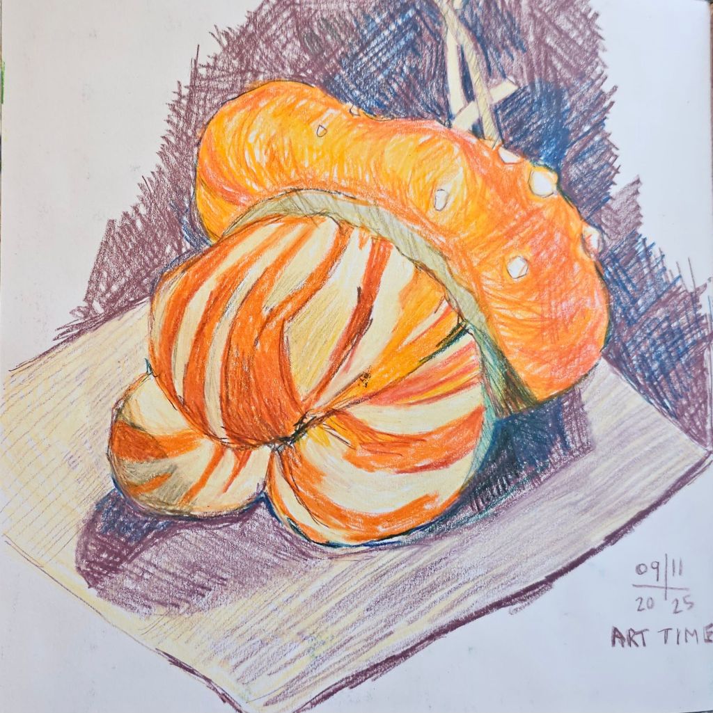
The ‘Turk’s Turban pumpkin was a ‘no brainer’, so visually appealing it just begged to be drawn. Sadly, by the time we decided to eat it, it had rotted on the inside. I did manage to save some seeds so hopefully I’ll have more subjects next year.
‘Turk’s Turban ‘ pumpkin
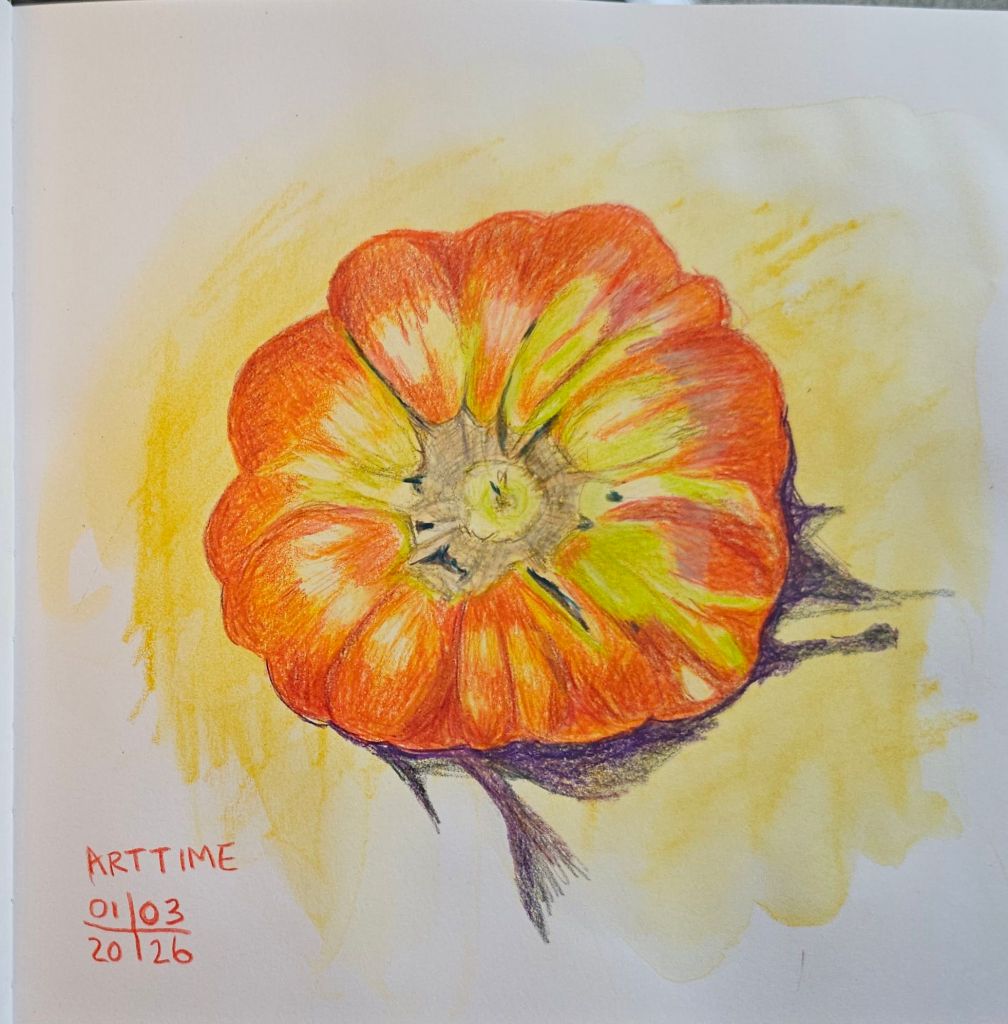
Next up was this ‘Grosse Lisse’ tomato, which weighed in at 554 grams (or 1 pound 2 ounces). It was picked still a bit green, but has subsequently ripened fully.
Tomato ‘Grosse Lisse’
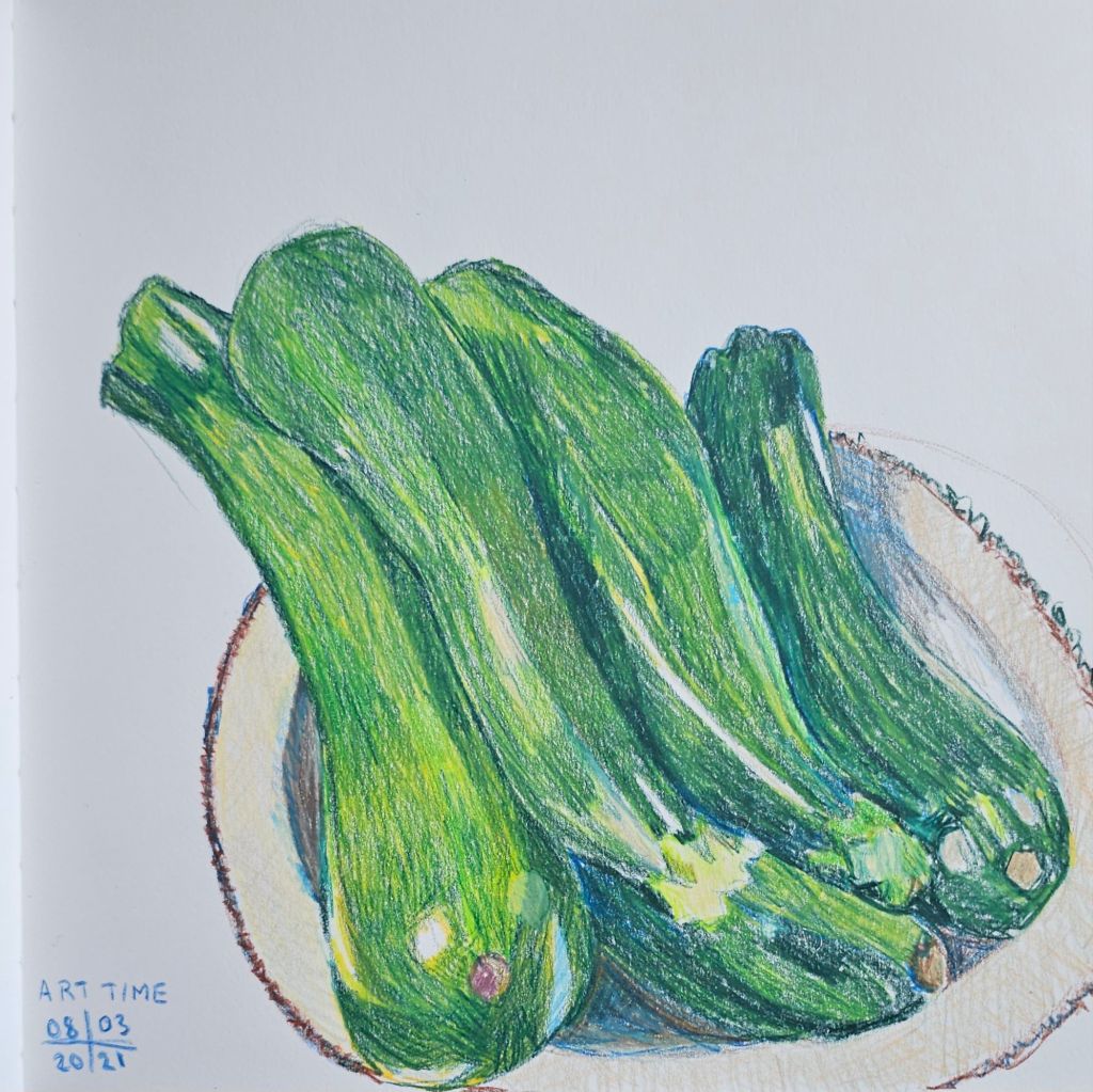
Last but not least are a small bunch of zucchinis (courgettes), some of the 150+ fruits that we have harvested so far this year.
A plateful of zucchinis
All the sketches are made using Caran d’Ache Luminance, light fast, colour pencils. My sketchbook is a Leuchtturm 1917 sketchbook, the combination of the smooth paper with the creamy pencils works particularly well.
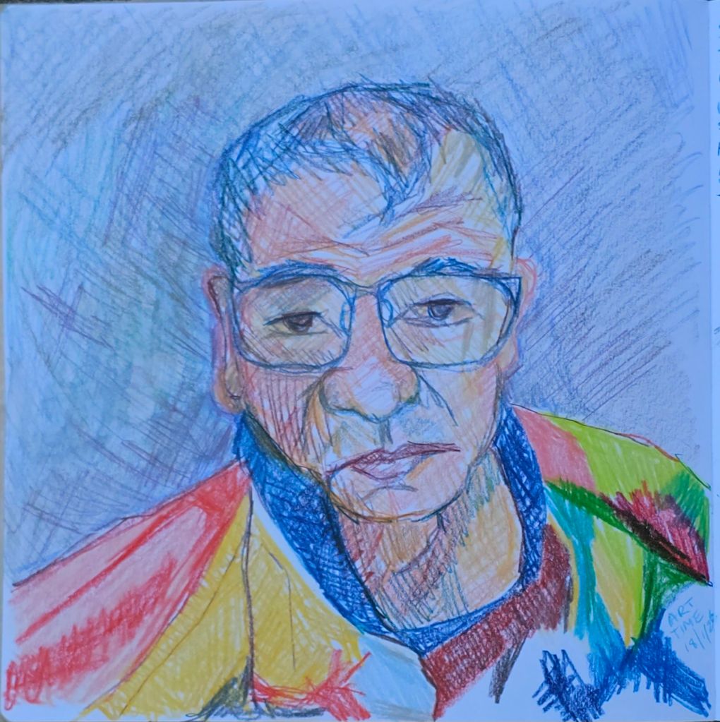
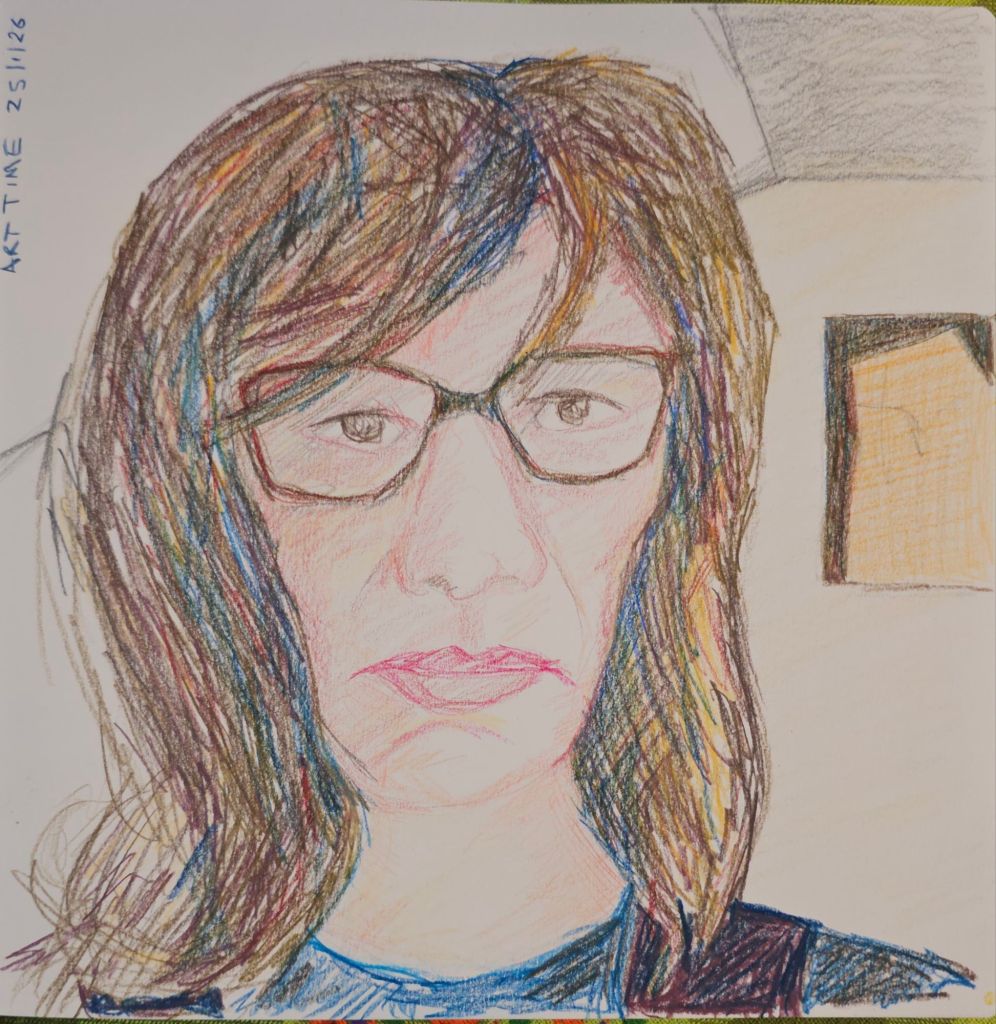
I’m really enjoying drawing portraits of my friends and my partner. I missed posting last week, so now I have two portraits to post.
Last week I did a second portrait of my partner, given that I wasn’t completely happy about the first one I made.
Steve
It’s hard to judge this portrait. It is more realistic in someway, but not the best likeness. I suppose the lesson I need to keep reinforcing is practice and keep doing it.
My second portrait of our friend has quite a few points of resemblance. She looks rather dour, but in reality it’s the downside of sketching people during a zoom meeting. Everyone is fairly intent on their screen which lends a seriousness to their face, which doesn’t necessarily reflect their personality.
I particularly enjoy using multiple colours of pencil to develop the darker tones. As we made our own selection of these pencils, we don’t have all the standard colours. This is way more interesting I think.
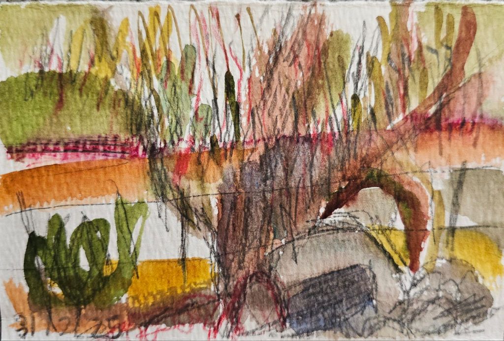
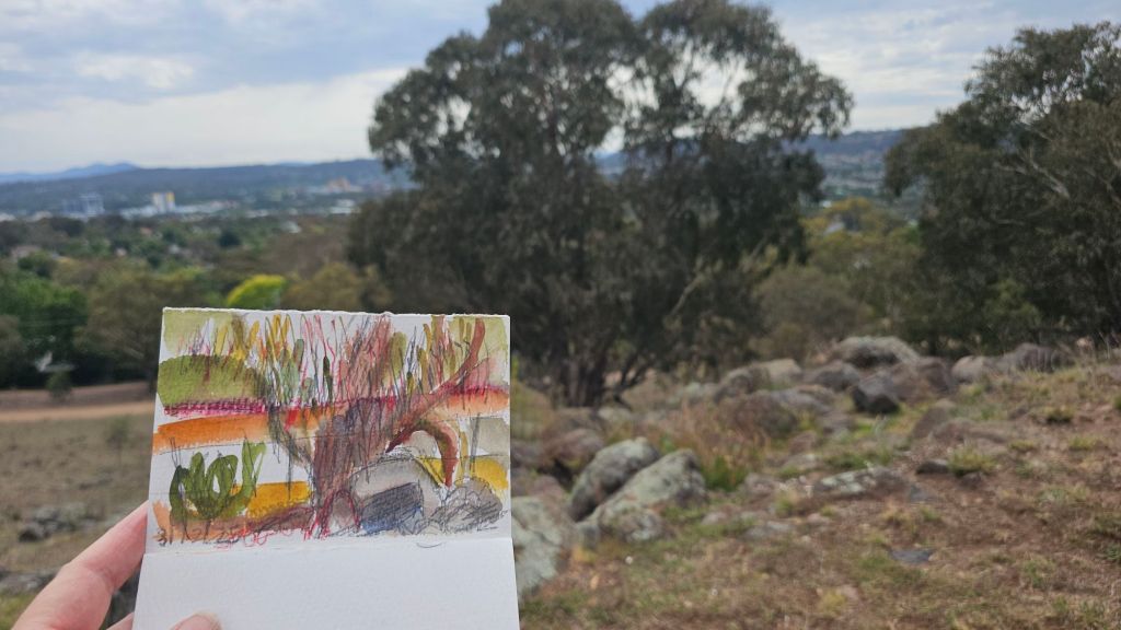
This is my last sketch of 2025 made on New Year’s eve while going for our ‘long’ walk around a nearby mountain.
I was using my regular tiny book I carry when walking and trying out an exercise from an artist I recently discovered called Orla Stevens *. The idea is to sketch for no more than 10 minutes changing the direction of your marks for each item you draw.
Tree with rocks
Now I know I haven’t nailed this yet, but I was really excited by her very loose approach to sketching. As this is one of our ‘regular’ walks I have drawn from this spot quite a few times already this year.
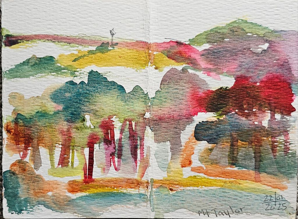
A broader view from the same location from July 2025, watercolour
I felt quite free to just go for it with this sketch. I certainly plan to do more in the future.
I’m keeping on with the exploration of tonal sketches started with my class with Olivia Marcus at the Urban Sketchers Symposium in Poznan. The more I explore, the more my own style preferences are entering the equation.
Sketching in the tiny book I carry on my walks.
One thing I have largely changed is not using black as an emphasis. Because I work predominantly in watercolour, I find the contrast between that and the black felt pen Olivia uses, can overwhelm my sketches. I’m exploring whether I can effectively substitute darker tones.
Sketching at Fyshwick Markets
I’m also testing out all different colour combinations. Some are instantly more appealing, but I don’t want to come to conclusions too soon. As I have a whole lot of new paints from our goody bags from Poznan, there’s still a lot to consider.
At Tutto in Mawson. I also added some pencil to this one to pick out more highlights.