I’m continuing on with my new approach to sketching with a flat brush, just to change things up a bit.
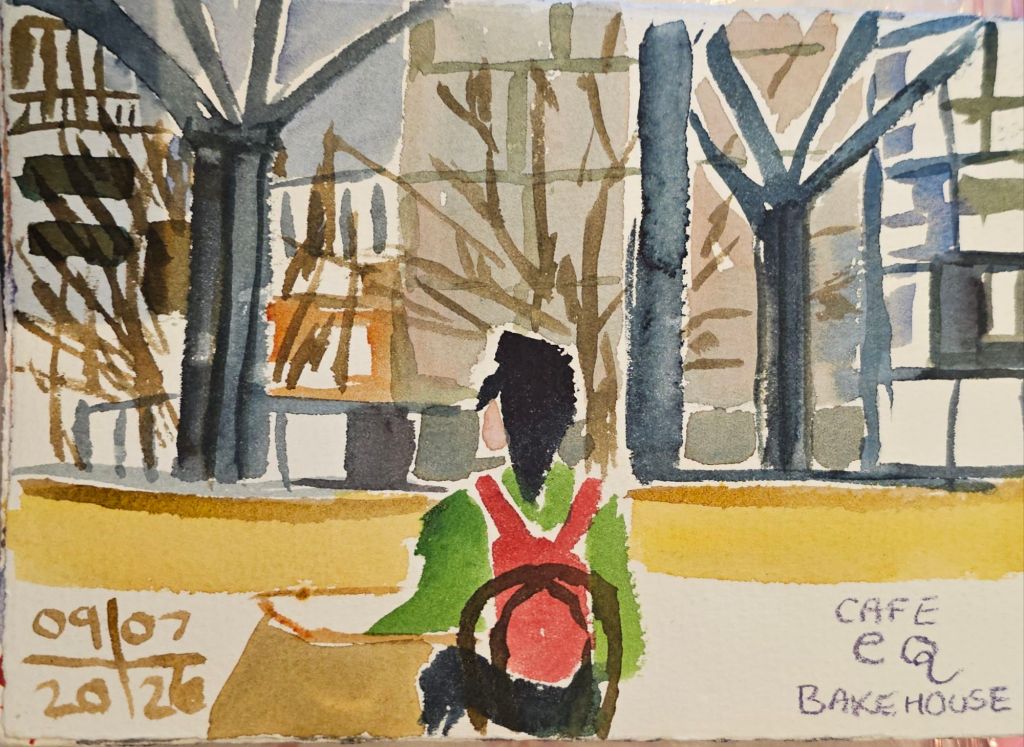
I also finally found the time to sketch from the upstairs gallery of one of our local shopping malls looking out to the view outside.
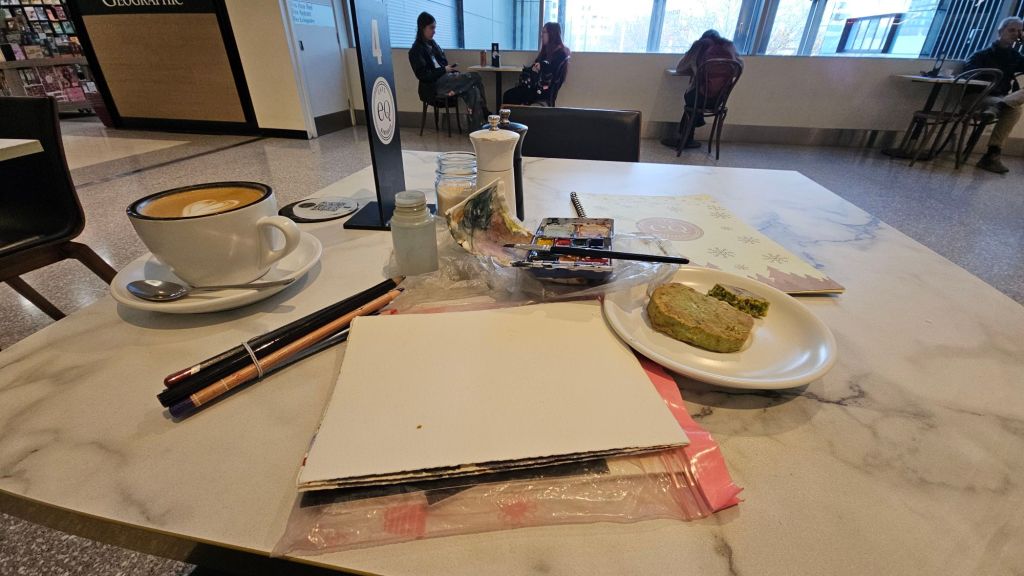
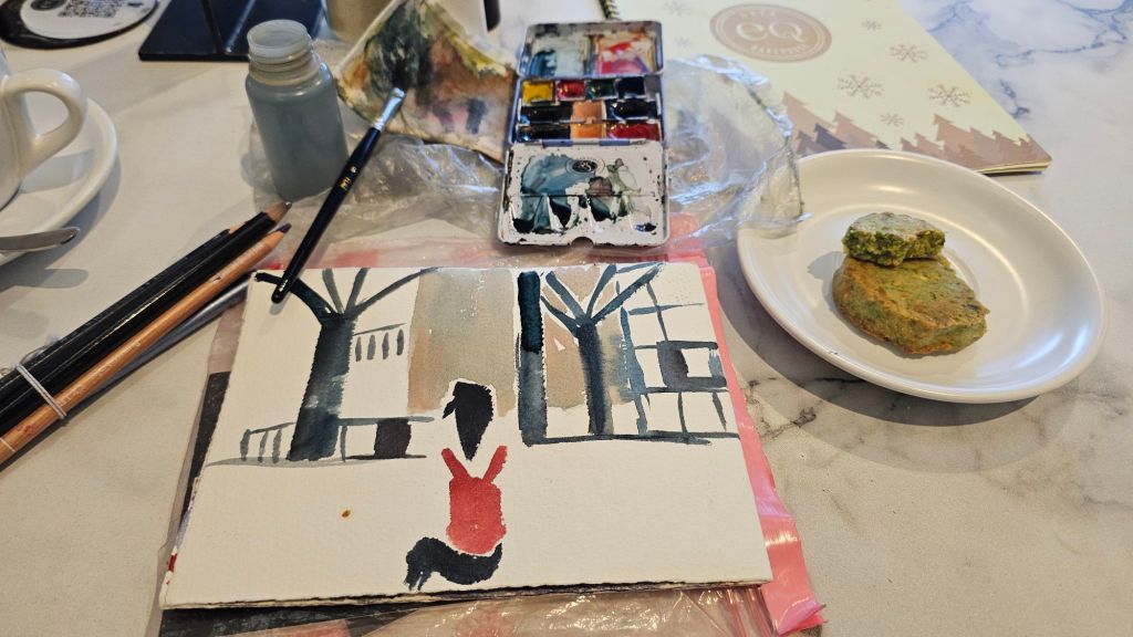
Getting set up with obligatory coffee and pistachio biscuit
I didn’t manage to snaffle one of the window tables, but sitting back from the window probably gave me a more expansive view of the structures outside the window.
First strokes, I could have stopped hereFinished sketch including background buildings
That’s all I could fit in before I had to go. Now I want to come back and do more sketching from here.
[This post was originally written on 15 September, but for some reason I forgot to post it. Oops.]
I recently went to the Urban Sketchers Symposium in Poznan, where I did a workshop with French artist Olivia Markus. She was teaching, amongst other things, an interesting approach to colouring sketches. The point of which, in part, was to reinforce a sense of depth of field in your sketch.
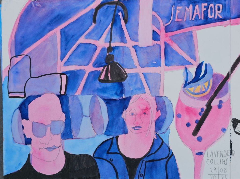
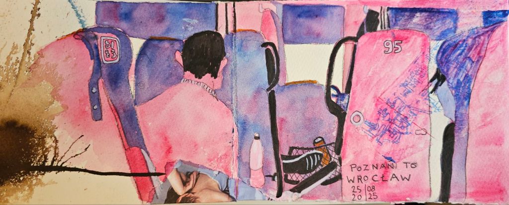
Two sketches I made at the Symposium
I think the simplified colour choices deliver exciting results. Of course, they also challenge your use of tonal contrast. So far, I’ve mainly used them for scenes with people in them. The limited colour selection imposes a unity, which is often missing from my regular sketches.
Now, I’m taking the next steps of testing out what I learned and then trying to integrate the process into my practice.
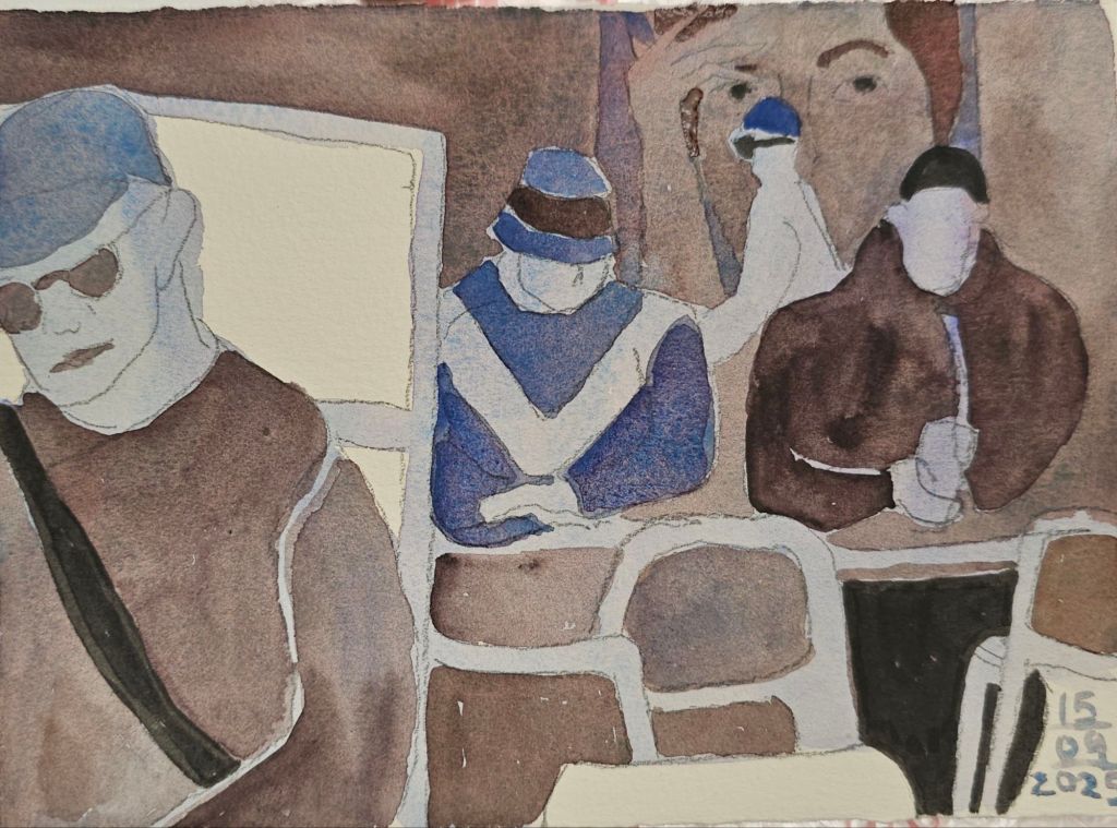
Evening moods in Wrocław On the train from Wrocław to Prague
I use watercolour as my main medium, so that does yield different results to the inks that Marcus uses. To be fair, I really haven’t tried the process with ink yet.
Demonstration in support of Palestine, London
I’m also experimenting with which colour combinations work most effectively together.
I find the stark black pen a bit strong, and it tends to overwhelm the watercolour’s subtle tones. Lately, I have been using less black, instead choosing to use a more intense pigment.
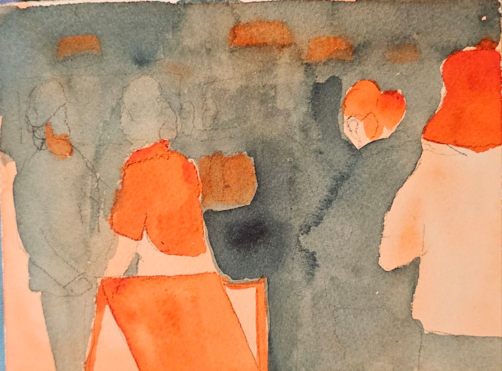
Friday, queues at the coffee shop, first version The final version with black and white marker bring added.
I’m still ‘not there’ yet in terms of the outcomes, but as today’s sketch show, there is some progress.
The one thing I’ve noticed with the new sketching technique I’ve been trying out is that it takes a long, long time fir my paint to dry. In turn, this means it takes me way longer than normal to complete a painting. Indeed, it takes me longer than I usually spend having a coffee.
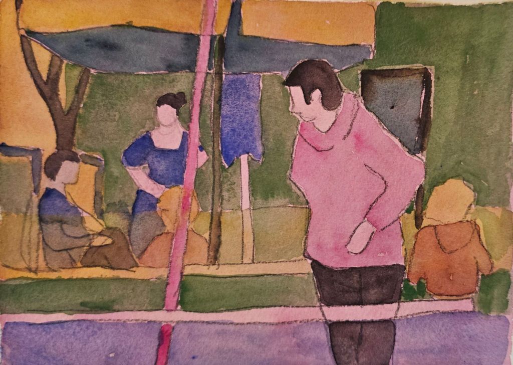
Last weekend, I got this far with my sketch, probably 15-20 minutes longer than my coffee lasted.
As I finished sketching, I realised that there were several sections that really annoyed me. However, I couldn’t be bothered to spend even more time at the cafe than I had already.
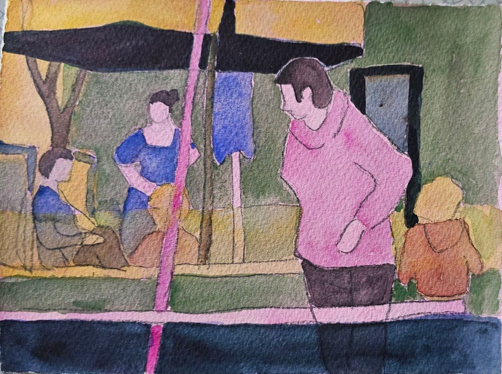
The updated version
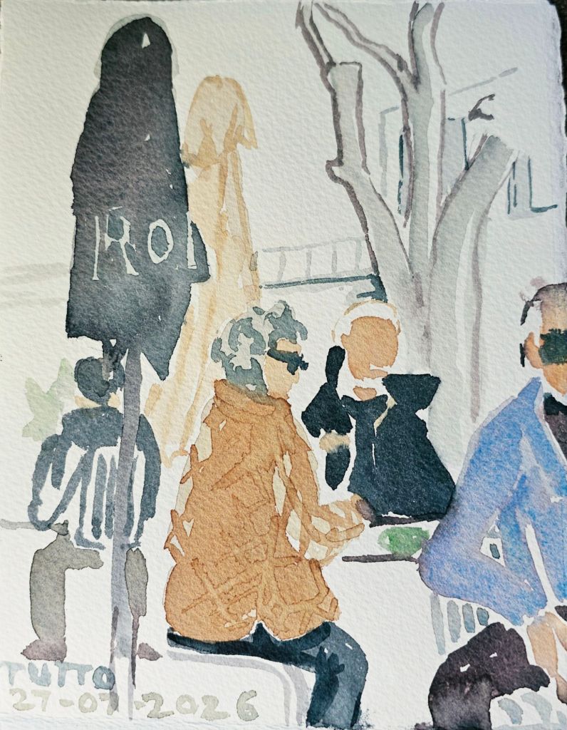
So last night I fixed the bits I wasn’t happy with. Extending the umbrella canopy to make more sense of the top left corner and adding the darker section along the bottom. “Don’t be afraid of the darks, [colours that is]”, as a sketching friend often says.
I’m happier with it, but is any artists ever truly happy with what they do?😀
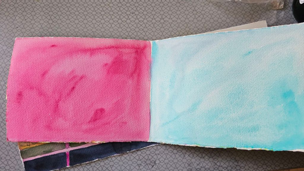
On a more practical note, I also realised that one time saver I could do was to paint a base layer of high-tone colour onto my pages before I went sketching. This should save me 10 to 15 minutes of drying time at least.
I’m keeping on with the exploration of tonal sketches started with my class with Olivia Marcus at the Urban Sketchers Symposium in Poznan. The more I explore, the more my own style preferences are entering the equation.
Sketching in the tiny book I carry on my walks.
One thing I have largely changed is not using black as an emphasis. Because I work predominantly in watercolour, I find the contrast between that and the black felt pen Olivia uses, can overwhelm my sketches. I’m exploring whether I can effectively substitute darker tones.
Sketching at Fyshwick Markets
I’m also testing out all different colour combinations. Some are instantly more appealing, but I don’t want to come to conclusions too soon. As I have a whole lot of new paints from our goody bags from Poznan, there’s still a lot to consider.
At Tutto in Mawson. I also added some pencil to this one to pick out more highlights.
I’m currently thinking about two cafe sketches that I did this week. The sketches both included obscured figures but have a very different feel to each other.
The two sketches
The looser composition of the one on the left gives a much wider view of the surrounding scene. It also reflects that I was sitting at some distance away from the people I was sketching. I always do the figures first, just in case they get up and leave – which they did before I finished the background. On reflection, I can also see that the proportion of the obscured person is not in keeping with the main figure. I think the composition would have been stronger if I had corrected this error.
My sketching set up with a small palette, travel brush and small sheets of watercolour paper.
The second sketch is much more focused, not only because the main person was sitting at the next table. Her focus was elsewhere and that big collar on her parka meant that she wasn’t noticing me sketching her. Again, the second obscured person was of interest to me. They also left shortly after I sketched them in.
One thing that I think helps make this second sketch pop are the dark shadows behind the cups. Many of us are ‘afraid of the dark’ when it comes to watercolour painting and yet, in the majority of cases, it’s just what a sketch needs to bring it to life.
I’ve also been trying to apply some advice from Singaporean sketcher Andrew Tan, who is an illustrator and comic book writer in his day job. He notes that to get a story across in a comic, you need to focus attention on the main character. You can do this by ensuring that there is a strong contrast between the focus of your attention and what surrounds it. Hence, the dark wall behind my person. There was indeed a shadowed wall behind her, but I dialled it up to help bring even more attention to her.
I think this is a much stronger composition
I regularly sketch at both these cafes. So, having these two side by side has prompted me to consider bringing a much more focused view when next I’m cafe sketching.