Warning – this is a very long post
The backstory
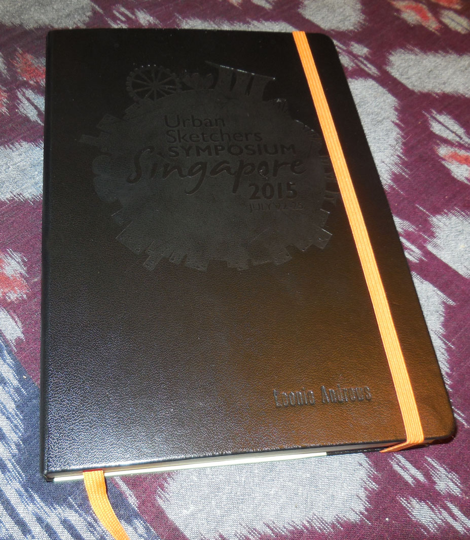
In our ‘goodies’ bag at the 2015 Urban Sketchers Singapore Symposium was a Leuchtturm 1917 + Whitelines Link ® A5 notebook. It was cool. It had the Symposium logo and our names embossed on it – wow! embossed! our own names! It had thin grey paper inside with white marks on it – yeah whatever – and it had an orange bookmark and an orange elastic band for the cover (orange is my favourite colour). Then I heard that this book had something to do with an app and a really great prize for anyone who entered some competition. I thought a big prize from Leuchtturm sounded great and all I had to do was figure out how to enter. Too easy!
Leuchtturm 1917 Whitelines Link notebook
It might of helped if I hadn’t been suffering from the lurgy that my partner caught on the plane and duly gave to me, things didn’t go smoothly. Firstly I needed to upload the Whitelines app which could upload the content of the book to any one of a number of digital platforms, none of which I used. Instagram was the easiest, I didn’t have it, but even with slow hotel wifi I managed to create an account, not to mention figure out yet another password. I was good to go. I knew that using this book required black pens …. that was about all I could remember. I even had a brilliant idea for the sketch, one based on thumbnail I’d done earlier in the day. Now I just had to stay up another half an hour or so (it was already past 11.00pm) and finish the drawing. You can see that this exercise had failure written all over it. It didn’t disappoint. I uploaded the test scribble with no problems. I did the drawing and finished – did I say half an hour – maybe three quarters of an hour later. It didn’t upload. I moved the book under the pallid overhead light it still didn’t upload. Nothing helped, nothing changed the fact that it didn’t upload. Several people tried to help the next day, but it didn’t upload. I put my book bag in my bag and pretty much forgot about it.
Present day and things have changed. I now understand how to use my book+app, it does work and it does upload. What changed? I have finally read the instructions, in the full light of a sunny day (I will explain below) not to mention understood them. I’ve also been giving the book a bit of a workout. here’s my review.
The review
The first thing I’ll say is that this product was not designed with artists in mind, so how I use it is probably not what the manufacturers envisaged, but that’s why I guess they gave it to us – to see what we could do with the technology.
The Leuchtturm 1917 + Whitelines Link is a notebook designed to let you take notes or draw diagrams, whatever on the specially prepared paper and upload it via the Whitelines Link app (available both for Apple and Android), to a variety of digital platforms. The paper is 80 gsm and the pages are pale grey, with a white box at each corner and a grid of dots or lines over the page (depending on which version you get). There are also three icons on the bottom of each page that, when ticked, allow you upload directly to email, Evernote or Dropbox. When you save a page to your device, you can share it with any number of other apps or platforms, such as Instagram or open it in programs such as Photoshop. The point about the paper in the book is that when the Whitelines Link app ‘reads’ the page it translates that grey background into a perfect white page so your notes, doodles or drawings can be saved to your smartphone or chosen platform and be easily read. The book I have has 249 pages plus some several content pages at the front of the book. The Leuchtturm 1917 + Whitelines Link is also available in an A4+ and A6 size.
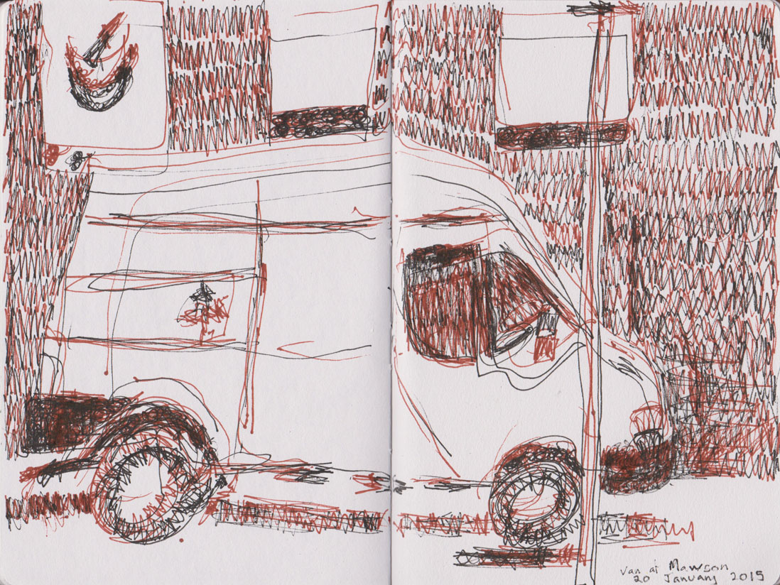
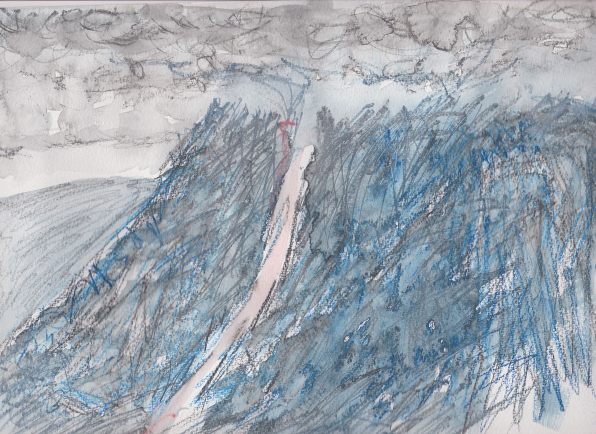
Obviously this paper works well with pen and ink, that’s what it was designed for. It will also work with brush pens and other media, but, the upload may not be great for all media. So here is a comparison between uploaded versus scanned images.

Comparison with the same drawing , scanned on the left and uploaded on the right. What hasn’t uploaded well is the watercolour wash.
So watercolour doesn’t upload well. I have successfully uploaded images with dark blue ink and also images coloured with acrylic paint-markers. Below I’ve tested several types of markers that I have in my kit.

Test with Posca paint markers
Clearly the flat colours work well, the metallic silver does not. Likewise the app didn’t pick up some of the grey Liquitex acrylic paint-markers I used, see below.
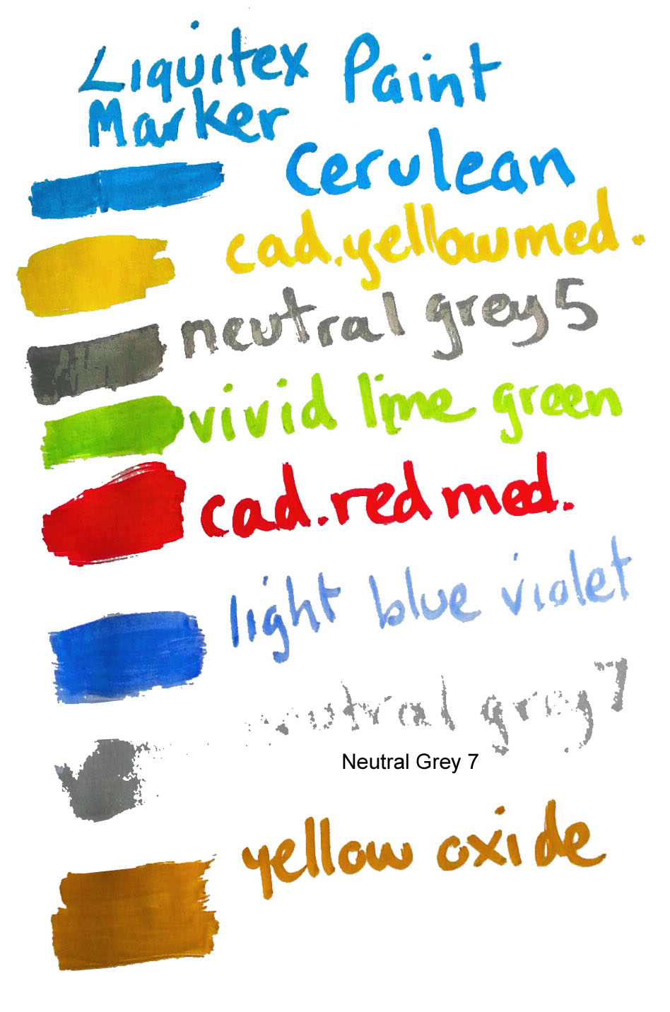
Liquitex acrylic paint marker test
A final test with my Copic Sketch markers.
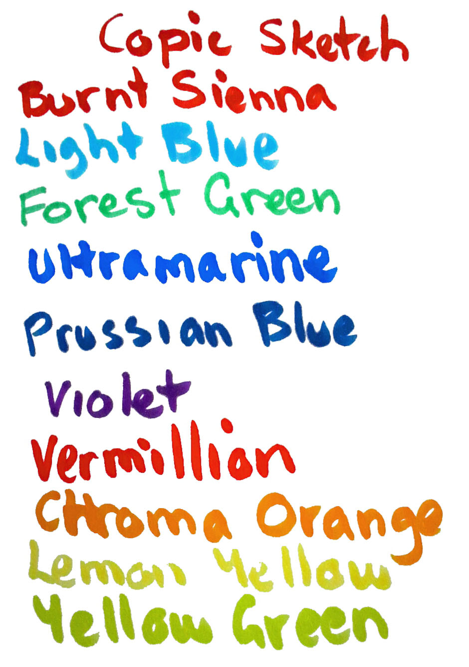
Copic Sketch marker test
Looking at these again I think the Copic Sketch markers work quite well – however because the paper is only thin the markers bleed right through the page making it impossible to use both sides as intended by the manufacturers.

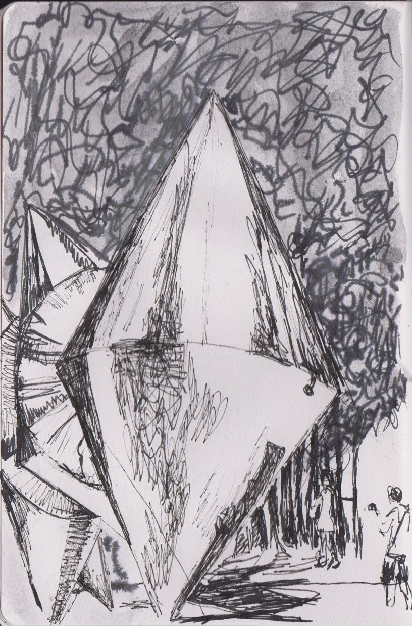
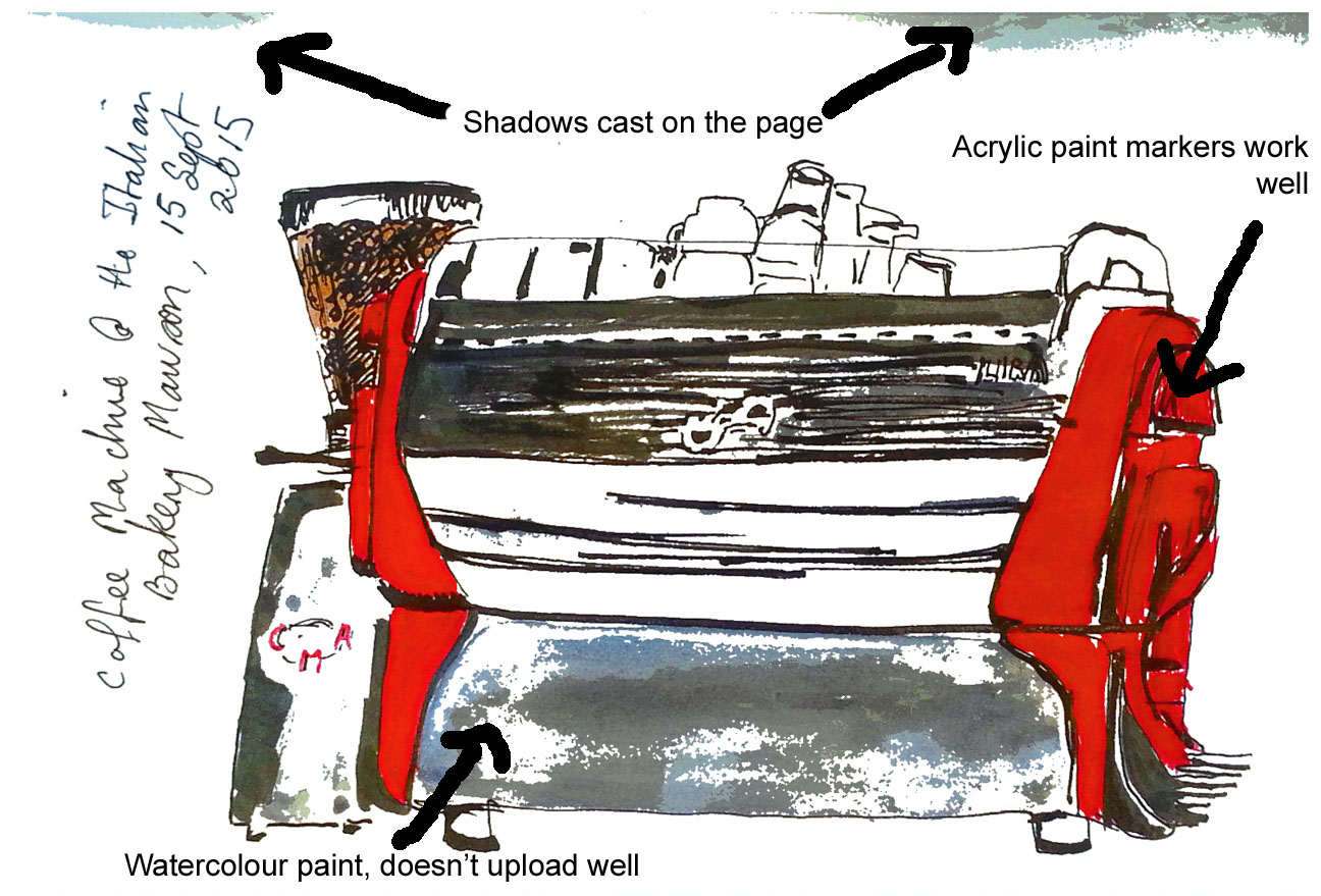
An uploaded sketch using Noodlers Black ink and Liquitex paint markers
Traps for unwary players
A quick summary of problems that I’ve encountered
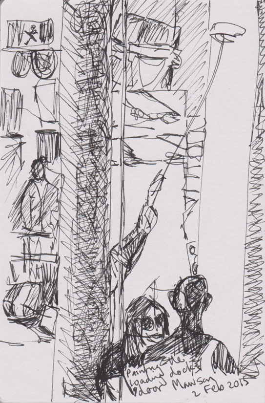
I said earlier that I had problems trying to upload my first drawing, there was a good reason for that. I had completely failed to understand that if you cover even one of the white boxes in the corner of each page then the app can’t ‘read’ the page. Remember that first drawing – being a good artist I drew right to the edge of the page, yep, right over every box. So no real surprises that the page didn’t upload.
That doesn’t detract from one of my major gripes about this book, that being so cool and ‘techie’ the makers failed to grasp that the majority of us can’t easily read white print on a pale grey page. This is fine for the actual pages, what it is not fine for is the instruction page! Thankfully I did keep the outer wrapper which I could read the instructions on.

Their instruction page on the left and the outer wrapper which did explain what was going on
Two other claims that I find less than accurate are that the thread bound book opens flat and that the pages are ink proof. I haven’t found that so far. Indeed one of the biggest issues I have with the uploading is precisely that there are shadows on the page, (see the image above), because the book doesn’t lie flat. I also haven’t found the pages to be ink proof. For the most part there is enough ‘show through’ that I have resigned myself to using one side of the page only .
Where the manufacturers could provide better guidance is to the lighting requirements for uploading. In Australia direct sunlight is so strong that it makes it impossible for the boxes to be read. Indoor lighting, if uneven, causes shadows and it’s also very easy to cast a shadow that gets recorded when using your device to upload the image.
The bottom line
I know I’ve highlighted some issues with this product and given you some of negatives but I am using the book quite often. It is the uploading feature that makes this book worth persisting with. If you are a regular social media user or you are travelling and want to carry minimal baggage then using this book in conjunction with your smartphone or tablet will save you hours of scanning or fiddling around trying to upload images to yourself or to others.
Despite the lightweight nature of the paper, this book can take a light wash of watercolour – it won’t upload well, but that won’t necessarily stop me from using that medium in a sketch. If you like using markers then you can use them quite readily, but don’t expect any subtle passages to upload, go for bold flat graphic colour instead. If you prefer to draw only with pen and black markers well then, you are the user this book is made for.
As for me? This book probably will not top my list for re-purchase, mainly because watercolour is the medium I like to work in and this book isn’t intended for that purpose. However should I become addicted to only using pen and ink then I would seriously consider buying this book.
But wait there’s more
Interested but not prepared to commit? The Whitelines Link people can give you a trial at using this paper without purchasing a whole book. You can download and print a sample page here.