Shades of grey

I’ve just finished working my way through my Strathmore Toned-Grey sketchbook, some 50 pages, most of which both back and front have been drawn on with coloured pencils. I’ve used coloured pencils since childhood, but as an adult I’m discovering these materials anew.

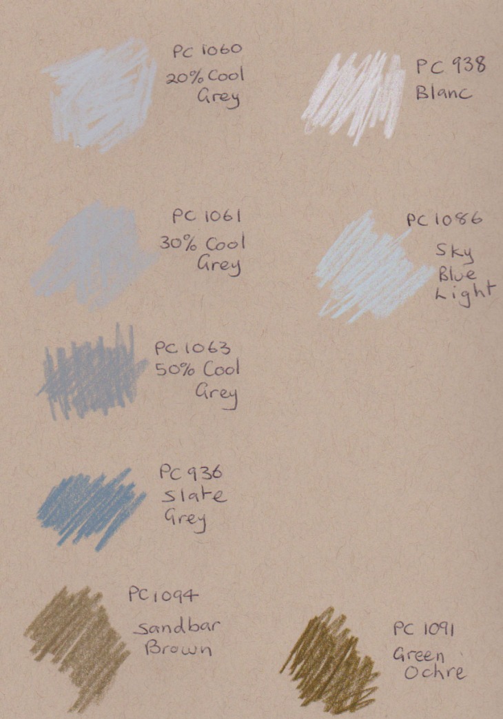
Unlike watercolours it’s hard to satisfactorily mix new colours using pencils. I wished I had a range of more subtle colours on many occasions. So my recent pencil buys have been of greys and neutrals, colours which are not strongly represented in the pencil box.

From left to right are: Green Ochre, Sandbar Brown, Slate Grey, 50% Cool Grey, 30% Cool Grey and 20% Cool Grey. On the right hand side of the pictures are the Sky Blue Light and White which I’ve been using for some time, but which fit also into this colour range.

New pencils, ohh goody!

New pencils, ohh goody!

I’ve drawn them onto Strathmore Toned Tan paper below. I had started using them in my previous sketchbook but I don’t have any spare pages to show them on the Toned Grey paper.

I already find these colours incredibly useful additions to my palette. Having now swapped to the Toned Tan sketchbook I’ll be interested to see how they go on the warmer background.

test colours on toned-tan paper, greys and neutrals

test colours on toned-tan paper, greys and neutrals

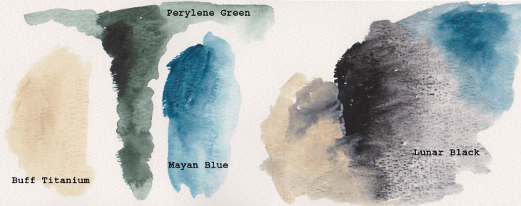
And just because I can , I’ve forced myself to buy even more watercolours that I’ve seen written about by several artists whose work inspires me. All the colours are from the Daniel Smith company.

These paints have been tried out on watercolour paper with a medium tooth. I love the granulation of the Lunar Black and I think the Buff Titanium is the sort of colour I’ve been after for some time. The Perylene green is for my partner who was after something dark for shadows in vegetation and the Mayan Blue is just because I like it.

Testing new watercolours

Testing new watercolours

Coloured Cats

In my quest to explore some possible new directions in my art I’ve been taking an online class called ‘Stretching’ with the Sketchbook Skool group (and yes they do know how to spell school). Each week a different artist shows you their work, what materials they use and encourages you to try different approaches to making art. As I am still convalescing this is a great opportunity to put aside ‘work’ for the time being and try something new.

Our cat Georgina, pen and ink and watercolour, 9 March 2016

Our cat Georgina, pen and ink and watercolour, 9 March 2016

So far I’ve really taken to a technique proposed by the ‘mobile illustrator’ Lapin, a French artist who lives in Barcelona. In his exercise he suggests that you draw a portrait where the head of the person (or in this case my cat) dominates the page and the rest of the body is squeezed into the remaining space by whatever means possible. Distortion is encouraged! One other thing, he prefers to make these drawings using a limited palette of pen and ink and three watercolours, Yellow Ochre, Prussian Blue and Alizarin Crimson. You can blend the colours or use them as they come. In this first drawing I used French Ultramarine instead of Prussian blue and I did add lemon yellow for her eyes.

I really liked the result I got so the next evening I had another go. This time I did use Prussian Blue, but I find it a bit of a thug in the watercolour palette so my preference is to stick to French Ultramarine.

Georgina, 10 march 2016, pen and ink and watercolour

Georgina, 10 march 2016, pen and ink and watercolour

This is my favourite portrait so far. It has captured the serious side of our cat. I would also emphasise that these portraits are not intended to be cariacatures, but are meant to draw the viewers attention to the face.

My final sketch did end up looking rather more comical thanI intended. I didn’t get the proportion of the head quite right so this does have a cartoonish feel about it. Of course my cat does have a lighter side anyway.

Georgina, 11 March 2016, pen and ink and watercolour

Georgina, 11 March 2016, pen and ink and watercolour

Taking the line to the landscape

Following on from my ‘two pencil’ practice in my last post, I decided to try the technique out on some nearby landscapes.  We are down at the coast for a week. At one end of the beach are some small but interesting cliffs, full of bulges and striations, layers and different colours.

image

The cliff at the northern end of Long Beach, near Bateman's Bay, NSW. Graphite, coloured pencil, gel pen and watercolour

I had so much fun working on this piece. As I was by myself I had plenty of time to fill the whole page with colour.  In trying to keep the loose approach I applied my paint with some small sticks I picked up on the sand.
I’ve done two more drawings since, but I haven’t had as much time to work on them.

image

Snapper Island from Surfside. Graphite, colour pencils, gel pen and watercolour.

The bay and nearby coast provide plenty of subjects to sketch. My most recent one is a bit further down the coast at Guerrilla Bay, one of the most popular dive and snorkeling sites around. Jimmy’s Islet protects the bay from the worst of the weather.

image

Jimmy's Islet in Guerilla Bay NSW. Watercolour, ink, graphite and coloured pencils


We’ve snorkeled here for the past two days. The variety and number of fish and the size of the various seashells makes you realise just how degraded many coastal areas are. This bay is part of a marine park so we have had some great experiences particularly spotting Banjo Sharks on both days.

My Pretty Little Art Career

This is a ‘drawing the exhibition’ post but between my title and that of Grayson Perry’s exhibition at the Museum of Contemporary Art in Sydney I thought you might lose interest before you even started.

We went to see My Pretty Little Art Career on the day it opened. This is the largest retrospective of Perry’s work which has been seen to date and it doesn’t disappoint. If Perry is unfamiliar to you then it’s probably easier to let him introduce himself. anybody can enjoy art and anybody can have a life in the arts – even me! For even I, an Essex transvestite potter, have been let in by the artworld mafia.”

Perry has a broad career spanning his initial work making ceramics and sculptural works up to his recent appearances on television where he has produced machine-woven ‘tapestries’ based on the English class system, and a series on the contemporary portrait. If you are a fan of the shows then the pieces you see on the TV are all here, as well as more recent works.
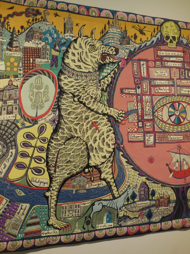
Map of truths

detail, Map of Truths and Beliefs, 2011, tapestry, 290 x 690 cm

What I really wanted to see are the pots that Perry makes. Subversive and sometimes shocking in their explicit language and images, they transcend the stereotype of a ‘decorative’ pottery and are a deliciously pointed response to people who look askance at the ‘minor’ arts. (Apologies for all the quotes, but this is a man / transvestite who likes to demolish art world stereotypes).

Precious Boys

detail, Precious Boys, glazed ceramic 53 x 53 cms

I was thrilled to see one of my all-time favourites,  Dolls at Dungerness in the room. There is also a place where you can watch a time-lapse sequence of Perry hand building and decorating a number of these pots. I liked that he had a small sign sitting next to his wheel reminding him to turn the camera on.

I was disappointed that there were no places to sit in the early rooms of Perry’s work, because I had to skip drawing those pots so artfully arranged in their individual display cases. There wasn’t enough room to move other than to circle around each cabinet to read all the details incised or printed on the pot’s surfaces.

The one place you can get a seat is in the large tapestry rooms. One of these rooms included a very large pot called What’s Not to Like, on which Perry’s teddy, Alan Measles, glazed in gold, surmounts a pot covered with a plethora of desirable consumer goods.
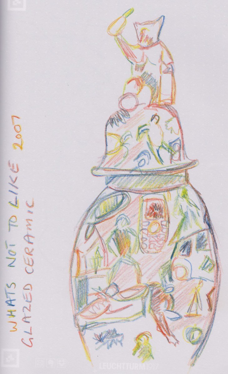
What's not

What’s Not to Like, glazed ceramic, 2007, pot 0 x 60 x 90 cms , lid 40 x 40 x 62 cms. My sketch Koh-i-noor Magic pencil on Leuchtturm 1917 Whitelines Link book

As always I really enjoy seeing an artist’s sketchbooks and process displayed. Perry’s notebooks were fascinating to look at. Here’s just one page.
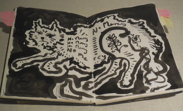
sketchbook

Sketchbook, Grayson Perry

Perry says of his sketchbooks that “Drawing in my sketchbook is an almost daily activity …. When I put an idea down I take it very seriously. I don’t waste ideas and there will come a point when I will make a work from the drawing. I have a backlog of categories of objects I want to make.” I look at my own practice and think about this statement. I have many sketchbooks and rarely re-visit them. How many of my ideas are going to waste? All guilty parties please raise their hand.

Perry’s teddy, Alan Measles and his alter-ego Claire appear in many works. I was particularly taken by these two small sculptures.

Alan Gold

Prehistoric Gold Pubic Alan Dogu, 2007, glazed ceramic, two parts; left 12.5 x 10.5 x 5.5 cm and; right 12.8 x 10 x4 .8 cm

And just because I can here is the X-92 that Claire has been photographed with.
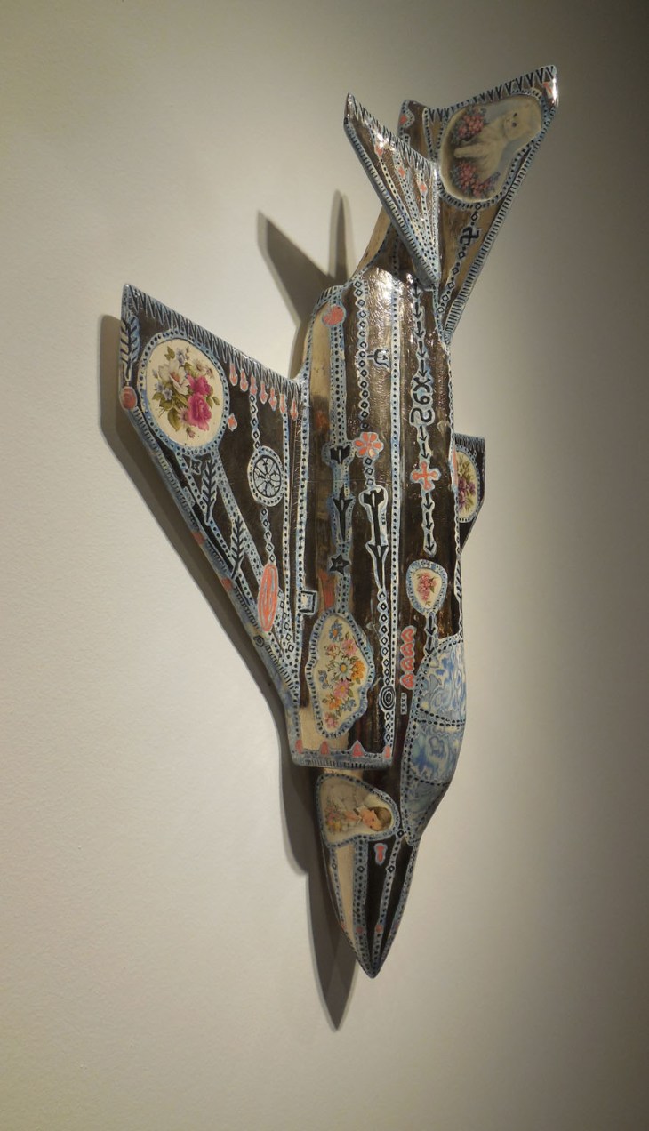
X92

X-92, glazed ceramic, 1999, 84 x 58 x 18 cms

This exhibition is highly recommended as is the accompanying catalog . (Rest assured I’ve given up rote buying of exhibition catalogs).

If you would like to read some other views of the exhibition I can recommend Paint Later’s post. If you want to read some more you can read Jacky Klein’s 2009 monograph Grayson Perry, (Thames and Hudson).

An imagination of Nasturtiums

Some weeks back I was chatting with Drawing Connections about nasturtiums. We were talking about memories of seeing these plants in the Himalayas. I have since pulled out my photos that I took of the nasturtiums twining up wires at the Kumbun in Gyantse, in Tibet.

Nasturtiums in Gyantse

Nasturtiums in Gyantse

Now I haven’t quite got around to making a painting of that scene, but I did get inspired to drag out my Japanese paints, which sit in their box from year to year – too good to use, you know – and make this picture of nasturtiums, using all the colours in my paint box.

Spoiler alert, nasturtiums don’t naturally occur in all these colours.

Nasturtiums, Japanese watercolour paints

Nasturtiums, Japanese watercolour paints