Perspective Practice

This is the first in a short series that comes from tidying up my blog. I have found several draft posts that never made the light of day. So here they come.

Following on from the class with Stephanie Bowers, an architectural illustrator and urban sketcher, on getting a handle on perspective, I thought I’d better get some practice in. These are some of the sketches I’ve done over the past few days.

29mar2017

Thank heavens for narrow alleys

While they are not necessarily the most exciting of locations, our local shopping precinct has enough lanes and intersections to make finding a subject easy.

5Apr2017b

The bus stop provided convenient seating, as well as subject matter

Stephanie also taught us watercolour techniques, to add to our perspective drawings. I love the opportunity to pick up tips from other artists, such as a good way of getting an even darker grey by mixing Ultramarine Blue and Burnt Sienna, with the tiniest touch of Alizarin Crimson. Stephanie also demonstrated using square brushes, something I haven’t done before with watercolour.

Urban Sketches – Granada

Here is another sketch from the backlog of my recent travel.

We were staying in the older part of Granada and it turned out that we had some interesting views from our apartment. On our first full day in the city I started working on a sketch of the church of San Andreas, built between 1528-42. It was great to be able to open our balcony doors and sit in the cool morning air drawing while hundreds of swifts darted around demolishing hoards of insects in the morning sky. It ended up taking three days to complete this piece. I was trying to make it reasonably accurate so having drawn it one day I had to erase it and start again on the second day and then finish the drawing and paint it on day three.

The bell tower of San Andreas Church, in the Albacin area of Granada. Pencil and watercolour

This building is considered to be a fine example of the Mudéjar style of architecture, which was heavily influenced by the Moorish styles in the years following the ‘reconquista’ when the Catholic Monarchs, Isabella and Ferdinand regained Spain for their Christian kingdom.

You can see from the photo the foreshortening in my sketch as I was looking up from underneath the bell tower.

After Porto

This post was originally written in August of 2018, shortly after I had returned from three months of travel in Europe (France, Spain and Portugal). I have no idea why I didn’t post it at the time, however I am interested to see how I wrote about aspects of watercolour painting, that are now part of my regular ‘style’. I have also included my latest cafe sketch at the end to show what I am doing now. Enjoy!

Reading the social media sites, post the Urban Sketchers Symposium held at the end of July 2018 in Porto, I was intrigued to see the number of people,who are reviewing their sketching practices. They have been inspired by the various styles and techniques of other people that they met at the event.

I too have found the approach of a number of other artists has made me re-consider my use of watercolour.

In May 2018 I briefly met Marion Rivolier at a USk (Urban Sketchers) Paris event at the Rodin Museum, (I can even be seen lurking in the photo taken of the event). Subsequently I have been inspired by her loose expressive watercolours. I went to her painting demonstration at the Porto Symposium to see if I could better understand how she was achieving her results. Marion’s advice included both the practical and the personal:

  • ‘know your colours so you can sketch fast’ – obvious in one way, but by using a limited number of colours and knowing in advance how they mix, you will speed up your process.
  • ‘You don’t have to draw everything you see – select like a stage director’
  • ‘[pencil] drawing at the beginning is like creating a prison for colour’. (Not in a good way).

Marion is especially good at capturing people and movement, so that will be an extra challenge for me.

People practice, sketching figures from photos in the weekend newspapers

Another teacher at the Symposium who was gaining a lot of attention was Maru Godas, with her ‘gouache like a child’ workshop. Maru’s advice to simplify and compress, rather than allowing yourself to be lost in detail. This is something I often need reminding about.

I fully appreciate that both these artist’s style has developed over year’s of practice. So, like I am always saying to new sketchers, you need to get “the brush-miles in” to get the result. I have taken out my bigger brushes to work with (makes painting fiddly detail difficult) and I’m on my way with lots of practice.

View into the front garden, with the Ibis sculpture ‘Gordon’ (found at a secondhand shop)

People drinking coffee.

Sketching the scene at the coffee shop.

My latest cafe sketch from June 2021 is here.

Friends chatting over coffee in the winter sunlight. Watercolour, 11 June 2021

Drawing in the gallery – The Prado, Madrid

The undoubted highlight of our trip to France and Spain (Portugal still to come), is the thrill of seeing up close and personal, works of art that I have previously only seen in books or online. The Prado is definitely in the ‘big hitter’ league, even if you only consider, Velasquez, El Greco or Goya individually and don’t include all the other amazing works of art between it’s walls.

In person I could see that El Greco really went for strongly clashing colours in his works; and that Goya borrowed the same poses in his paintings of the Spanish Royal family as Velasquez used for portraits of the Hapsburgs back in his day.

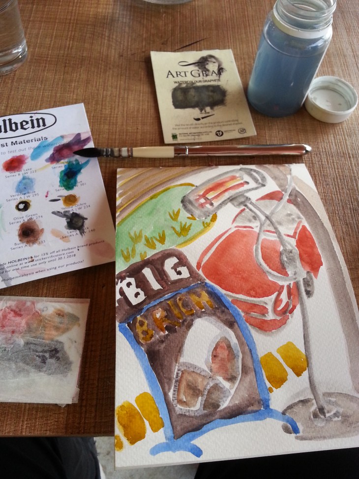
I completed all these sketches in the Prado, but I later added some watercolor to highlight certain elements of the paintings.

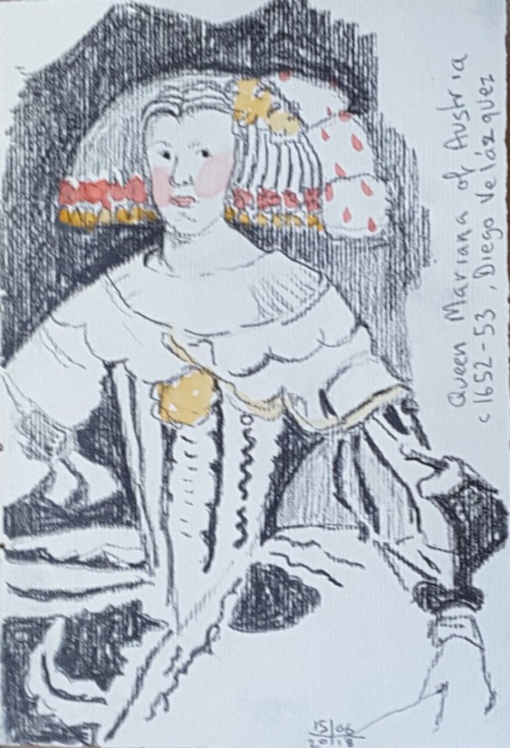
In his portrait of Queen Mariana of Austria, Velasquez lines up her very prominent pink cheeks with the red ribbons in her hair and the plume at the side of her wig. The Queen’s gown is a study of black and grey. The painting on the whole has a very restricted palette which results in emphasising the highly formal nature of this work.

After Velasquez, Queen Mariana of Austria, c 1652-1653, graphite

The Infanta Margarita of Austria, here painted by Jaun Bautista Martinez del Mazo, is the same little girl that Velasquez painted in his most famous painting Las Meninas, which hangs only a few metres away from this portrait. Del Mazo’s portrait was painted several years after the Valasquez portrait when the Infanta was betrothed to the Emperor Leopold of Austria (who she married in 1666). Del Mazo was Velasquez’s son-in-law and was appointed court painter after Velasquez death.

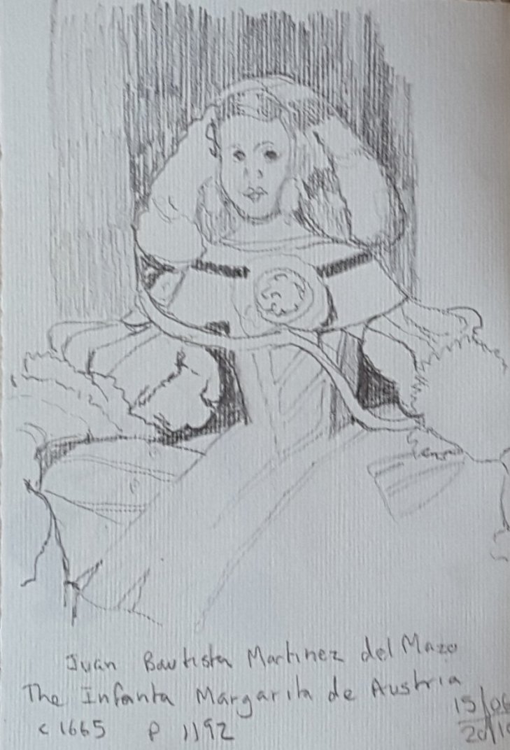
After Jaun Bautista Martinez del Mazo, the Infanta Margarita of Austria, c 1665, graphite

In his portrait del Mazo also uses the colour red to great effect. The background is treated with a range of warm-hued browns and reds and the result is far more tender than the portrait of her mother, Queen Mariana.

After del Mazo, The Infanta Margarita of Austria, graphite and watercolour, added later

The other sketch I drew was one of Goya’s ‘black’ paintings. These were originally painted on the walls of his house and later transferred onto a backing so they could be hung. These are strange and disturbing works. Their meanings have been the subject of some pretty varied interpretations over the years since they were made public.

The sketch I made is of a painting called Atropos, or the Fates (I assume that the titles were post-Goya as he didn’t intend for thees works to be public). Four dark figures float above the yellow-toned landscape, appearing to hold scissors and other attributes of the mythological Fates who were thought to control human destiny.

After Francisco Goya, Atropos, or The Fates, detail, pencil on Fabriano paper

I found this a compelling work, the sort you can’t quite look away from, but wish you could. The floating figures were quite convincing which is rather a contradiction as they are also malevolently manifest and solid. Many of the other works in this series really creeped me out. If I have to spend a night at the museum I bags NOT staying in this room.

More ‘colour cows’ join the herd

There’s not much that I like better than buying art supplies. Visiting another country, in my experience, is an excellent excuse to explore new brands and our new friends at USk Paris were most helpful in directing us to local art suppliers.

Here are the latest colours, mainly from Schmincke and Sennelier. I also have a new brush, whose name is Leonard no. 3, made by Gerstaecker (a brand I am unfamiliar with).

Down the bottom of the page are some Herbin inks that I also got in Paris at Galleries Lafayette. They come in 10 ml as well as 30ml bottles, all the better to encourage you to buy multiple bottles (see, it works). The most disappointing thing is that these inks are not waterproof. That hasn’t stopped me from using them, but I would be using them a lot more if I could be sure they wouldn’t run.

New colour cows: top row – Idanthrone blue (WN), Cobalt green turquoise (Schk), Delft blue (Schk); middle row – Payne’s grey (Schk), Potters pink (Schk), Light grey (Sen), Brown Green (Sen)

The other day I took Leonard no.3 out painting. He was a very good brush indeed. He holds lots of water and also has a good fine tip. This was the brush I used for the painting/ collage below, on the Canal St Martin.

The lock at Parc Eugene Varlin, Canal St Martin. Watercolour, pencil and collage.

Today I filled my favourite Sailor Fude nib pen with the Herbin Orange Indien and used it in my sketch of the Tropical Glasshouse at the Jardin des Plantes. When used in conjunction with watercolour you can get away without seeing too much ink bleeding.

Inside the Tropical House at the Jardins des Plantes, Paris