After Porto

This post was originally written in August of 2018, shortly after I had returned from three months of travel in Europe (France, Spain and Portugal). I have no idea why I didn’t post it at the time, however I am interested to see how I wrote about aspects of watercolour painting, that are now part of my regular ‘style’. I have also included my latest cafe sketch at the end to show what I am doing now. Enjoy!

Reading the social media sites, post the Urban Sketchers Symposium held at the end of July 2018 in Porto, I was intrigued to see the number of people,who are reviewing their sketching practices. They have been inspired by the various styles and techniques of other people that they met at the event.

I too have found the approach of a number of other artists has made me re-consider my use of watercolour.

In May 2018 I briefly met Marion Rivolier at a USk (Urban Sketchers) Paris event at the Rodin Museum, (I can even be seen lurking in the photo taken of the event). Subsequently I have been inspired by her loose expressive watercolours. I went to her painting demonstration at the Porto Symposium to see if I could better understand how she was achieving her results. Marion’s advice included both the practical and the personal:

  • ‘know your colours so you can sketch fast’ – obvious in one way, but by using a limited number of colours and knowing in advance how they mix, you will speed up your process.
  • ‘You don’t have to draw everything you see – select like a stage director’
  • ‘[pencil] drawing at the beginning is like creating a prison for colour’. (Not in a good way).

Marion is especially good at capturing people and movement, so that will be an extra challenge for me.

People practice, sketching figures from photos in the weekend newspapers

Another teacher at the Symposium who was gaining a lot of attention was Maru Godas, with her ‘gouache like a child’ workshop. Maru’s advice to simplify and compress, rather than allowing yourself to be lost in detail. This is something I often need reminding about.

I fully appreciate that both these artist’s style has developed over year’s of practice. So, like I am always saying to new sketchers, you need to get “the brush-miles in” to get the result. I have taken out my bigger brushes to work with (makes painting fiddly detail difficult) and I’m on my way with lots of practice.

View into the front garden, with the Ibis sculpture ‘Gordon’ (found at a secondhand shop)

People drinking coffee.
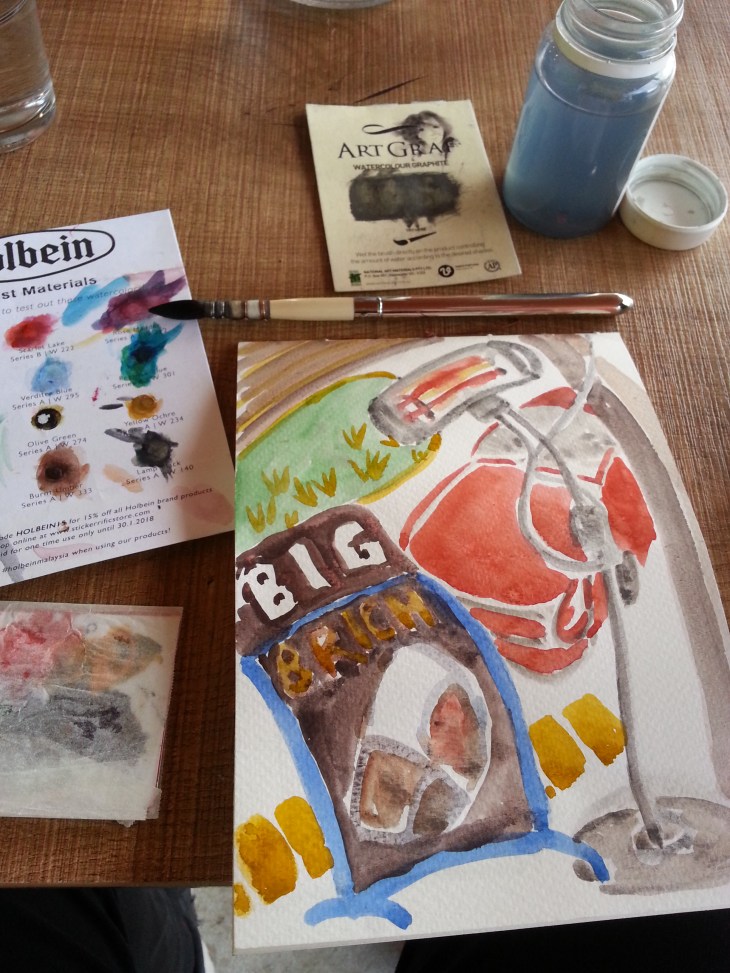
Sketching the scene at the coffee shop.

My latest cafe sketch from June 2021 is here.

Friends chatting over coffee in the winter sunlight. Watercolour, 11 June 2021

Drawing in the gallery – The Prado, Madrid

The undoubted highlight of our trip to France and Spain (Portugal still to come), is the thrill of seeing up close and personal, works of art that I have previously only seen in books or online. The Prado is definitely in the ‘big hitter’ league, even if you only consider, Velasquez, El Greco or Goya individually and don’t include all the other amazing works of art between it’s walls.

In person I could see that El Greco really went for strongly clashing colours in his works; and that Goya borrowed the same poses in his paintings of the Spanish Royal family as Velasquez used for portraits of the Hapsburgs back in his day.

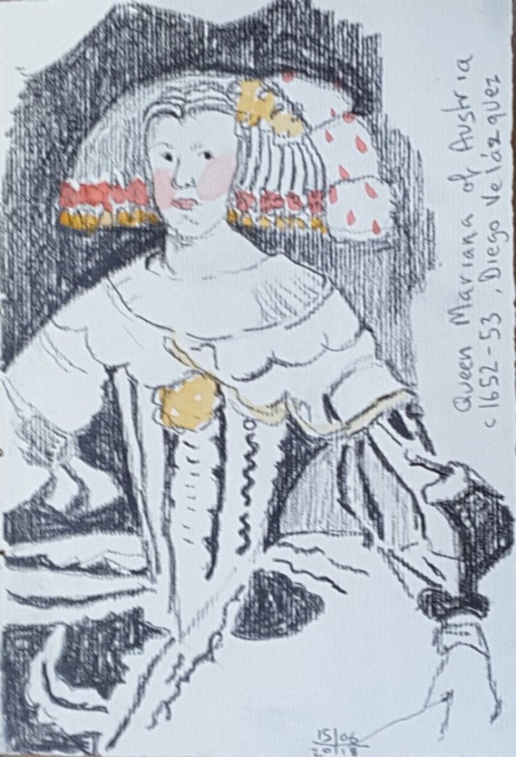
I completed all these sketches in the Prado, but I later added some watercolor to highlight certain elements of the paintings.

In his portrait of Queen Mariana of Austria, Velasquez lines up her very prominent pink cheeks with the red ribbons in her hair and the plume at the side of her wig. The Queen’s gown is a study of black and grey. The painting on the whole has a very restricted palette which results in emphasising the highly formal nature of this work.

After Velasquez, Queen Mariana of Austria, c 1652-1653, graphite

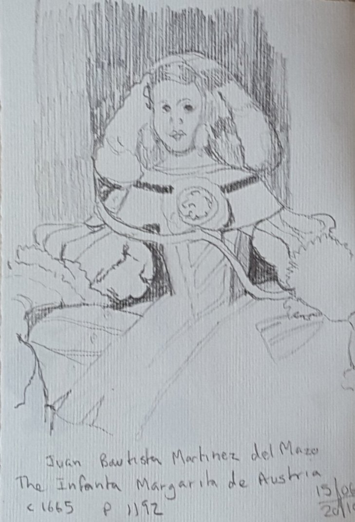
The Infanta Margarita of Austria, here painted by Jaun Bautista Martinez del Mazo, is the same little girl that Velasquez painted in his most famous painting Las Meninas, which hangs only a few metres away from this portrait. Del Mazo’s portrait was painted several years after the Valasquez portrait when the Infanta was betrothed to the Emperor Leopold of Austria (who she married in 1666). Del Mazo was Velasquez’s son-in-law and was appointed court painter after Velasquez death.

After Jaun Bautista Martinez del Mazo, the Infanta Margarita of Austria, c 1665, graphite

In his portrait del Mazo also uses the colour red to great effect. The background is treated with a range of warm-hued browns and reds and the result is far more tender than the portrait of her mother, Queen Mariana.

After del Mazo, The Infanta Margarita of Austria, graphite and watercolour, added later

The other sketch I drew was one of Goya’s ‘black’ paintings. These were originally painted on the walls of his house and later transferred onto a backing so they could be hung. These are strange and disturbing works. Their meanings have been the subject of some pretty varied interpretations over the years since they were made public.

The sketch I made is of a painting called Atropos, or the Fates (I assume that the titles were post-Goya as he didn’t intend for thees works to be public). Four dark figures float above the yellow-toned landscape, appearing to hold scissors and other attributes of the mythological Fates who were thought to control human destiny.

After Francisco Goya, Atropos, or The Fates, detail, pencil on Fabriano paper

I found this a compelling work, the sort you can’t quite look away from, but wish you could. The floating figures were quite convincing which is rather a contradiction as they are also malevolently manifest and solid. Many of the other works in this series really creeped me out. If I have to spend a night at the museum I bags NOT staying in this room.

More ‘colour cows’ join the herd

There’s not much that I like better than buying art supplies. Visiting another country, in my experience, is an excellent excuse to explore new brands and our new friends at USk Paris were most helpful in directing us to local art suppliers.

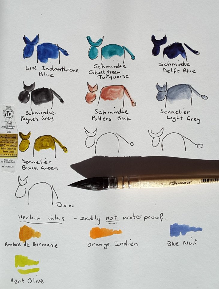
Here are the latest colours, mainly from Schmincke and Sennelier. I also have a new brush, whose name is Leonard no. 3, made by Gerstaecker (a brand I am unfamiliar with).

Down the bottom of the page are some Herbin inks that I also got in Paris at Galleries Lafayette. They come in 10 ml as well as 30ml bottles, all the better to encourage you to buy multiple bottles (see, it works). The most disappointing thing is that these inks are not waterproof. That hasn’t stopped me from using them, but I would be using them a lot more if I could be sure they wouldn’t run.

New colour cows: top row – Idanthrone blue (WN), Cobalt green turquoise (Schk), Delft blue (Schk); middle row – Payne’s grey (Schk), Potters pink (Schk), Light grey (Sen), Brown Green (Sen)

The other day I took Leonard no.3 out painting. He was a very good brush indeed. He holds lots of water and also has a good fine tip. This was the brush I used for the painting/ collage below, on the Canal St Martin.

The lock at Parc Eugene Varlin, Canal St Martin. Watercolour, pencil and collage.

Today I filled my favourite Sailor Fude nib pen with the Herbin Orange Indien and used it in my sketch of the Tropical Glasshouse at the Jardin des Plantes. When used in conjunction with watercolour you can get away without seeing too much ink bleeding.

Inside the Tropical House at the Jardins des Plantes, Paris

Urban Sketchers Paris

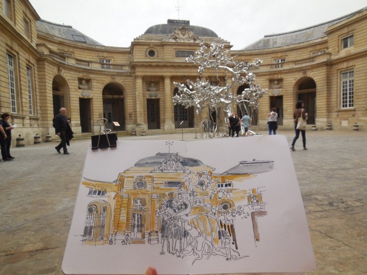
I went out sketching with Urban Sketchers Paris last weekend. We started off at La Monnaie (The Paris Mint). By complete coincidence I had the great pleasure of catching up with friends from USk Singapore and USk Kuala Lumpur who were also visiting Paris. Urban sketching certainly brings the world together!

Inside the mint there were a plethora of things to draw. An exhibition by artist-in-residence Subhota Gupta inspired many. I was struck by the contrast between his glittering and complex sculpture ‘Family Tree’ that was set in the main courtyard of La Monnaie and the 18th century building facade behind it. It was an extremely challenging subject to tackle, but I was pretty pleased with the outcome, (although I subsequently noticed that my building was a bit lop sided).

Family Tree, in the main courtyard of La Monnaie, Paris

After a picnic lunch by the Seine we walked down to the Marais to visit the Foundation Lafayette. En route our host for the day, Xavier, showed us the workshop where architect Renzo Piano has his architectural models made.

Unfortunately a gallery changeover at the Foundation meant that we couldn’t draw where we had planned. Instead we opted for a coffee break and the challenge of sketching each other.

My sheet of sketches of fellow sketchers

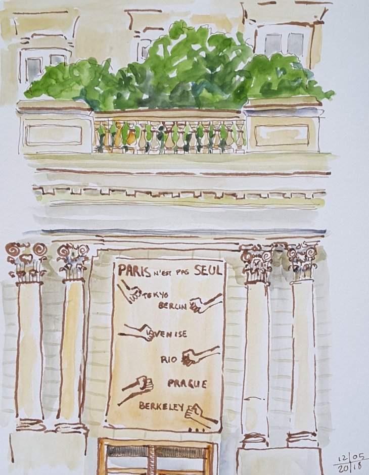
Some of us then walked to the nearby National Archives, but our plans to draw in their lovely gardens were drenched by rain. My final sketch of the day was made while sitting under the colonades of the building, looking across to the blown-up (only in size), version of some classic posters, currently lining the inner walls of the building.

Thanks to Xavier for organising and the other sketchers who made it such a great day.

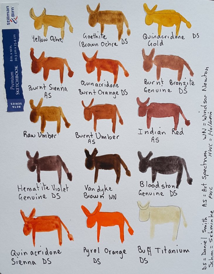
How now brown cows?

(Serious amounts of watercolour obsessing follows, you were warned).

The desperate need to clean up and refill my palette has lead me to look at my current watercolour paint sets. Just to be clear, all my paint ‘sets’ now consist of my own choice of colours in half pans, in tins I have found or purchased. Some of my half pans are all used up, while others sit full and untouched. So I grabbed my newest sketcbook, a Stillman & Birn Beta series (270 gsm) and as many tubes of paint as I could find and got to work.

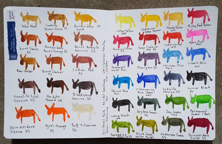
I don’t know about you, but I get so envious bored of all those sketcbooks that are artfully decorated with renderings of the artist’s working palette on their opening page. Give a girl a break! I give to you the ‘art cow’, a far more entertaining way of getting a sketchbook underway, without the need to resort to ‘serious-ity’. This approach also immediately renders concerns about not ‘ruining’ your sketchbook irrelevant.

On sorting out my paints I asked myself (rhetorically, of course), can you have too many browns/ earth tones in your palette. The answer is, of course not! I have some 15 colours in my palette that fall roughly into that category!

How now brown cows?

What about the rest of my paints I hear you wonder? In comparison they are fairly ordinary, although there are the odd outliers.

Most of the rest of the colours

I have a definite need for lots of greens. I find Perylene Green indispensable for super dark shadows in trees and elswhere. The yellow greens, such as Serpentine Genuine and White Knight’s Olive green are there as well. A darker cousin of those yellow greens, Undersea Green will be put on trial over the coming months. Viridian has finally been given the flick, it’s one of those ‘thug’ colours, that can overwhelm a painting. And no, I have never like the grey it makes with magenta either.

The blues are pretty standard, with the exception of Sodalite Genuine, which works beautifully as a subtle blue grey. Peacock Blue, from PWC, is a fun inclusion, with a better than expected lightfastness rating of two. I often use it in a mix with greens or yellow to make green.

My former fantasy colour favourite, Opera Pink, has been cast, like Tosca, out of the window, to be replaced by the more reliable Permanent Rose. I will be interested to see how my old favourite fares in my ‘test cow’ as I heard recently that some brands of Opera Pink, which is colour-heightened by a dye, can be so fugitive as to fade inside a closed book.

As I have currently run out of empty half pans, the decision is still out on whether Naples Yellow or Quinacridone Violet will make the final cut. Oh the fun of playing with colour!

The full herd over the start of my book!

PS No correspondence will be entered into over the anatomical accuracy, or otherwise, of my cows.