(Serious amounts of watercolour obsessing follows, you were warned).
The desperate need to clean up and refill my palette has lead me to look at my current watercolour paint sets. Just to be clear, all my paint ‘sets’ now consist of my own choice of colours in half pans, in tins I have found or purchased. Some of my half pans are all used up, while others sit full and untouched. So I grabbed my newest sketcbook, a Stillman & Birn Beta series (270 gsm) and as many tubes of paint as I could find and got to work.
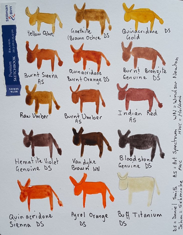
I don’t know about you, but I get so envious bored of all those sketcbooks that are artfully decorated with renderings of the artist’s working palette on their opening page. Give a girl a break! I give to you the ‘art cow’, a far more entertaining way of getting a sketchbook underway, without the need to resort to ‘serious-ity’. This approach also immediately renders concerns about not ‘ruining’ your sketchbook irrelevant.
On sorting out my paints I asked myself (rhetorically, of course), can you have too many browns/ earth tones in your palette. The answer is, of course not! I have some 15 colours in my palette that fall roughly into that category!

How now brown cows?
What about the rest of my paints I hear you wonder? In comparison they are fairly ordinary, although there are the odd outliers.

Most of the rest of the colours
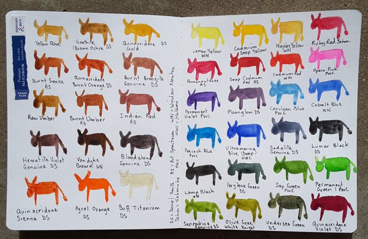
I have a definite need for lots of greens. I find Perylene Green indispensable for super dark shadows in trees and elswhere. The yellow greens, such as Serpentine Genuine and White Knight’s Olive green are there as well. A darker cousin of those yellow greens, Undersea Green will be put on trial over the coming months. Viridian has finally been given the flick, it’s one of those ‘thug’ colours, that can overwhelm a painting. And no, I have never like the grey it makes with magenta either.
The blues are pretty standard, with the exception of Sodalite Genuine, which works beautifully as a subtle blue grey. Peacock Blue, from PWC, is a fun inclusion, with a better than expected lightfastness rating of two. I often use it in a mix with greens or yellow to make green.
My former fantasy colour favourite, Opera Pink, has been cast, like Tosca, out of the window, to be replaced by the more reliable Permanent Rose. I will be interested to see how my old favourite fares in my ‘test cow’ as I heard recently that some brands of Opera Pink, which is colour-heightened by a dye, can be so fugitive as to fade inside a closed book.
As I have currently run out of empty half pans, the decision is still out on whether Naples Yellow or Quinacridone Violet will make the final cut. Oh the fun of playing with colour!

The full herd over the start of my book!
PS No correspondence will be entered into over the anatomical accuracy, or otherwise, of my cows.


