Looking for a life model

I’m in a watercolour sketching phase at the moment, sketching people in general and portraits in particular. Mostly I work in coffee shops trying to get a quick sketch done before the subject inevitably leaves at the critical artistic moment. However I am also really ‘over’ drawing people with cups or mobile phones in their hands. Given that I don’t attend regular life drawing classes I need a way to find some interesting models. 

So what to do? ‘Cheat’ I happily reply. I notice that I am not alone in drawing sculptures, by way of a substitute for a live model. Art galleries or even local parks can be good places to find interesting subjects.Here are some sculptures I drew while I was in Japan.

Two sculptures and an attendant in the Churyo Sato wing of the Miyagi Museum of Art in Sendai

Here’s another.

Shade, Churyo Sato, Miyagi Museum of Art, Sendai

When even the sculptures are lacking I turn to another source, photographs. The Boss, belting out a number (original photo Getty Images)

I find that newspaper photographers are particularly talented at capturing interesting positions of sportspeople or dancers. 

Aussie swimmers, Kyle Chalmers and James McEvoy (original photo AP)

The hard part, is to spend only the same amount of time sketching from the photo as you would if they were really in front of you. Just remember this is a way to practise making a quick sketch, not a photo-realist masterpiece. 

Kit bashing

Tomorrow is my first time back meeting with Urban Sketchers Canberra, after two months away. I  realised that I wanted to change my watercolour box set up so I wasn’t lugging around multiple tins (like I normally do ).

I had a tin and some spare empty half pans. All I needed to do was reorganise the two tins into one. 

The tin is 12.5 x 8 cm (roughly 5 × 3 inches). I also managed to fill the spare space with a bit of old face washer for cleaning my brushes. The pans are held in place by the simple technique of using heavy duty double sided tape stuck to one of those magnetic calendars (sent out by our local pollies). The magnetic calendar is easy to cut up then stuck on the bottom of the pans. The pans stay put for everyday use, but can be easily swapped around when I change my mind about what colours I want in the tin.

There are 24 colours in the new tin and no doubt way too many browns and greens. I will play around with the combinations over the coming months and no doubt change it again!

Drawing the exhibition – Venetian Renaissance Paintings 

OK I haven’t tallied up just how many exhibitions I saw in my two months in Tokyo, but it was quite a lot. I did try and sketch, where possible, various bits and pieces of works that caught my attention.  

The first exhibition I saw was of Venetian Renaissance paintings from the Gallerie Dell’Accademia in Venice. If nothing else visiting this exhibition made me realise that there is much to learn from any period, and it can be relevant to a contemporary art practice. I suppose the most important thing is to have an open mind. 

The first thing that struck me was realising just how I often make ‘realism’ the compositional basis of my work. In the early rooms I encountered Bellini’s Virgin and Child (Madonna of the Red Cherubs) a piece of Surrealism if ever there was one! What was this man doing? Chanelling more of the medieval approach to compositio than I anticipated, yet painting with a Renaissance appreciation for portraying realistic people and a depth of field.

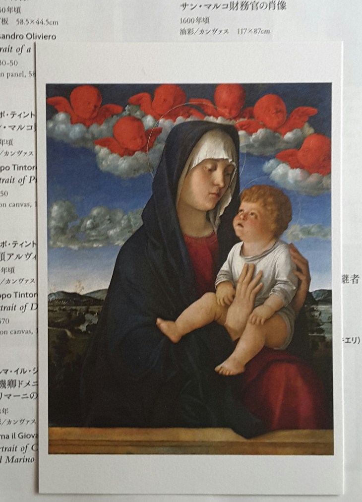
Giovanni Bellini, Virgin and Child (Madonna of the Red Cherubs), 1485-90, oil on panel

Want to get more of the story into your picture, but don’t have enough space on the canvas? Easy stick God and the Holy Spirit framed in a window. Well that what Giovanni Savoldo did with his Annunciation. 

Giovanni Savoldo, Annunciation, c. 1538, oil on canvas

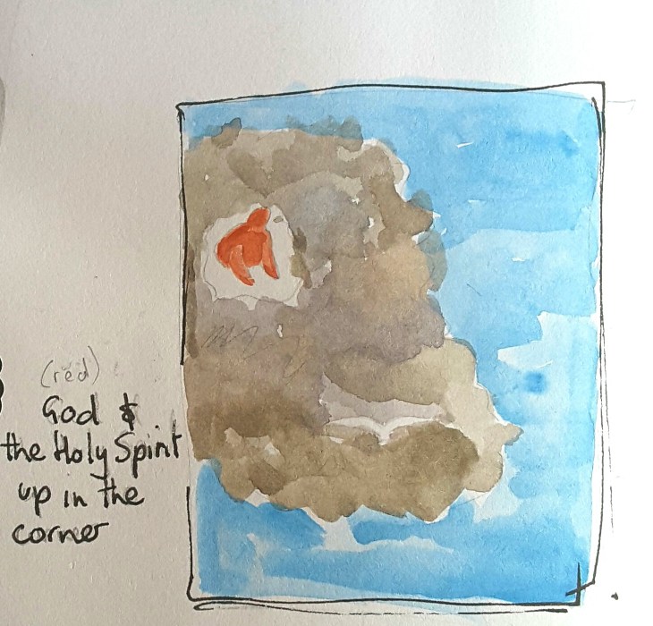
Detail of Savoldo’s Annunciation, c.1538. Pencil sketch in the gallery, with watercolour added later.

This approach might seem a bit old-fashioned, then what did I see today, at The National  Portrait  Gallery (Canberra), but William Robinson’s double self portrait, Town and Country, 1990, where he uses the just the same device to portray different aspects of his life.

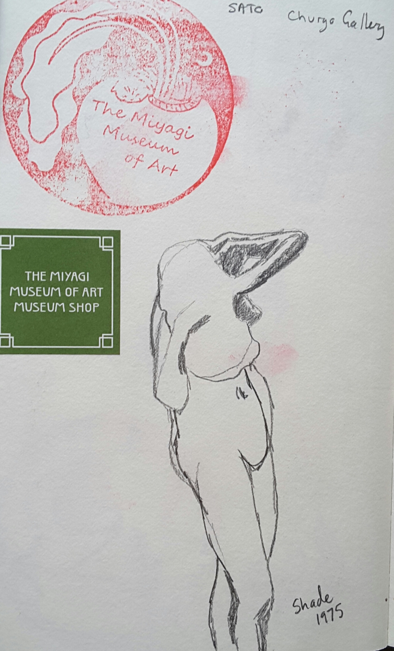
In contrast to the dramatic gestures of many works, intended to evoke and reflect religious devotion, one of the strongest works I saw was a painting based on the simplest formats. Attributed to  Francesco Bissolo, The Redeemer’s Head, 1500-10, is a symetrical, frontal portrait painted in an very limited palette.

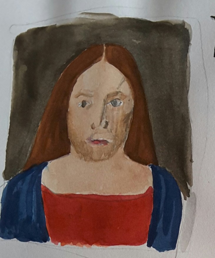
The Redeemer’s Head, 1500-10, attributed to Francesco Bissolo, original tempera on panel. My version pencil with added watercolour.

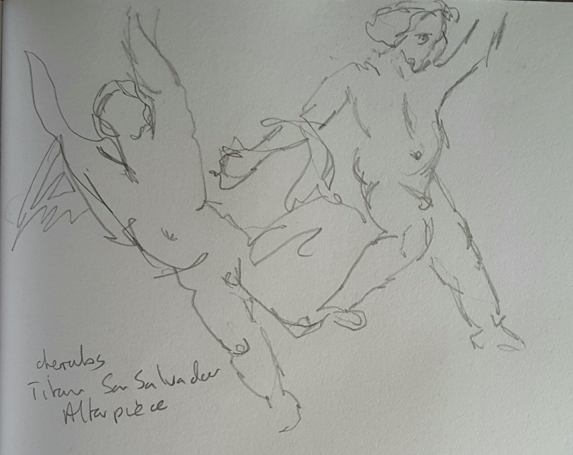
The highlight of the exhibition was Titian’s Annunciation, from the Church of San Salvador,  1563-65. The large 4 metre plus high oil on canvas was full of interesting details, sure to keep the easily distracted occupied during mass. I sketched two details, firstly the key subject the painting, the angel visiting the Virgin Mary (who has coyly raised her veil to hide herself).

Detail, The Annunciation, 1563-65, Titian, original oil on canvas. My sketch a ‘blind’ drawing in pencil trying to capture the dramatic posture of the angel’s wing.

But I  couldn’t resist the  cherubs skittering around in the upper portion of the painting. 

Detail, The Annunciation, Titian, 1563-65, cherubs. My sketch pencil

Imay have seen just one too many Virgin and Child’s in this exhibition, but I did learn a thing or two.

Art practice, not Art perfect

I was reminded earlier today that the phrase is ‘meditation practice’ not ‘meditation perfect’*, so I’m nicking that idea to apply to my art. I don’t know many artists who think their work is ‘perfect’, but sometimes I seem to operate as if that should be the default. So in the spirit of it being Friday I’m cutting myself some slack and having fun with my art ‘practice’.

Returning from interstate last week I was making this rather stiff drawing of 4 people who appeared to be related …

2Aug2016a

Waiting at the airport, 3 related women and one girl, coloured pencil

… when this bloke stuck himself right in front of my subjects.

2Aug2016

What gets in the way of art, becomes the art!

The pen I was using wasn’t running smoothly as the cap is a bit loose and the ink dries and causes blockages. I sort-of revived it a bit by putting water from my brush pen onto it, so while the sketch is a bit pale, I think it’s way more interesting than my first effort.

The next day the pen wasn’t much better, but I couldn’t resist sketching this cheeky magpie, hanging around the cafe for a feed. The first parts of the sketch were pale and then with help from my partner we managed to get the ink flowing a bit better . Once that was done I realised that I had made a much more interesting range of marks than if the ink had been flowing properly.

3Aug2016

Necessity becomes virtue as the paler initial marks allow for more interest in the feathers and offer a contrast to the background

I picked up that pen again today, but not before actually checking and re-filling it. This morning I didn’t find my fellow cafe-goers very exciting subjects, so I decided to include some of the graphics from the nearby reptile shop to make things more interesting. I decided the whole could be improved if I added some paint when I got home.

12Aug2016a

Cafe habitues with green paint

I then decided, in short order, that the result wasn’t quite what I was after. So I resorted to even more paint.

12Aug2016b

My fix

I’m feeling much happier about this version.

Sadly I have to report that since the big make-over of the small precinct where we go for coffee, that our dinosaur has ‘left the building’. It has been replaced by two trees some ground-cover plants and a lot of wood-chips. Making my sketches ‘interesting’ will become more of a challenge with the dinosaur.

*Phrase thanks to Headspace

Goulburn sketches

We took a quick trip up the road today to Goulburn, one of the oldest cities in New South Wales. As always we were attracted by the various period buildings throughout the city. This visit we allowed enough time to make a number of sketches.

While waiting for my lunch I quickly sketched one of the commercial premises on the main street. I found the combination of dark and light patterns a perfect subject for playing with my fountain pen.

5Aug2016a

Auburn St shop, pen and ink

After lunch we shifted down to the railway lines to paint, not the attractively restored station, but rather one of the storage buildings further along the track.

5Aug2016b

Railway shed, watercolour, 5 August 2016

Our final stop was back in Belmore Park, in the centre of the city where we decided to make a quick sketch of the Victorian era Court House. I swapped styles yet again to try out my black and white and a punch of colour technique. I was pretty pleased with the outcome except for one thing – I left out a whole section of the upper level of the building – oops.

5Aug2016c

Not quite the Goulburn Courthouse, watercolour, pen and ink, 5 August 2016

There was nothing for it but to have another go.

5Aug2016d

The dome of the Goulburn Court House with the missing bits added in, watercolour, pen and ink, 5 August 2016

One of the things I realised when I looked even more closely is that the top Image result for queen victoria canadaof the dome is quite literally crowned with a copy of Queen Victoria’s imperial and state crown that featured in the print of the Queen, a copy of which graced my grandparent’s home. Our day of sketching ended somewhat abruptly when a bus load of school boys arrived and quite literally parked out the view and raised the decibel level in the park quite dramatically.

For these sketches I got to try out my Stillman and Birn Gamma series Vellum Suface sketchbook, (150gsm).