Goulburn sketches

We took a quick trip up the road today to Goulburn, one of the oldest cities in New South Wales. As always we were attracted by the various period buildings throughout the city. This visit we allowed enough time to make a number of sketches.

While waiting for my lunch I quickly sketched one of the commercial premises on the main street. I found the combination of dark and light patterns a perfect subject for playing with my fountain pen.

5Aug2016a

Auburn St shop, pen and ink

After lunch we shifted down to the railway lines to paint, not the attractively restored station, but rather one of the storage buildings further along the track.

5Aug2016b

Railway shed, watercolour, 5 August 2016

Our final stop was back in Belmore Park, in the centre of the city where we decided to make a quick sketch of the Victorian era Court House. I swapped styles yet again to try out my black and white and a punch of colour technique. I was pretty pleased with the outcome except for one thing – I left out a whole section of the upper level of the building – oops.

5Aug2016c

Not quite the Goulburn Courthouse, watercolour, pen and ink, 5 August 2016

There was nothing for it but to have another go.

5Aug2016d

The dome of the Goulburn Court House with the missing bits added in, watercolour, pen and ink, 5 August 2016

One of the things I realised when I looked even more closely is that the top Image result for queen victoria canadaof the dome is quite literally crowned with a copy of Queen Victoria’s imperial and state crown that featured in the print of the Queen, a copy of which graced my grandparent’s home. Our day of sketching ended somewhat abruptly when a bus load of school boys arrived and quite literally parked out the view and raised the decibel level in the park quite dramatically.

For these sketches I got to try out my Stillman and Birn Gamma series Vellum Suface sketchbook, (150gsm).


Getting in line

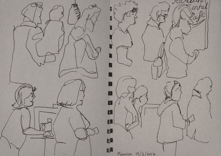
Today I decided to keep it simple. Pen and ink, blind drawing and the queue at the coffee shop & bakery.

The queue at the bakery, pen and ink, 19 March 2016

The queue at the bakery, pen and ink, 19 March 2016

It’s annoying that my current sketchbook is just a fraction too large to fit on my scanner so I’ve had to scan and re-join today’s drawings.

The queue at the bakery, pen and ink, 19 March 2016

The queue at the bakery, pen and ink, 19 March 2016

Coloured Cats

In my quest to explore some possible new directions in my art I’ve been taking an online class called ‘Stretching’ with the Sketchbook Skool group (and yes they do know how to spell school). Each week a different artist shows you their work, what materials they use and encourages you to try different approaches to making art. As I am still convalescing this is a great opportunity to put aside ‘work’ for the time being and try something new.

Our cat Georgina, pen and ink and watercolour, 9 March 2016

Our cat Georgina, pen and ink and watercolour, 9 March 2016

So far I’ve really taken to a technique proposed by the ‘mobile illustrator’ Lapin, a French artist who lives in Barcelona. In his exercise he suggests that you draw a portrait where the head of the person (or in this case my cat) dominates the page and the rest of the body is squeezed into the remaining space by whatever means possible. Distortion is encouraged! One other thing, he prefers to make these drawings using a limited palette of pen and ink and three watercolours, Yellow Ochre, Prussian Blue and Alizarin Crimson. You can blend the colours or use them as they come. In this first drawing I used French Ultramarine instead of Prussian blue and I did add lemon yellow for her eyes.

I really liked the result I got so the next evening I had another go. This time I did use Prussian Blue, but I find it a bit of a thug in the watercolour palette so my preference is to stick to French Ultramarine.

Georgina, 10 march 2016, pen and ink and watercolour

Georgina, 10 march 2016, pen and ink and watercolour

This is my favourite portrait so far. It has captured the serious side of our cat. I would also emphasise that these portraits are not intended to be cariacatures, but are meant to draw the viewers attention to the face.

My final sketch did end up looking rather more comical thanI intended. I didn’t get the proportion of the head quite right so this does have a cartoonish feel about it. Of course my cat does have a lighter side anyway.

Georgina, 11 March 2016, pen and ink and watercolour

Georgina, 11 March 2016, pen and ink and watercolour

Material concerns

Sketching materials often cause me a dilemma. Like many sketchers I run the risk of paralysis from too much choice. When I made my trip to Brisbane last week I decided on one sketchbook – a grey-tone Strathmore and a limited selection of pens/pencils. My main pencils were Koh-i-noor Magic pencils, so I couldn’t ‘control’ to any extent  the colours that came out. I didn’t know whether I could do it! Indeed I did resort to one digital drawing.

Brisbane River Bridges, digital drawing on PS Touch app (for Android)

Brisbane River Bridges, digital drawing on PS Touch app (for Android)

Despite this small detour I did get back on track.This sketch uses only coloured pencil and white chalk. I used several types of the Magic pencils: Original, Fire and America.

Late afternoon sun on the Storey Bridge Brisbane, coloured pencil, white chalk, 20 January 2016

Late afternoon sun on the Storey Bridge Brisbane, coloured pencil, white chalk, 20 January 2016

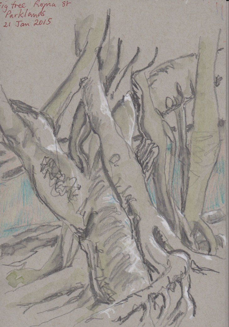
The next day we took our sketch books up to the Roma St Parklands where the twisting shapes of the Moreton Bay figs captured my attention.

Fig tree, Roma Street Parklands, white chalk, graphite and coloured pencil, 21 January 2016

Fig tree, Roma Street Parklands, white chalk, graphite and coloured pencil, 21 January 2016

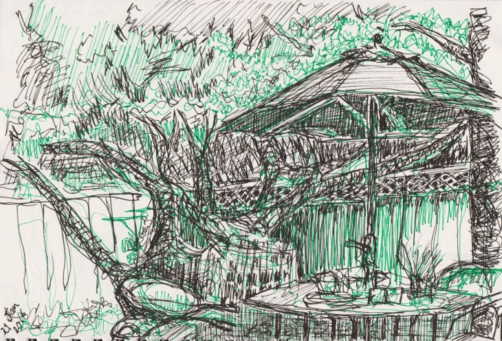
Back home I realised that I hadn’t picked up a pencil in days so I grabbed what was to hand, a green Artline fibre pen and my black ink pen and got down to it.

Backyard, green fineline pen and ink, 29 January 2016

Backyard, green fine line pen and ink, 29 January 2016

It can be a challenge just getting past that ‘perfection’ monkey, but it’s always worth getting out and just drawing.

A Little Pomp and Ceremony

3Jan2015a

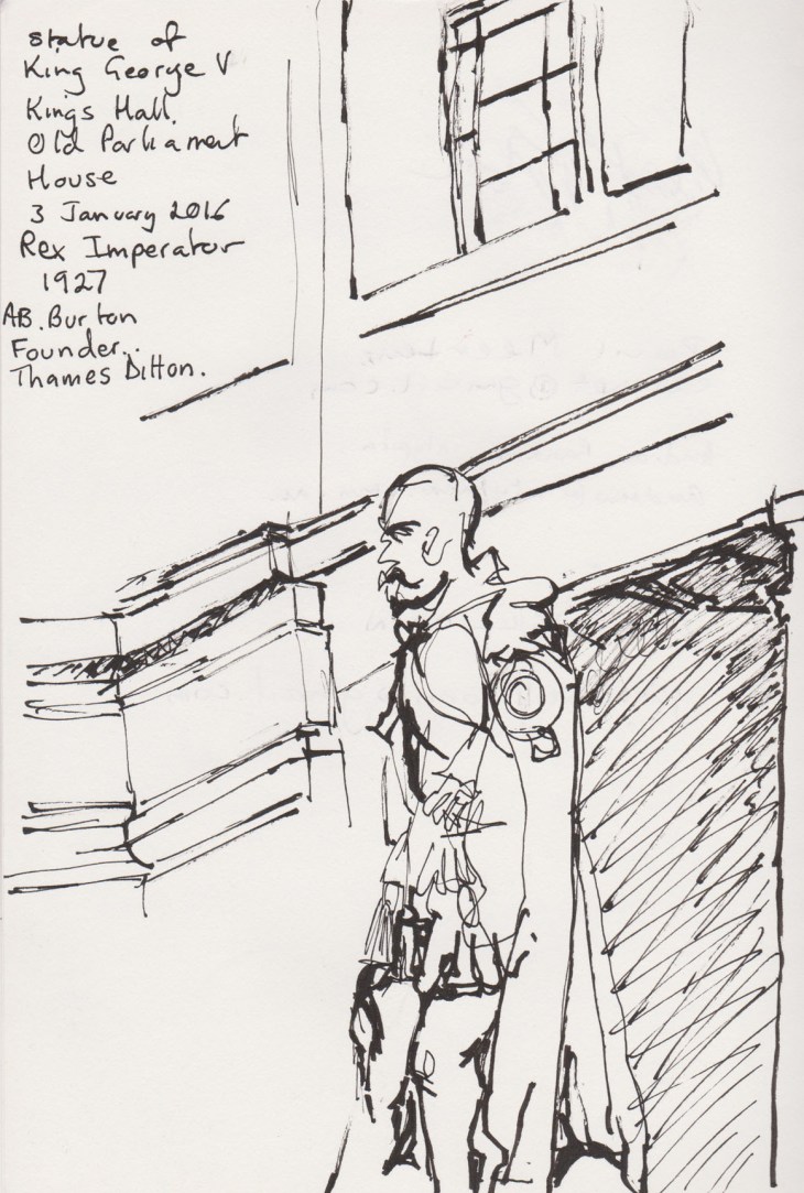
Sculpture of Kin George V, Rex , Imperator 1927 by Sir Bertram Mackennal , pen and ink sketch, Old Parliament House Canberra

Today was the first sketch outing of 2016  of our Urban Sketchers Canberra group. We met in the foyer of Old Parliament House (now the Museum of Australian Democracy). There were sixteen of us, including two new members and a visitor. I was thrilled that we had such a good turn out while so many people are still on holidays.

I’d already decided to sketch the sculpture of King George V, which is located in Kings Hall. This sculpture portrays the King in the robes of the Order of the Garter and is the second casting of this statue, originally commissioned for New Delhi. I couldn’t capture the full regalia from the angle I was drawing (another day perhaps), but the King shows a very fine leg in his hose and garter.

Inspired by his decorative garments I decided to try another location to sketch parliamentary regalia, in the House of Representatives chamber. It turns out five others of our group were already in there, with some fine sketches being made (see more here).

3Jan2015b

Replicas of the Mace, foreground, and the Dispatch box, rear right, in the House of Representatives chamber, Old Parliament House. Pen and ink, 3 January 2015

Resting on one end of the main table is a replica of the Mace, the original of which is now in the new parliament building, in the House of Representatives chamber. At the far end of the table you can see one of the Dispatch boxes. I was amused to learn from one of the guides that these replicas of the Dispatch boxes were made when the movie ‘The Dish‘was filmed in the chamber. The film company kindly left them with the museum after they finished filming.

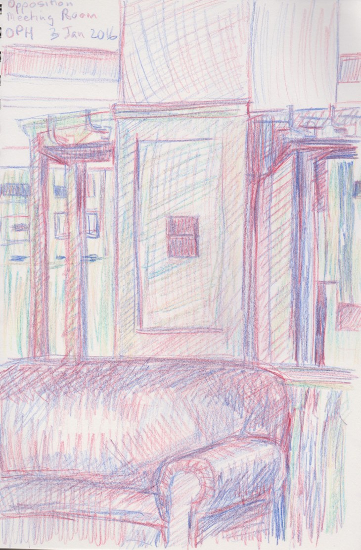
After all this pomp and ceremony I decided to make my final sketch in the Senate Opposition Meeting Room, where I could sink into the comfortable large lounges, much as many a Senator has no doubt done before me.

3Jan2015c

The Opposition Senate Meeting Room. Pencil sketch, koh-i-noor coloured pencils, 3 January

The upholstery is in the maroon coloured leather, that is used in the Senatorial wing of the building. Original furniture and fittings were designed by John Smith Murdoch, the architect of the building. I’m currently testing out my new Koh-i-nor Magic pencils (more in another post). I think that the paper I used was not perhaps very well-suited to these pencils. I will try paper with a bit more surface bite to it next time.

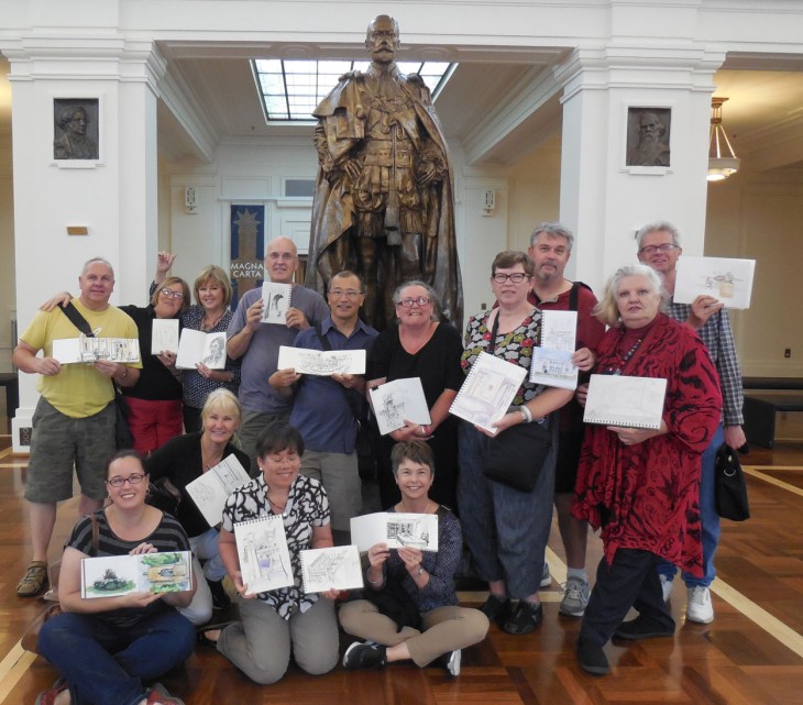
And finally here is our group, along with His Royal Highness.

USKCanberraJan2016

Urban Sketchers Canberra at Old Parliament House, 3 January 2016