USk Singapore Symposium Day 3

OK there has been a bit of a gap in the Singapore saga, a result of problems uploading my posts while traveling, traveling in general and having other things to do, like traveling. So now the big catch up.

Day 3 in Singapore saw me in a workshop with Melanie Reim, titled ‘Found in Translation – The influence of Calligraphy on Gesture in the Figure‘, exploring how we can use the influence of calligraphic marks to make lively sketches. Melanie walked us through some of the calligraphic styles found around the world and then showed us the work of artists who have used this approach. You may like to check out the work of Ben Shahn or David Stone Martin.

We were encouraged to draw using shorter, more graphically interesting lines. This is in contrast to the way I usually draw with a continuous line. As Melanie said we should look at the joints of arms and legs and the shift of weight in the body as the point where you could use a calligraphic mark to indicate the body’s movement. The other instruction she gave us was to use the notes she had provided to find the marks that might suit what we were drawing. This proved to be good advice – I don’t know about you, but I am prone to believe I’ve taken the information in and don’t need the prompt of notes – wrong!

We started with faces and bodies, the challenge was to draw 20 faces and 20 bodies in 40 minutes. Ohhh Kayyy – using a brush pen (Pentel) I got underway.

Figures and faces in the Albert St Mall, 25 July 2015, brush pen

Figures and faces in the Albert St Mall, 25 July 2015, brush pen

More figures, Albert St Mall 25 July 2015

More figures, Albert St Mall 25 July 2015

The note to myself about holding the brush was a reminder that if I used the brush as I would normally hold a pen to write I got very uniform strokes. I recalled that on the odd occasion when I have taken a calligraphy lesson I have to hold the brush in a vertical position, using my thumb and forefinger. This way I can get both thick and thin lines and a much wider range of pressure in one stroke.

After this first exercise we collected for a quick review of what we had learned and some advice on how we might better apply the ideas and techniques.

Melanie, providing an on the ground crit session in the Albert Mall

Melanie, providing an on the ground crit session in the Albert Mall

Our second exercise was to draw a scene using calligraphic marks and incorporating figures in the scene. One tip that Melanie gave us was to place an interesting figure in the foreground to help draw the viewer into the image. Just when I was asking myself “will I see someone take an ‘interesting’ stance?”, that person materialised in front of me. In my case a young man walked by with a bag held up on his shoulder – perfect! I was positioned outside the Chinese temple so I had lots of colour and movement to include in the drawing. I also, usefully, had the view-finder that Virginia gave us the day before to help focus in on my subject.
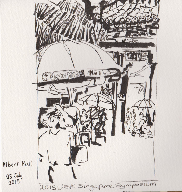
Outside the temple, brush pen, pen and ink, 25 July 2015.

Outside the temple, brush pen, pen and ink, 25 July 2015.

I liked how Melanie’s calligraphic figurative style worked so well with Virginia’s teaching from the day before on using light and darks. I was really pleased with the resulting drawing.

The next day we found ourselves in a local food court where we could sit and sketch while eating our Bandung bean curd, (a rose-flavoured dessert rather like a junket). Again Marc Taro Holmes’ lessons and Melanie’s gestural lines proved to be a good fit.

At the food court, some of our fellow diners, brush pen, 26 July 2015
At the food court, some of our fellow diners, brush pen, 26 July 2015
USk Singapore Symposium Day 2

Another early start. We were up and out to find some breakfast before the day’s workshop . This I was with Virginia Hein for Dark and Light with a Punch of Colour.
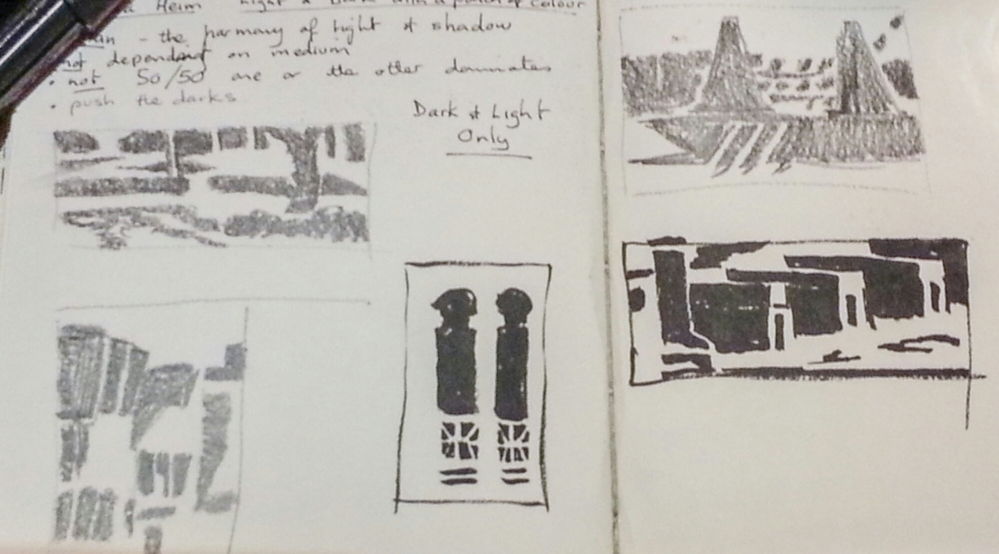
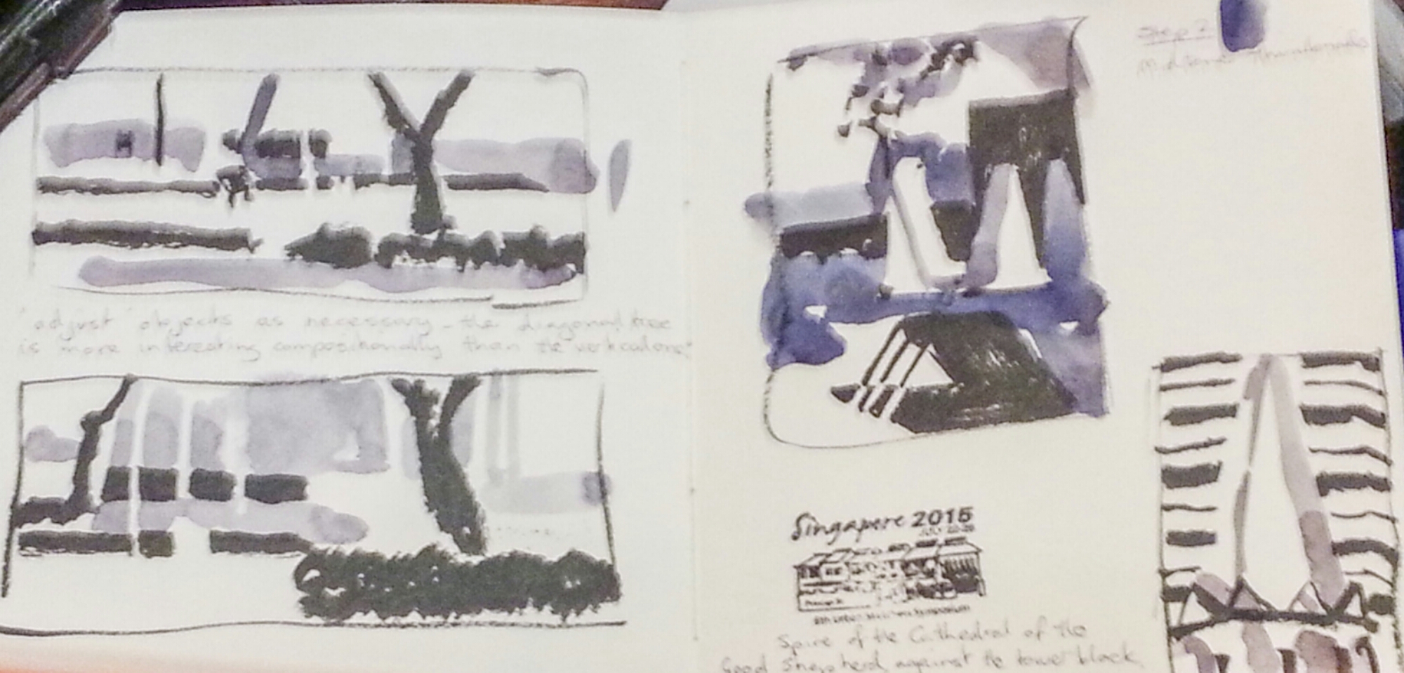
Virginia started us of by explaining the concept if notan, a Japanese word for the harmonious blance of light and dark. Not a 50/50 split but rather a means of examining the bones of a composition before making a study or final work. It turns out , unbeknownst to me at the time that this is something I really love doing.
There were three steps to the class. First drawing a thumbnail sketch in pencil , preferably a flat carpenter’s pencil, or a regular pencil drawn using it’s side , marking in the dark tones. It may help to use a view finder, that is a piece of paper with a rectangle torn into it , so you can frame a scene and select what you want to draw.

image

By the way its easy to say that there’s not enough time to make a thumbnail sketch, but it is time well spent as we were reminded. Since the class I’ve tried to stick to this approach and I’ve found it very helpful way of noting a scene particularly if I don’t have time for a full drawing.
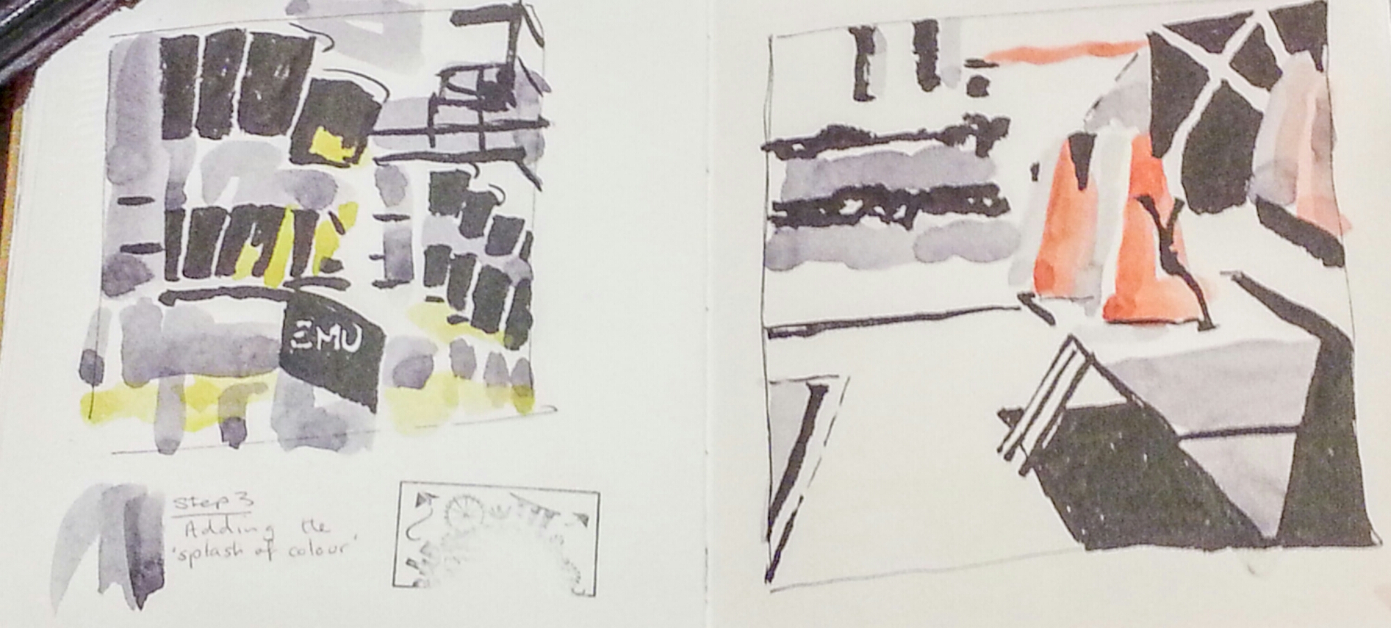
Next step is to fill in the mid-tones. For some reason I struggled with this at first. Virginia suggested that this should be in grey. You can mix your own or use Payne’s grey, just remember that the mid-tones can also be used to delineate objects.

image

Finally for that punch of colour. For our first attempt Virginia suggested that we limit it to one colour. But once you’ve got the hang of things you can try it out with more colours. One tip, remember that some of your colours may act as mid-tones, this can make your final image less satisfactory.

image

Drawing the exhibition – The Daylight Moon

It is an amazing thing to drive for an hour through a landscape, to arrive in a room where that same landscape has been abstracted into 10 works of art.

Looking eastwards across the dry bed of Lake George

Looking eastwards across the dry bed of Lake George

The Goulburn Regional Gallery is currently showing, The Daylight Moon, a collection of 10 works by Rosalie Gascoigne. Gascoigne was born in New Zealand 1917 and died in Australia in 1999, (she lived in Australia from 1943). Gascoigne is, arguably, the greatest Australian landscape artist of the late 20th century. The ten works have been selected to show Gascoigne’s response to Lake George. The Lake is the major feature on the drive between Canberra and Goulburn. It is known throughout our region as the disappearing lake, as the water levels change from full to totally dry depending on the local rainfall.

The gallery layout is simple. Partitions have been placed to  square up the centre of the gallery. The centre of that space is occupied by a large work called A Piece to Walk Around, (1981), which is a composition of dry thistle stems, thousands of them, laid in a simple grid pattern directly on the floor. In the gallery this takes the corresponding position of the lake as the central theme of the exhibition. The remaining works are hung on the surrounding walls, with space to breathe, as is appropriate to the sense of space that is present in the land around Lake George.

My immediate response to the gallery space was to stop and take a deep and relaxing breath, then let the art flow around me. I have seen many of Gascoigne’s pieces over the years, but those included in this show were largely unfamiliar. If you haven’t seen Gascoigne’s work you should know that her pieces are composed from found materials, such as corrugated iron and old timber road signs, that she collected from small town dumps in the area.

Gascoigne’s ability to visualise a work of art out of these basic materials remains a constant surprise. She described her process as follows “… you’ve got to use what you’ve got and you’ve got to fake it and fake it and fake it, until suddenly you personally see it. And whether anybody else sees it is of course immaterial.”*

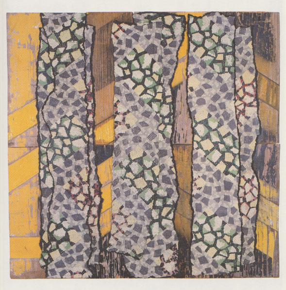
I realised that I needed to slow down enough to really take in the work. So I borrowed a seat so I could sit down and draw one of the works, High Country, (1999).

Rosalie Gascoigne's High Country 1999, graphite, 15 July 2015

Rosalie Gascoigne’s High Country, 1999, graphite, 15 July 2015

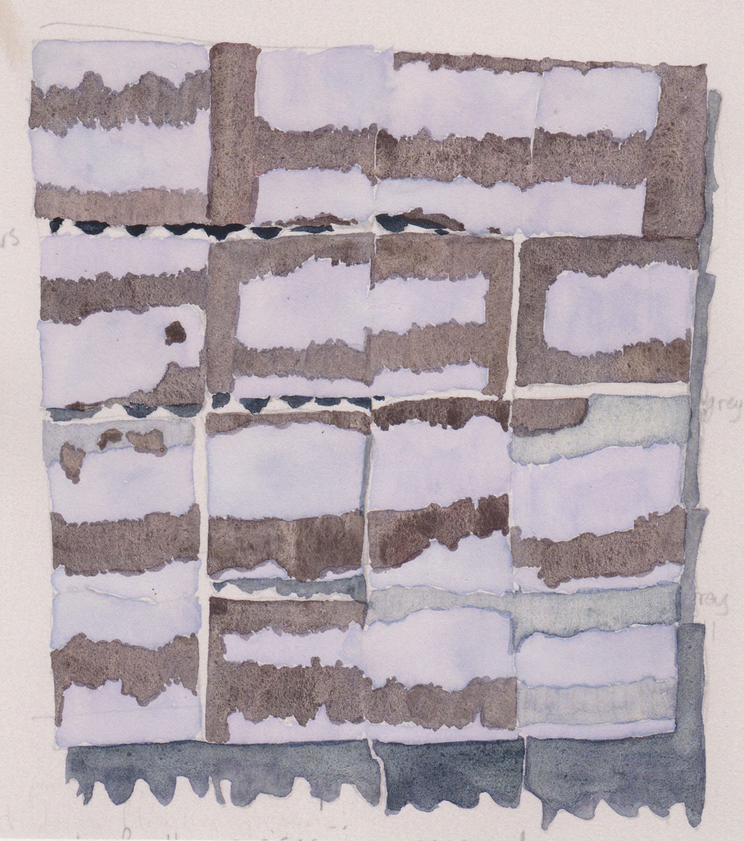
These are my notes made in the gallery, but I couldn’t resist copying the drawing onto watercolour paper and adding some colour once I had returned home.

Rosalie Gascoigne's High Country 1999, painted corrugated iron panels on wood, 134 x 121 cm, watercolour on photocopy

Rosalie Gascoigne’s High Country 1999, painted corrugated iron panels on wood, 134 x 121 cm, watercolour on photocopy

What did reveal itself as I sat and focused on this work were the shadows cast by undulations of the corrugated iron on the wall and even on the supporting wood panel. Other works, such as White Garden, (1995), cast similar lacy shadows. With closer examination you could also see where Gascoigne had worked with the original piece of iron, cutting and rearranging the individual segments into a complete work.

A smaller work that particularly captured my eye was Poplars 19 (1996-97).

Poplars 19, 1996-97, Rosalie Gascoigne, 60 x 62 cm, linoleum on wood with retro-reflective strip, collection of Tarra Warra Museum of Art

Poplars 19, 1996-97, Rosalie Gascoigne, 60 x 62 cm, linoleum on wood with retro-reflective strip, collection of Tarra Warra Museum of Art

This is a show that invites contemplation. It would be too easy to breeze in, glance at the walls, do a quick turn around the central floor work and walk out again. Please don’t.

If you are a local you have until 22 August to see this exhibition. Highly recommended, along with the drive through the country.

Poplars, Wollogorang Creek, NSW

Poplars, Wollogorang Creek, NSW

* Rosalie Gascoigne, interview with Stephen Fenely, Express, ABC, 4 December 1997, excerpt quoted in the exhibition catalogue.

Goulburn Regional Art Gallery
Cnr Church & Bourke Sts. Goulburn NSW 2580
t 48 234494 | f 48 234456 | e
Open Monday-Friday, 10 am – 5pm Free entry. Saturday 1-4pm

Free the people

I’ve been working on drawing people for some months now. I don’t find it easy and I might easily persuade myself to draw something else but I am persisting with it. To try and improve the outcomes – in my eyes at least – I’ve been trying out some different techniques.

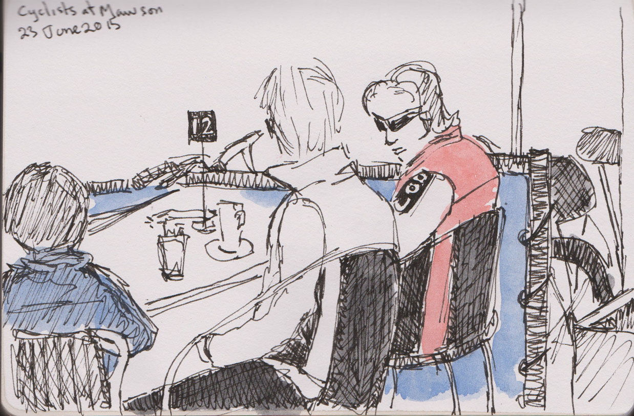
My default position to date has been a fairly realistic approach which relies on hoping my subjects are wearing sunglasses so I don’t have to draw tricky eyes and noses. Most of these drawings work, but the result is that my city appears to be occupied by shady characters at best and the random, deranged-looking person at worst.

Cyclists, pen and ink and wash, 23 June 2015

Cyclists, pen and ink and wash, 23 June 2015

I’ve been tossing around some options for changing my approach to drawing people. I was much happier with the quick sketches I did at the beach earlier this year, where I used a quick wash of watercolour that I quickly sketched into. So over the past few weeks I’ve been working on this as a new approach to people sketching in cafes.

Trying a new approach, watercolour and graphite, 24 July 2015

Trying a new approach, watercolour and graphite, 24 June 2015

I’ve mainly used a watercolour graphite pencil to add detail, I’m also trying using my pen and ink.

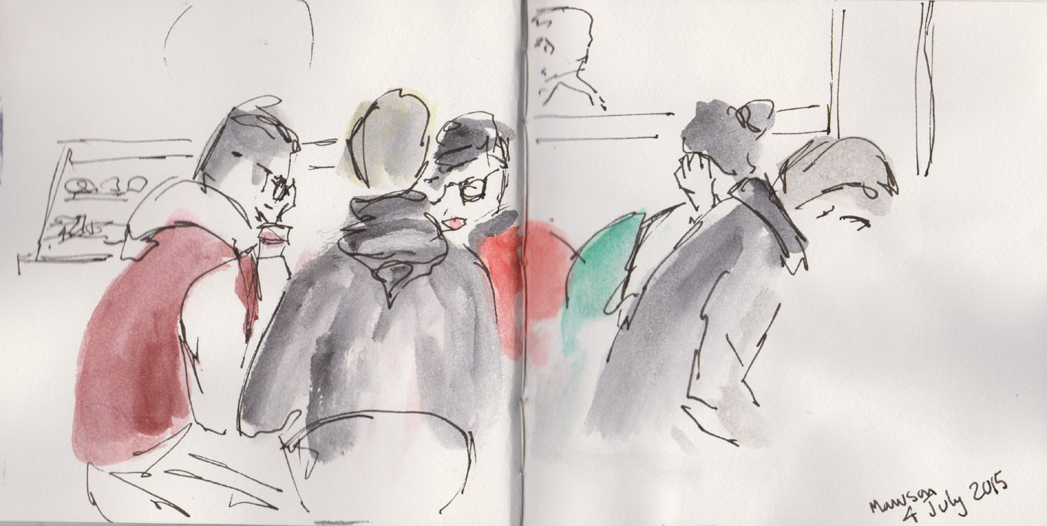
Busy Saturday, watercolour and pen and ink, 4 July 2015

Busy Saturday, watercolour and pen and ink, 4 July 2015

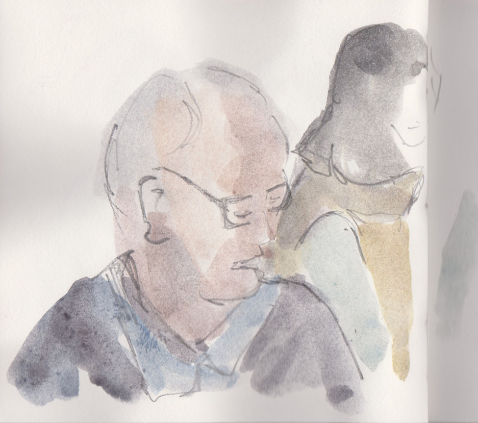
I’ve also found that if I put down a light wash that I can also quickly add some shadows and contours with subsequent washes.

Man reading, watercolour and graphite, 27 June 2015

Man reading, watercolour and graphite, 27 June 2015

And while it might seem obvious it has also dawned on me that if I am working on a small piece of paper it is actually harder to get a well drawn face because I don’t have enough space to capture the details I want, duh!

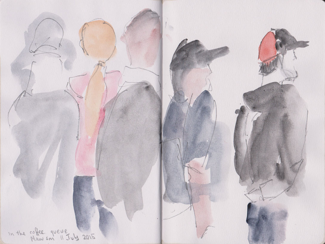
There’s no doubt that I’m still better at capturing body shapes than faces,

The coffee queue, watercolour and grapjite, 11 July 2015

The coffee queue, watercolour and grapjite, 11 July 2015

but I am keeping on with this approach.

Two people , quick sketch, watercolour and graphite, 11 July 2015

Two people , quick sketch, watercolour and graphite, 11 July 2015