Henderson Waves, Singapore

Henderson Waves is the highest footbridge in Singapore, at just over 36 metres above the road. Designed by RSP Architects Planners & Engineers (Pte) Ltd and IJP Corporation Ltd, UK, for the Urban Redevelopment Board of Singapore it joins Mt Faber to the Telok Blangah Hill Park. The hills are part of the Southern Ridges Walk, a hiking trail that takes you through three major parks: Kent Ridge Park, Telok Blangah Hill Park and Mount Faber Park, (I can assure you that given the heat and humidity we didn’t hike the trail).

Looking up at the Waves from Henderson Road

Henderson Waves from Telok Blangah, looking towards Mt Faber Park.

We were interested in sketching this modern marvel. It’s deck is made of balau wood and the seating areas along the bridge provide a suitably challenging set of curves for a sketcher to tackle. On this typically hot and humid day it also had the best breezes going.

Henderson Waves, watercolour and pencil

Looking out from Henderson Waves towards a set of residential towers. Watercolour, pen and ink.

How now brown cows?

(Serious amounts of watercolour obsessing follows, you were warned).

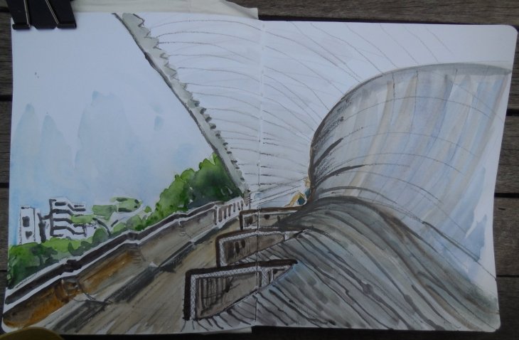
The desperate need to clean up and refill my palette has lead me to look at my current watercolour paint sets. Just to be clear, all my paint ‘sets’ now consist of my own choice of colours in half pans, in tins I have found or purchased. Some of my half pans are all used up, while others sit full and untouched. So I grabbed my newest sketcbook, a Stillman & Birn Beta series (270 gsm) and as many tubes of paint as I could find and got to work.

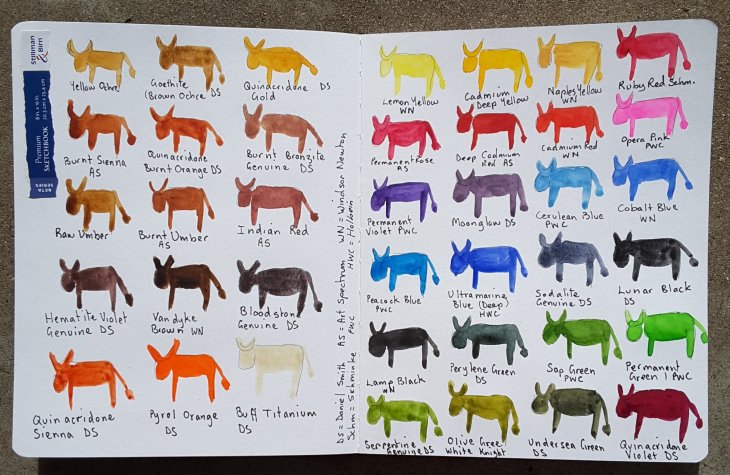
I don’t know about you, but I get so envious bored of all those sketcbooks that are artfully decorated with renderings of the artist’s working palette on their opening page. Give a girl a break! I give to you the ‘art cow’, a far more entertaining way of getting a sketchbook underway, without the need to resort to ‘serious-ity’. This approach also immediately renders concerns about not ‘ruining’ your sketchbook irrelevant.

On sorting out my paints I asked myself (rhetorically, of course), can you have too many browns/ earth tones in your palette. The answer is, of course not! I have some 15 colours in my palette that fall roughly into that category!
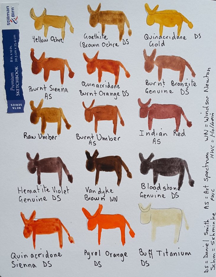
How now brown cows?

What about the rest of my paints I hear you wonder? In comparison they are fairly ordinary, although there are the odd outliers.

Most of the rest of the colours

I have a definite need for lots of greens. I find Perylene Green indispensable for super dark shadows in trees and elswhere. The yellow greens, such as Serpentine Genuine and White Knight’s Olive green are there as well. A darker cousin of those yellow greens, Undersea Green will be put on trial over the coming months. Viridian has finally been given the flick, it’s one of those ‘thug’ colours, that can overwhelm a painting. And no, I have never like the grey it makes with magenta either.

The blues are pretty standard, with the exception of Sodalite Genuine, which works beautifully as a subtle blue grey. Peacock Blue, from PWC, is a fun inclusion, with a better than expected lightfastness rating of two. I often use it in a mix with greens or yellow to make green.

My former fantasy colour favourite, Opera Pink, has been cast, like Tosca, out of the window, to be replaced by the more reliable Permanent Rose. I will be interested to see how my old favourite fares in my ‘test cow’ as I heard recently that some brands of Opera Pink, which is colour-heightened by a dye, can be so fugitive as to fade inside a closed book.

As I have currently run out of empty half pans, the decision is still out on whether Naples Yellow or Quinacridone Violet will make the final cut. Oh the fun of playing with colour!

The full herd over the start of my book!

PS No correspondence will be entered into over the anatomical accuracy, or otherwise, of my cows.

A fistful of cafes

I have been refining my coffee sketching process this year, applying the KISS principle (‘keep it simple stupid’) to what I carry in my bag for impromptu sketching sessions. A test card of watercolours, a pencil, a pen and a waterbrush and a ‘book’ made from one sheet of A3 watercolour paper. Both the book and the colour card fit into a plastic sleeve from an old bank passbook (gosh, do you remember those?). Here’s a shot of the set up.

Each A3 sheet is folded in half horizontally to make two panorama style pages. These are folded in half then sewn together through the fold. Each side of the panorama is the folded in half again (as you can see in the photo above), which means the final size all folded up fits in the plastic sleeve.

The completed booklet

Here are sketches from my latest book. What I really like is that, depending on your layout you can sketch over part, or the full stretch of the page.

Cafe sketch, watercolour and graphite

Celebrating ‘National (read USA) Pencil Day’, the day the first pencil with attached eraser was patented in 1858

Inspired by the woman with the red hair, watercolour and graphite

Reading the papers with the rest of the retirees, pen and ink

Arborists clearing our trees from the powerlines. The left hand page of a full spread.

Shredding the prunings, the right hand page of the full spread

At the markets, pen and ink with watercolour

A final cafe sketch for the week. Watercolour and ink.

Ultimately I plan to bind these booklets together into a single book.

Unplanned connection

Without the internet I am unlikely to have ever found Claudia McGill’s Haiku 365.

Everyone I asked

said it was an ugly thing

and handed it back.

Together it sits here with my watercolour and paste up work about demolition and rebuilding in the Woden town centre near my home.

Thanks Claudia!