Cafe Wednesday and sundry others

At last we’ve made it back to our local cafe for Wednesday morning coffee.

What's on the menu? Chocolate chip cupcake and a flat white coffee. 3 December 2014, pen and ink and Copic marker.

What’s on the menu? Chocolate chip cupcake and a flat white coffee. 3 December 2014, pen and ink and Copic marker.

I also have a few other images which fit under the ‘cafe’ theme which I haven’t posted. Going backwards…

The Italian Bakery at Mawson, people and umbrellas, 2 December 2014, Copic marker.

The Italian Bakery at Mawson, people and umbrellas, 2 December 2014, Copic marker.

The strange third figure was actually the person, seated on the right, but they sat down too quickly to capture them in the standing position.

This dog wasn’t much more cooperative either. I thought it was asleep but it sat up and changed position several times, hence the multiple heads.

Dog at the Italian Bakery, Mawson, 29 November 2014, pen

Dog at the Italian Bakery, Mawson, 29 November 2014, pen

And ‘furthest from the front’, this view out the window of where I had lunch two weeks ago, the charmingly alliterative Long Wong Best BBQ Roast Duck cafe.

Not in China anymore, the view from the Long Wong Best BBQ Roast Duck restaurant, Dickson, 24 November 2014, Copic marker and acrylic marker.

Not in China anymore, the view from the Long Wong Best BBQ Roast Duck restaurant, Dickson, 24 November 2014, Copic marker and acrylic marker.

Drawn in – November

Its been quite a while since I went to one of the National Portrait Gallery’s Drawn In sessions. A friend suggested we go and so we joined lots of other people for an afternoon session of sketching and listening to some beautiful singing.

I managed 3 sketches in various styles and media. First a blind drawing in pencil of a floral arrangement in the area we were drawing.

Blind drawing, floral arrangement, National Portrait Gallery Canberra, 30 November 2014, pencil

Blind drawing, floral arrangement, National Portrait Gallery Canberra, 30 November 2014, pencil

A view to the display of portraits by Rick Amor in the gallery entrance.

Rick Amor, Gallery 1, National Portrait Gallery, Canberra, 30 November 2014, pencil, ink and watercolour.

Rick Amor, Gallery 1, National Portrait Gallery, Canberra, 30 November 2014, pencil, ink and watercolour.

The last was a still life and partial figure of the woman sitting in front of me.

Bags and partial figure, National Portrait Gallery, pen and ink, 30 November 2014

Bags and partial figure, National Portrait Gallery, pen and ink, 30 November 2014

After I’d finished drawing I went over to look more closely at the Rick Amor portraits which vaguely appear in my sketch. I was particularly interested in the preparatory drawings for Amor’s 1994 portrait of Gary Catalano.

Gary Catalano

Gary Catalano , 1994 by Rick Amor Gary Catalano, 1994 by Rick Amor pencil and watercolour on yellow paper (56.5 x 76.0 cm) Collection of the National Portrait Gallery of Australia

I was impressed by the economy of the drawings with no need for extensive explanatory detail.

Gary Catalano, 1994 by Rick Amor

Gary Catalano, 1994 by Rick Amor, oil on canvas (57.0 x 57.0 cm) , private collection.


Their adaptation to the final painting doesn’t lose the spareness conveyed by the drawings. There’s quite a lesson in that approach.


Profession – artist

“Are you an artist?” was something I often got asked when people saw me sitting , drawing, while I was  in China. It always seemed easier to say yes, than go into some complicated discussion about what I do, but I found it difficult to say this without some vague feeling of being fraudulent. I’ve since realised that I’ve been missing the point completely. The Oxford English Dictionary defines the word ‘profession’ as follows:

“An occupation in which a professional knowledge of some subject, field or science is applied, a vocation or career, especially one that involves prolonged training and a formal qualification.”

And I’m not going to get hung up on the formal qualification bit either. It’s the concept of the application of knowledge combined with prolonged training that chimes with why I even bother to persist with drawing and why I am an artist. I am even more consoled by the words of the great Japanese artist Hokusai who explained:

“From the age of 6 I had a mania for drawing the shapes of things. When I was 50 I had published a universe of designs. But all I have done before the the age of 70 is not worth bothering with. At 75 I’ll have learned something of the pattern of nature, of animals, of plants, of trees, birds, fish and insects. When I am 80 you will see real progress. At 90 I shall have cut my way deeply into the mystery of life itself. At 100, I shall be a marvelous artist. At 110, everything I create; a dot, a line, will jump to life as never before. To all of you who are going to live as long as I do, I promise to keep my word. I am writing this in my old age. I used to call myself Hokusai, but today I sign my self ‘The Old Man Mad About Drawing.”
Hokusai Katsushika

So I will promise to persist and with persistence I will become an even better artist. Hokusai sensei arigato gosaimashita! (Thank you Teacher Hokusai!).

The Orange Ironing Board, 27 November 2014, pen and ink and watercolour

The Orange Ironing Board, 27 November 2014, pen and ink and watercolour


Brushing up

During my brief stay in Adelaide I visited the Art Gallery of South Australia to see a ‘mini’ exhibition of calligraphic works on display in their Asian galleries. The exhibition, Brush and Ink, Contemporary Asian Calligraphy, displays large scale calligraphic works from China, Japan and Mongolia.

Japanese artist and commercial designer, Hiroko Watanabe’s installation takes up the end wall of the room. According to the room notes the 3D nature of this work is reflective of her work making commercial light-boxes to be placed on buildings. I always like to see ‘gesture’ in drawing and this work has it in bucket loads. I gather from the various reviews of this work that it was actually made during a performance with the group Above the Clouds, as part of the OzAsia festival. An interesting review of Watanabe’s performance can be found here.

"The value of the so-called invisible wind", Hiroko Watanabe, ink on Japanese paper (washi), 2014

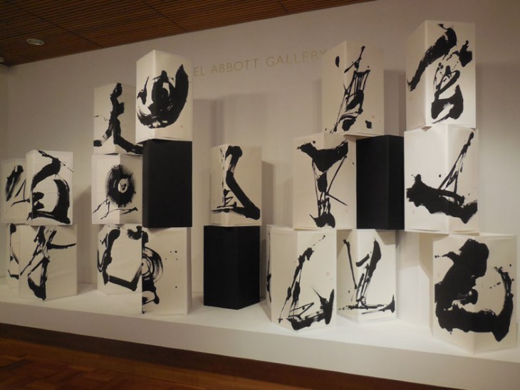
“The value of the so-called invisible wind”, Hiroko Watanabe, ink on Japanese paper (washi), 2014

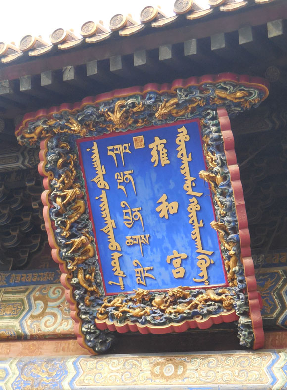
The Mongolian calligrapher’s were a revelation, quite literally I have never seen any of this calligraphy before and I only recently learned that there was a Mongolian script. This plaque attached to the Yonghe (Lama) Temple in Beijing is written in 4 distinct scripts from left to right as you see it Mongolian, Tibetan, Chinese and Manchu.

Inscription on the Yonghe Temple Beijing in  four scripts, (l to r) Mongolian, Tibetan, Chinese and Manchu.

Inscription on the Yonghe Temple Beijing in four scripts, (l to r) Mongolian, Tibetan, Chinese and Manchu.

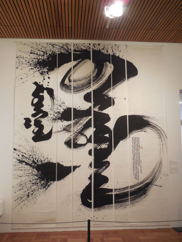
The exhibition room notes say that ” calligraphers from Mongolia often describe the physical act of writing from the top down in one fluid motion, ‘as a man riding a very fast horse’, or like a falling coin'”. I can only concur as the overwhelming sense I had of these works was of their dynamic motion. This ceiling to floor work by D Ganbaatar is a case in point.

"Mongolian Pride" , by D. Ganbaatar, 2013, ink over 6 sheets of papyrus

“Mongolian Pride” , by D. Ganbaatar, 2013, ink over 6 sheets of papyrus

I’m still trying to understand how this work “Aspiration”, by Lkhagva Tuvshinjargal, has been made (apologies for the light reflections in the photo, they were unavoidable). I couldn’t tell if this was white ink on a previously prepared paper or some type of reductive technique, like bleach taking colour out of a dark cloth. If anyone knows how this technique is achieved I’d be interested to find out.

"Aspiration", by L

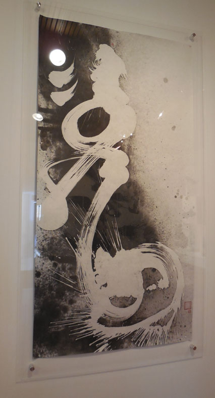
“Aspiration”, by Lkhagva Tuvshinjargal, 2013, ink on papyrus

If you would like to see more of  Lkhagva Tuvshinjargal work I found some on this Hungarian blog (Google translate works well as my Hungarian is non-existent).

I also enjoyed this small collection of calligraphy on ceramics, from the AGSA’s own collection, also on display as part of the exhibition.

Ceramics by Shoji Hamada and Milton Moon (and possibly another artist who's name I've forgotten)

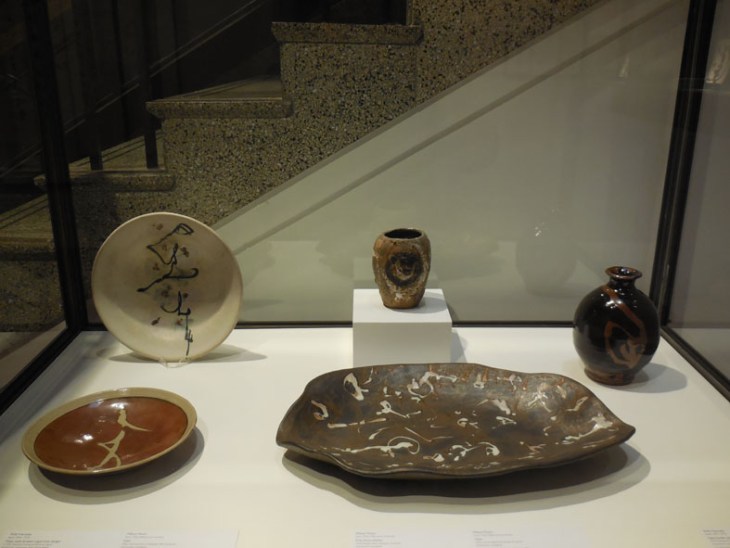
Ceramics by Shoji Hamada and Milton Moon (and possibly another artist who’s name I’ve forgotten)

Additional images of Mongol calligraphy can be found on the following sites:

Mongolian National Modern Art Gallery – calligraphy

Mongolian Calligraphy on Facebook


Leaving on a jet plane

While I’m still in travel mode I’ll share three airport drawings from my recent travels.

Sydney Airport food court on our way out of Australia.

Sydney Airport food court and signage, 18 October2014, pen and ink and acrylic marker

Sydney Airport food court and signage, 18 October2014, pen and ink and acrylic marker

Waiting at Guilin Airport waiting for our flight to Kunming.

The curved ceiling of Guilin Airport with ceramics for sale, 28 October 2014, Copic marker

The curved ceiling of Guilin Airport with ceramics for sale, 28 October 2014, Copic marker

Our return flight from Adelaide, in the Qantas Club Lounge, looking out over the airport forecourt.

In the Qantas Club Lounge, 18 November 2014, Copic marker and Pit artist pen.

In the Qantas Club Lounge, 18 November 2014, Copic marker and Pit artist pen.