Mark making with Monica

After a critical examination of my early attempts at calligraphy, my Japanese homestay ‘mother’ was able to say that the ‘tail’ of one my my kanji was ‘quite good’. I think at that point I decided that it was unlikely I would ever take up the formal discipline of calligraphy. And yet I still remain attracted to the calligraphic mark.

I hoped that I might somehow jump the gap to achieving wonderful marks, without the hard work underpinning formal training. So when artist and calligrapher Monica Dengo‘s current online course A Bridge between Drawing and Writing, floated past me on a social media platform I saw an opportunity to develop my skills in another way.

We started with some familiar drawing techniques, such as drawing without looking at the page.

Then we worked through a series of exercises to explore the possibilities of written forms.

Playing with letter forms.

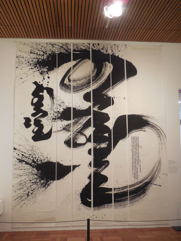
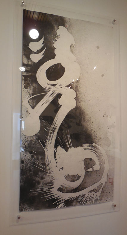
We combined these two sets of marks in more finished works.

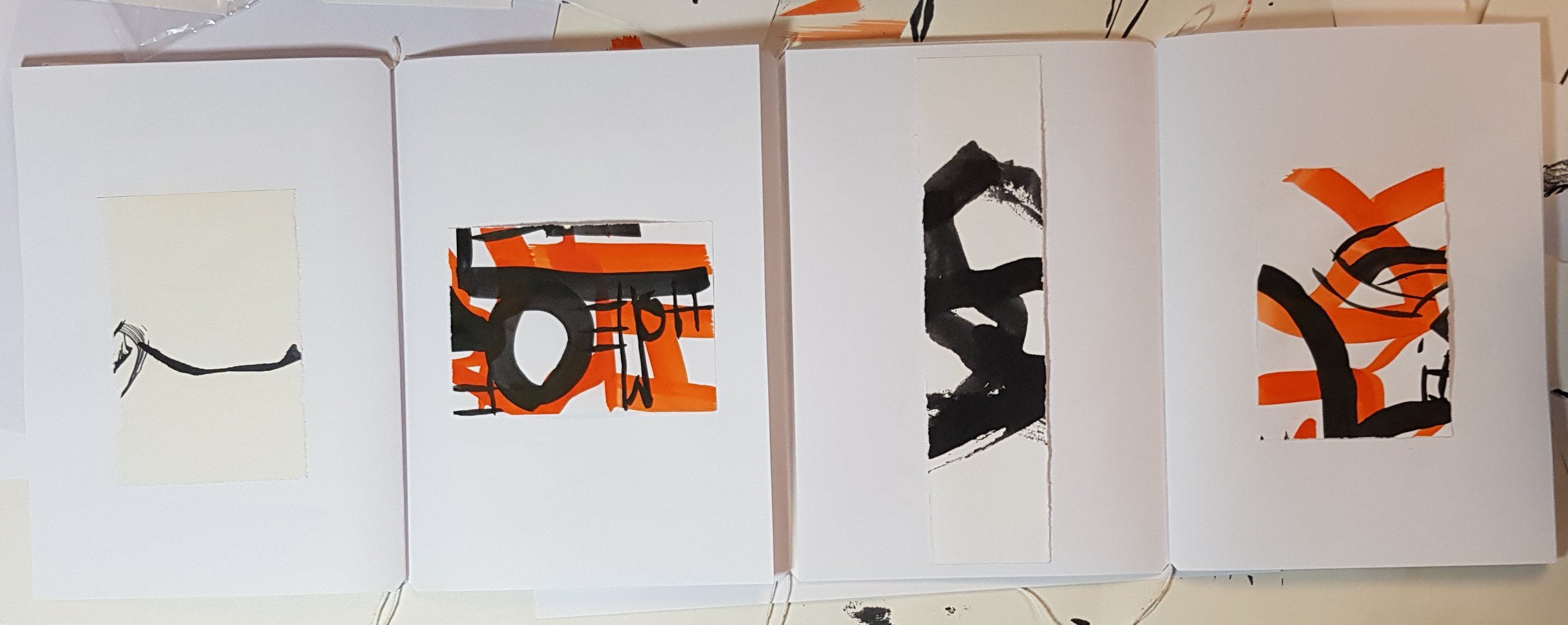
Adding colour boosted the energy of the work.

The final stage of the workshop was to display our finished pieces in a simple book structure, that allowed various combinations of work to be displayed.

Working on compostional combinations across my book.

Monica provided clear outlines and supporting material for the workshop. The 3 × 2 hour sessions flew by and participants were also offered a feedback session on their work after the class finished.

Three pages in my book.

I really feel that this class has opened up new possibilities for my work. I can certainly recommend Monica’s classes to anyone interested in exploring text and mark making.

Monica has told me that she will be running another online class, with times suitable for people in Australia, New Zealand and Asia, from 4-7 June. Please see Monica’s website or contact her for full details. Monica also presents online classes with times suitable for people in Europe and America.

You can see Monica’s work on her Instagram account @monica_dengo

Brushing up

During my brief stay in Adelaide I visited the Art Gallery of South Australia to see a ‘mini’ exhibition of calligraphic works on display in their Asian galleries. The exhibition, Brush and Ink, Contemporary Asian Calligraphy, displays large scale calligraphic works from China, Japan and Mongolia.

Japanese artist and commercial designer, Hiroko Watanabe’s installation takes up the end wall of the room. According to the room notes the 3D nature of this work is reflective of her work making commercial light-boxes to be placed on buildings. I always like to see ‘gesture’ in drawing and this work has it in bucket loads. I gather from the various reviews of this work that it was actually made during a performance with the group Above the Clouds, as part of the OzAsia festival. An interesting review of Watanabe’s performance can be found here.

"The value of the so-called invisible wind", Hiroko Watanabe, ink on Japanese paper (washi), 2014

“The value of the so-called invisible wind”, Hiroko Watanabe, ink on Japanese paper (washi), 2014

The Mongolian calligrapher’s were a revelation, quite literally I have never seen any of this calligraphy before and I only recently learned that there was a Mongolian script. This plaque attached to the Yonghe (Lama) Temple in Beijing is written in 4 distinct scripts from left to right as you see it Mongolian, Tibetan, Chinese and Manchu.

Inscription on the Yonghe Temple Beijing in  four scripts, (l to r) Mongolian, Tibetan, Chinese and Manchu.

Inscription on the Yonghe Temple Beijing in four scripts, (l to r) Mongolian, Tibetan, Chinese and Manchu.

The exhibition room notes say that ” calligraphers from Mongolia often describe the physical act of writing from the top down in one fluid motion, ‘as a man riding a very fast horse’, or like a falling coin'”. I can only concur as the overwhelming sense I had of these works was of their dynamic motion. This ceiling to floor work by D Ganbaatar is a case in point.

"Mongolian Pride" , by D. Ganbaatar, 2013, ink over 6 sheets of papyrus

“Mongolian Pride” , by D. Ganbaatar, 2013, ink over 6 sheets of papyrus

I’m still trying to understand how this work “Aspiration”, by Lkhagva Tuvshinjargal, has been made (apologies for the light reflections in the photo, they were unavoidable). I couldn’t tell if this was white ink on a previously prepared paper or some type of reductive technique, like bleach taking colour out of a dark cloth. If anyone knows how this technique is achieved I’d be interested to find out.

"Aspiration", by L

“Aspiration”, by Lkhagva Tuvshinjargal, 2013, ink on papyrus

If you would like to see more of  Lkhagva Tuvshinjargal work I found some on this Hungarian blog (Google translate works well as my Hungarian is non-existent).

I also enjoyed this small collection of calligraphy on ceramics, from the AGSA’s own collection, also on display as part of the exhibition.

Ceramics by Shoji Hamada and Milton Moon (and possibly another artist who's name I've forgotten)

Ceramics by Shoji Hamada and Milton Moon (and possibly another artist who’s name I’ve forgotten)

Additional images of Mongol calligraphy can be found on the following sites:

Mongolian National Modern Art Gallery – calligraphy

Mongolian Calligraphy on Facebook


A beautiful museum …

Imagine this, you’re in an amazing museum, with floors and floors of things to see and an hour and a half to do it in. What do you do? This was the dilemma I found myself in on several occasions while I was traveling in China. If you are on a group tour you have to accept that, in the words of our tour guide, what you consider ‘a beautiful museum’ is someone else’s ‘another boring museum’.

The Shanghai Museum of Art, built in 1996, in what can only be described as grand hotel lobby style (lots of marble), houses countless works of art and national treasures. I soon realised that I could only focus on a small portion of the collection. After a brief flirtation with the minority group textiles I wandered down a floor and found the amazing paintings of Zhang Lu, (1464 – 1538), who worked professionally as an artist, independent of the imperial court.  I was able to record these amazing works because you can take photographs in the museum as long as you don’t use a flash.

The Daoist Philosopher Liezi, by Zhang Lu

The Daoist Philosopher Liezi, by Zhang Lu

The dynamism of his brush strokes and ability to depict people with great economy really resonated with me.

Detail of the painting of the Philosopher Liezi by Zhang Lu.

Detail of the painting of the Philosopher Liezi by Zhang Lu.

The gold fragments, which may appear to you as spots on the paper, are actually inclusions in the paper. It’s quite a common type of paper to use for calligraphy even today.

I will share two other images with you. The Four Sages of Shang Mountain.

Detail of the Four Sages of Shang Mountain by Zhang Lu

Detail of the Four Sages of Shang Mountain by Zhang Lu

The Five Elders (also representing the five elements -Wood, Earth, Water, Fire, and Metal).

Detail of the Five Elders by Zhang Lu

Detail of the Five Elders by Zhang Lu

I could live in envy of Zhang Lu’s ability to paint such lively lines, but I know the benefit will come from my trying to develop such facility in my own work.

If you would like to see more images of Zhang Lu’s work I would recommend the Los Angeles County Museum of Art, Album of Daoist paintings, which was part of their 2013 Exhibition Ming Masterpieces from the Shanghai Museum.