Up close to Van Gogh

While in the Netherlands in 2019 we had the opportunity to binge, in person, on the works of Vincent Van Gogh at both the Van Gogh Museum in Amsterdam and the Kröller-Müller Museum in Otterlo. The latter is the largest private collection of Van Gogh’s work in the world and the second largest collection after the Van Gogh Museum. Unlike the Van Gogh Museum, the Kröller-Müller does allow photography so I was able to take photos and details of some of the works I saw during my visit.

The reason I am posting these photos now is that a fellow blogger, Rose Davies, has been spending some of her recent time attempting to copy Van Gogh’s painting Starry Night. As she commented in her recent post, “it’s so interesting to analyse a famous artwork and see what has gone into it”. So I thought I’d share a few of my detail shots and two drawings I made in the Kröller-Müller Museum.

Please note that these photos were taken standing back and using a close up lens, rather than with my face on the painting. Although I did see a man literally lean over a barricade, place his hand on the wall next to a Van Gogh self portrait in the Rijks Museum and literally stick his face only a few centimetres off the glass!

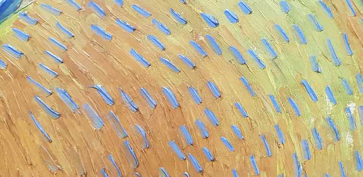
Enclosed Wheat Field with Rising Sun, late May 1889,

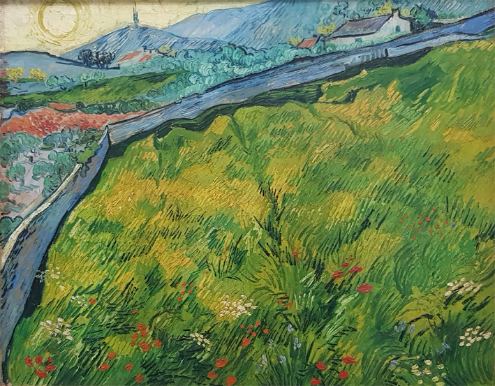
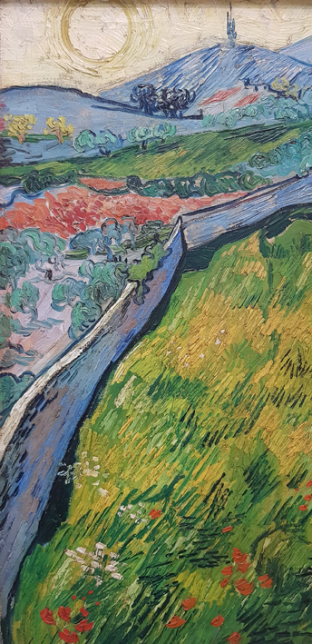
Detail from the left side of the painting (as we are looking at it).

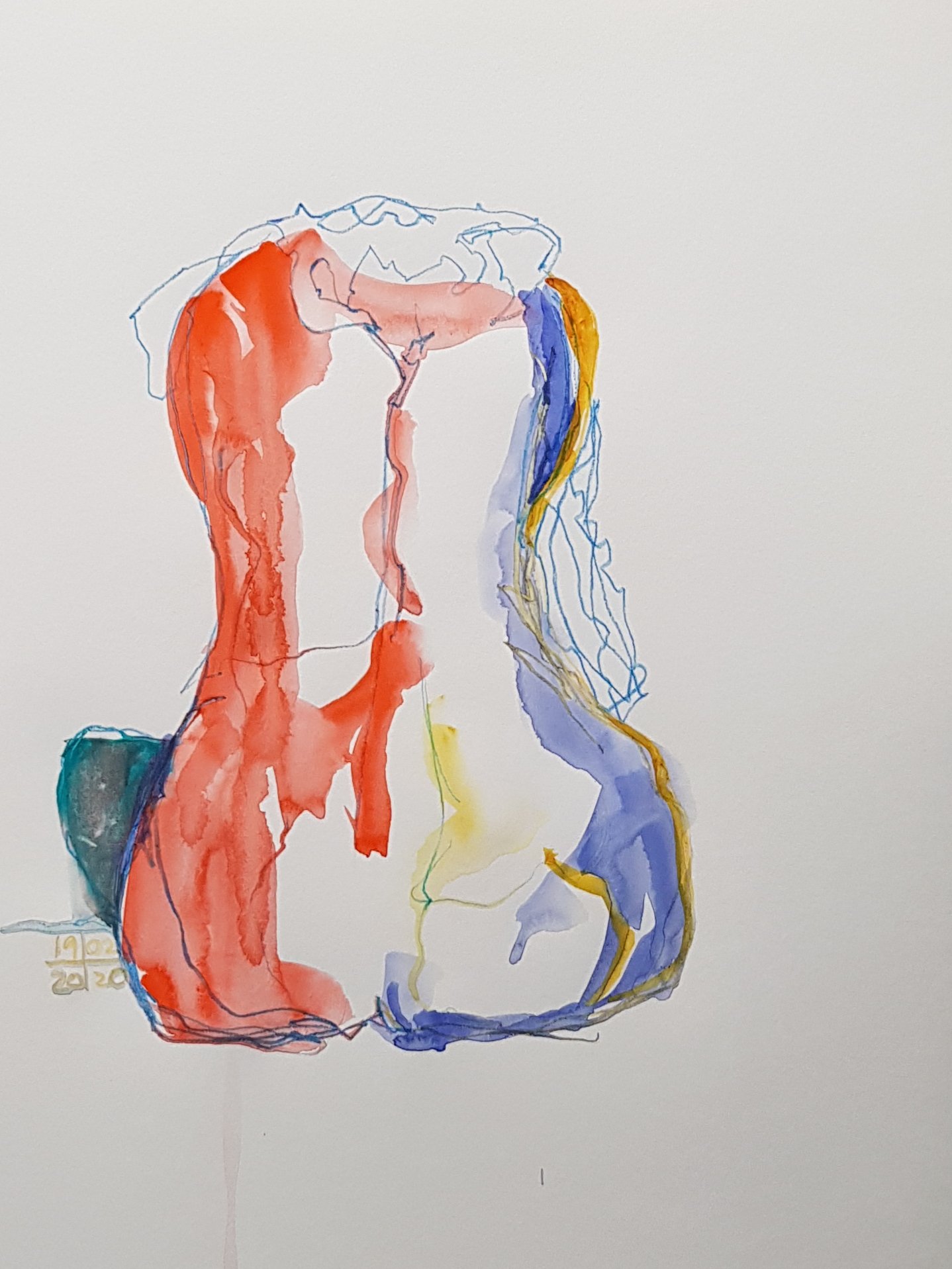
My notes on the painting, Enclosed Wheatfield with Rising Sun.

Wheatfields in a Mountain Landscape, early December, 1889,

Details of the tree from the left side of the painting (as we are looking at it).

vvg2a

Detail of the tree in the centre right of the painting, (as we are looking at it).

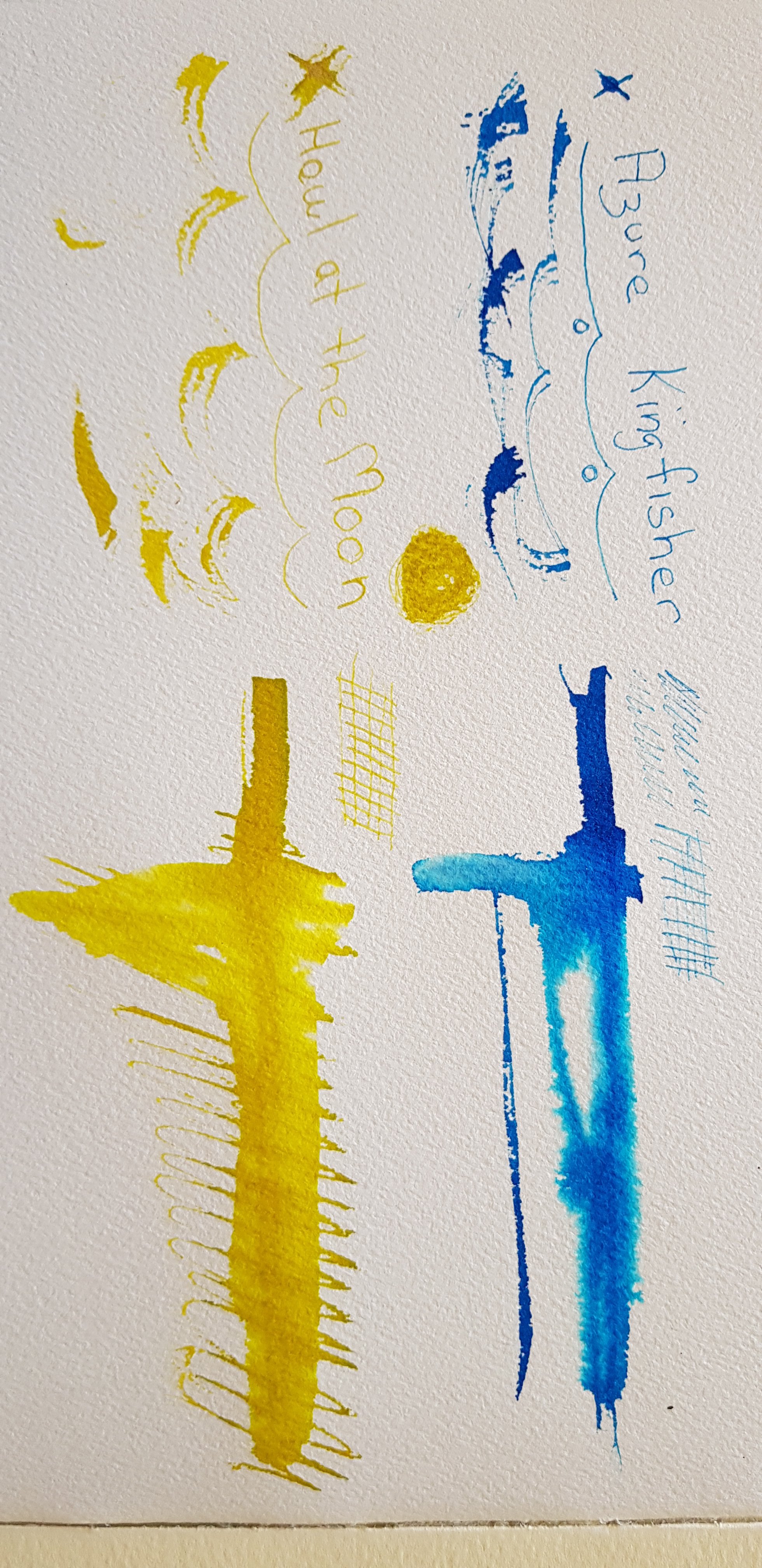
My notes on the colours of the tree on the centre right of the painting

Terrace of a Café at Night (Place Du Forum), circa September 1888

Detail of the street and figures to the far right of the painting, (as we are looking at it).

You can see those black arcs of ‘dry brush’ skipping over the other layers of paint.

Portrait of a Young Woman, late June-early July 1890

Detail of the left shoulder, (as we are seeing the painting).

I love how we are so simply led over the contour of her torso by those blue brush strokes, something that I noticed Van Gogh often does in his self-portraits as well.

Let’s hope that in the near future we will be able to see such art in person again.

Angel of the North [Tuggeranong]

Our omaaarrrgggge (homage) to the Angel of the North by Sir Anthony Gormley

Well what can I say, I love the idea of the art challenge sweeping the world’s museums and galleries where people try and recreate famous artworks at home. #museumfromhome, #betweenartandquarantine.

This is our contribution, as we have a maquette of the Angel of the North, in the National Gallery of Australia collection. 

Photographer Stephen Lee

Materials provided by Book Depository and Wine Selectors. Tape by Flying Tiger.

The artist wore her own clothes (allbeit in unusual ways, she does know how to wear them normally).

Cursive ‘a’

Thank you, thank you, thank you Rachel Hazel (aka thetravellingbookbinder) for your latest inspiration.  It is just what I needed today. I had hit a slump and didn’t know what to do with myself, until I recalled Rachel’s blog post from a few days ago on making an alphabet sketchbook.

This is such an uncomplicated project that it almost seems too easy … and yet it is just the thing to jog you out of a malaise. The idea is to take your book and some ink and just start writing the same letter across the page. Rachel suggests using a stick and some ink, which I duly did. I used two products: Ecoline Liquid Watercolour by Royal Talens, in Deep Grey; and Noodlers Ink in Squeteague. The stick I picked up in our garden.

Two liquid media that I used for my alphabet book.

I am working into a Japanese accordion book which has just been waiting for such a project. I think that I bought it nearly 10 years ago.

The process of writing is quite absorbing. After a while it is hard to recognise the letter, the shape instead comes to the fore. It feels a bit like that thing you do when you repeat a common word over and over until it ceases to mean anything and dissolves into a jumble of sounds.

This is my favourite page so far. I made a whole lot of random marks on the page and only let it partially dry before working back into it.

As you can see from my photos I didn’t stop at one page. At my current rate expect that this will probably end up as the book of ‘cursive a’.

Only part way through and I can’t see it stopping anytime soon.

I suggest that you take a look at the fantastic images on Rachel’s blog. She at least has managed to get past the letter ‘a’ and shares some very beautiful pages and a short flip through of her book as well.

Inky Fingers

I’m not sure if ink is the latest “thing”, but it certainly seems to be on trend at present. Wherever I turn there is a new range of inks and new companies to discover. Alas I am a frail spirit and I easily succumb to the enticement of new art products.

This time it’s ink from Van Dieman’s Ink in Tasmania (Van Diemans Land being the Dutch name given to the island after they ‘discovered’ it several tens of thousands of years after the indigenous Palawa people got there). But I digress. I hadn’t heard of the company but the inks looked interesting and I was able to buy 2ml sample size bottles which inspired me to try 4 colours.

I chose Cradle Mountain Grey, Blackened Seas, Azure Kingfisher and Howl at the Moon. The last two are ‘shimmer inks’, that is they have tiny fine particles of glittery stuff in them. None of these inks is waterproof. The company does list them as light and age resistant. As I am most likely to use these in my sketchbooks that shouldn’t be an issue for me. I have tried the inks out on my 300 gsm cold pressed Arches watercolour paper. Although the nibs that I tested them with really don’t do well on the toothed surface I wanted to see the initial colour and whether bleeding on damp paper would yield secondary colours. You can see the results below.

The Cradle Mountain Grey is the colour I find the most versatile of these inks. It also has some interesting secondary colours when drawn out with water. I really dislike the definite-ness of the black ink line and watercolour approach that many sketchers use. This grey backs off a fraction from that dark insistent line. It will be interesting to see how it goes when I am sketching with it in my fountain pen. The Blackened Seas is also an interesting colour, that I could see myself using.

The two shimmer colours I will likely only use with a dip pen and brush as there is no guarantee that I can fully clean them out of a fountain pen. I can see the silver shimmer in the Howling at the Moon colour, but there wasn’t much obvious gold shimmer in the Azure Kingfisher. It might be that I didn’t shake the sample up sufficiently well, or perhaps my sample didn’t containmuch gold in the first place. If you look at the photo you can see how the shimmer inks settle out after sitting for a while.

The 2ml samples give me plenty of ink to play with. I am looking forward to further expermentation.
Further information about the inks and the full colour range can be found here.

Life Drawing .

Last week I went to my first life drawing class of the year. We had a stand-in model, one of the class, as the booked model cancelled just before the class started.

I took the big tip from last year’s classes and bought myself a roll of paper from the kids section of IKEA for the short poses. As you can see you just keep rolling it up and over the easel.

Short sketches in coloured pencils.

For my quick poses I used coloured pencils, part of my drive to start using all those stray art materials I have hanging around.

For the longer poses I swapped over to watercolour. Our group is quite eclectic in terms of media. We ranged from pencil to digital, acrylic and watercolour.

15 minute pose, watercolour and pencil, two versions.
15 minute pose, watercolour and pencil.