Turner watercolour workshop, Day 2

Day 2 took off at a similar pace to the first day of the class. Toni started by walking us through some ways of making sketches. According to Turner’s contemporaries Turner carried a rolled up sketchbook in his pocket and drew with his pencil as if writing. By leaving the pencil on the surface of the paper the pencil moves easily over the paper and delicate lines can be drawn, which may readily be painted over later. You can draw this way quite quickly and if you have the time additional detail can be added. Another method, even quicker still, is to do a ‘thumbnail’ sketch just getting the most basic shapes in, using the lightest tones at the back and darkest tones at the front. Here is my sample of these two approaches. The top sketch formed the idea for the first colour work below.
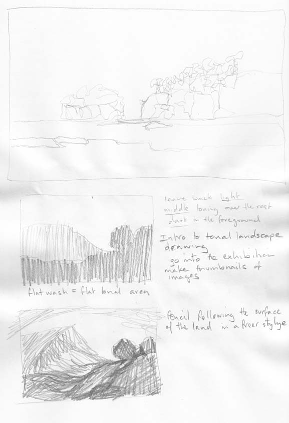
Two sketching techniques. The top a pencil moves quickly and lightly over the surface. The lower two are fast thumbnail sketches.

Two sketching techniques. The top a pencil moves quickly and lightly over the surface. The lower two are fast thumbnail sketches.

Turner was able to do 10 to 15 sketches in the time he could do one colour study. If you look at Turner’s sketchbooks you can see the numerous quick sketches that he he made while traveling by carriage through Europe. Once he was settled into his overnight accommodation Turner could then add colour to these studies or further work up his sketches or colour studies.

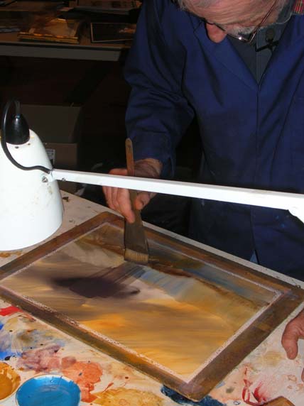
Toni then demonstrated how to use normal cartridge paper for watercolour studies without having to tape the paper down. The way you do this is to wet both sides of your cartridge paper and place it on a smooth surface, such as a piece of glass or plastic and then the cohesion of the water molecules will hold it in place. Of course you do need to work wet into wet using this approach.
cartridge paper wet of wet technique

Cartridge paper wet of wet technique. The darker lines are made using the end of my brush and the ‘lifted’ area in the upper right is made by flicking my fingernail up the wet paint.

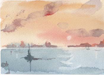
I was really happy with this as a way of doing quick studies. Here is another one.
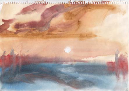
Waterscape on cartridge paper

Waterscape on cartridge paper

The main drawback with using cartridge paper is that you are pretty limited with the sort of ‘lifting’ techniques you can use. Wiping with a tissue works, but the creating the sun in the image above actually tore into the paper.

After lunch we had a lecture by Dr Joyce Townsend on Turner’s materials. I think that the most amazing aspect of her talk was her obvious delight at being able to actually use Turner’s original pigments, that were left in his studio at his death (part of the Turner Bequest), to paint samples demonstrating the colours he used.

Turner's studio materials: madders of different shades,  on 19th century Whatman paper, painted by Joyce Townsend.

Turner’s studio materials: madders of different shades, on 19th century Whatman paper, painted by Joyce Townsend.

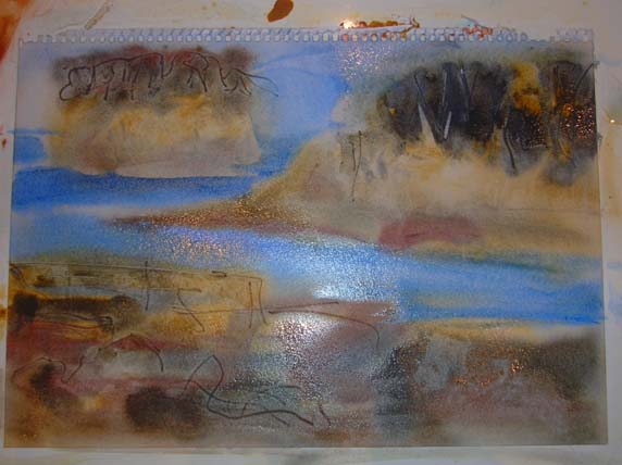
It was then up to us to bring together what we had learned to develop a final work on BFK Rives paper. While this paper is made as a printmaking paper Toni said he had found it to be the best paper to allow working, re-working and lifting techniques including scraping with a knife. Here is my final piece.

Watercolour on BFK Rives paper 31 July 2013

Watercolour on BFK Rives paper 31 July 2013

From my perspective, the quick sketching and fast ways to work up colour studies are the main things I have taken from this workshop. That and the need to get out and apply what I’ve learned over these two days.
Turner watercolour workshop, Day 1

I’ve had a wonderful two days this week doing a watercolour workshop at the National Gallery of Australia on  JMW Turner – learning from the master. The course was held as part of the Turner from the Tate exhibition. Our tutor was Tony Smibert, who is a Tate Gallery Visiting Artistic Researcher. Toni’s area of interest is watercolours and he has worked closely over the years with Dr Joyce Townsend who is the leading specialist on Turner’s materials (paint, paper, tools etc).

Toni Smibert demonstrating JMW Turner's watercolour techniques

Toni Smibert demonstrating JMW Turner’s watercolour techniques

We set off at a fast pace as Toni discussed and demonstrated the methods that Turner used. Turner’s work uses many basic concepts, such as the relationship between warm and cool colours and light and dark contrast. We worked on small areas, dividing up sheets of Arches watercolour paper, to record methods and processes. Toni suggests repeating these exercises, making many small works so these techniques become ingrained. This is not so you develop slavish copying but to help you get to the point where you can intuitively use the techniques as and when it applies to your own work. Like Toni said doing the exercise once won’t teach you the method.

Day 1, my sample page

Day 1, my sample page

Simple design structures such as a washes of warm colour above a wash of cool colour, suggesting sky over water, or the reverse suggesting sky over land were explored. With a bit of guidance we were able to readily produce a convincing waterscape.

A waterscape using a warm wash above a cool wash.

A waterscape using a warm wash above a cool wash.

We then explored ideas such as dropping cool colours into a warm background:

Cool colours into a warm background - the basis for Turner's "Blue Rigi"

My sample of cool colours into a warm background
– the basis for Turner’s “Blue Rigi“

and warm colours into a cool background to develop landscapes. This flows from another method which is ‘finding the landscape’ in the paint. Basic structures can be worked and re-worked to develop a final image.

My sample of warm colours into a cool background

My sample of warm colours into a cool background – similar to Turner’s approach to a “Study for the Red Rigi“

It was a very full day. At the end of our class we went into the exhibition so Toni could show us some specific examples of Turner’s techniques and demonstrate some approaches to doing quick sketches. What a luxury to have the originals to study so closely.

Printing at Megalo

On Friday I spent my first day printing at Megalo, our public access print facility, for the first time in over a year. There have been big changes as they have recently moved to a newly renovated building. It’s full of light and very pleasant to work in.

I had no specific plan of what i would print so I decided to play around. I’m pretty much a screen printer, but I like to be fairly unstructured in my print making approach. I generally print with dyes rather than pigments which allows for some very free image making and the ability to use some water colour techniques as well.

Printing at Megalo. The plastic sheeting is needed to protect the print table from the dyes.

Printing at Megalo. The plastic sheeting is needed to protect the print table from the dyes.

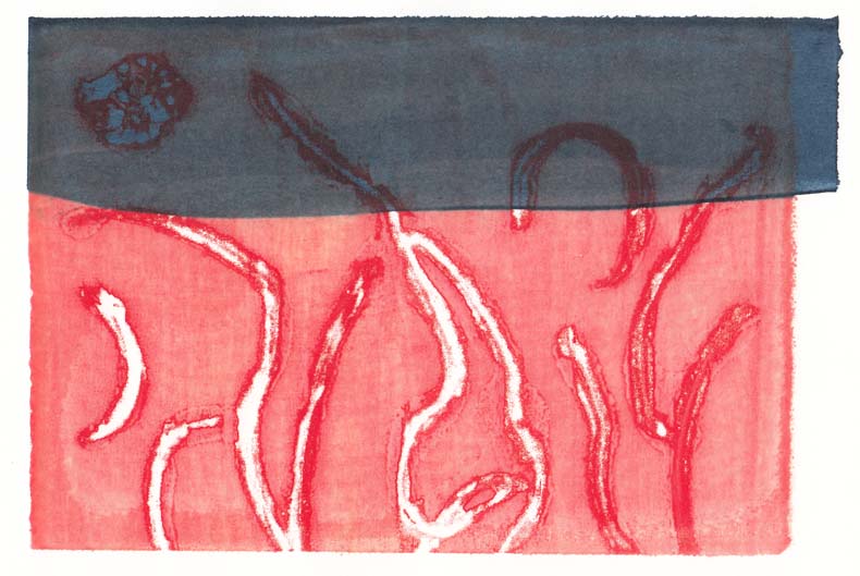
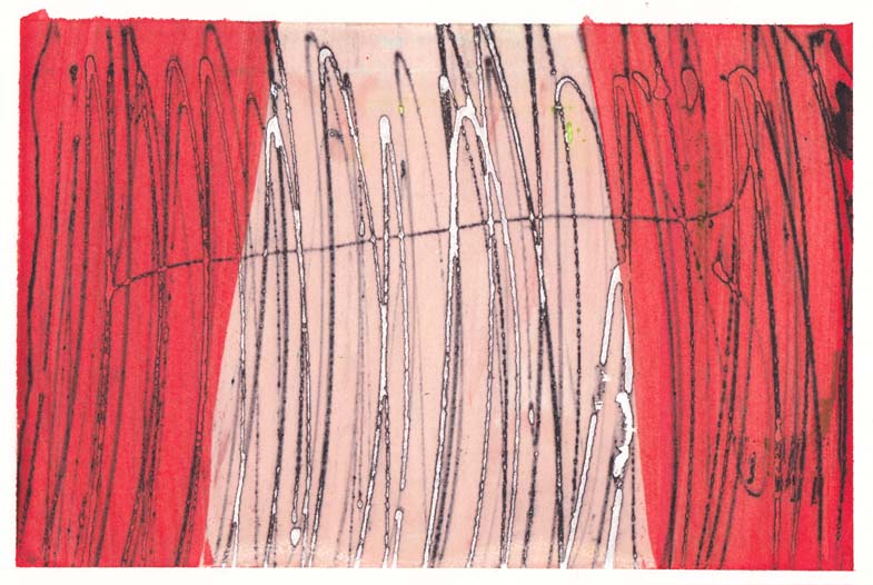
To make things a bit easier for myself I chose to print on A4 size sheets of Stonehenge paper. I also decided that I would just do whatever doodles came into my mind, no preciousness allowed. Here are two of my prints.

Screen print using dyes, 26 July 2013

Screen print using dyes, 26 July 2013

Screen print using dyes, 26 July 2013

Screen print using dyes, 26 July 2013

I’m really pleased with the outcomes and I’m looking forward to my next printing session. I thought I handled the long days printing quite well – that is until I got home and promptly fell asleep in front of the TV.

Japanese Ceramics

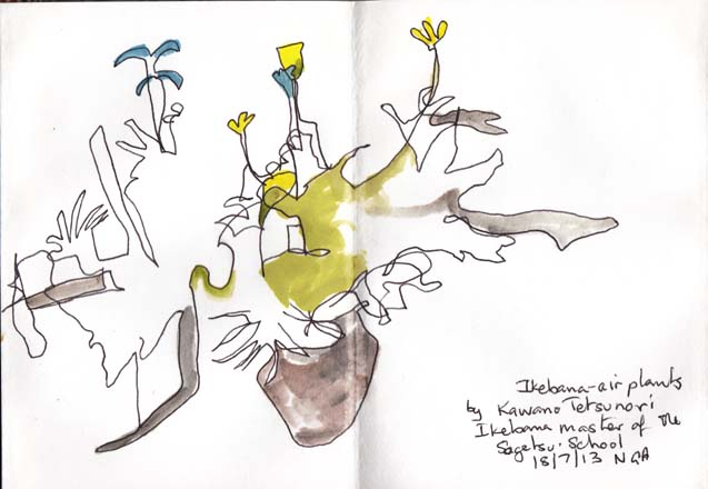
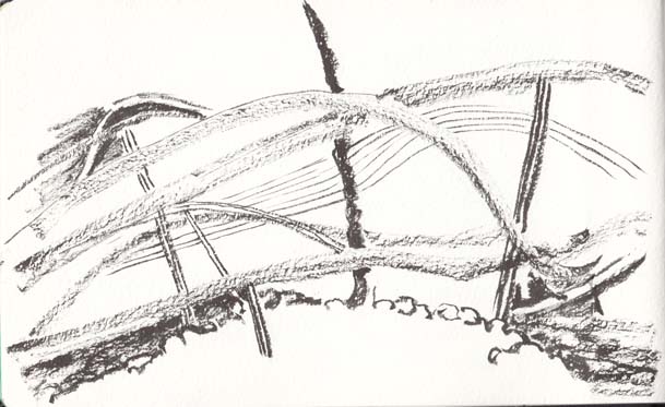
Yesterday I went to the first of a series of four lectures on contemporary Japanese ceramics, which are being held at the National Gallery of Australia. While waiting for the audience to settle in I did a quick ‘blind’ drawing of the image on the screen of an ikebana arrangement by Kawana Tetsunori, a master of the Sogetsu School of ikebana.

Kawana Tetsunori, ikebana arrangement, 18 July 2013

Kawana Tetsunori, ikebana arrangement, 18 July 2013

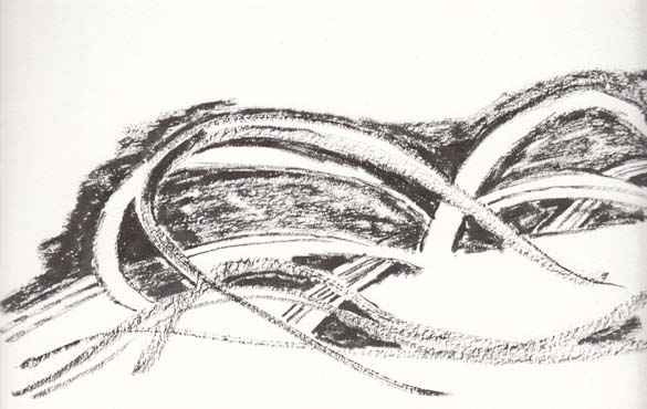
I love the serendipity of life. When I looked up Kawana San’s website I realised that I had seen a major installation work of his, ‘Five Elements Water’, at the National Gallery of Victoria in June 2009. Not only that, but I had made a number of drawings of the installation.

Five Elements Water, Kawana Tetsunor,i NGV Melbourne, June 2009

Five Elements Water, Kawana Tetsunori, NGV Melbourne, June 2009, brush pen on paper

Five Elements Water, Kawana Tetsunor,i NGV Melbourne, June 2009     Five Elements Water Kawana Tetsunori, NGV Melbourne June 2009, brush pen on paper

Five Elements Water Kawana Tetsunori, NGV Melbourne June 2009, brush pen on paper

Five Elements Water, Kawana Tetsunor,i NGV Melbourne, June 2009     Five Elements Water Kawana Tetsunori, NGV Melbourne June 2009, brush pen on paper

Five Elements Water Kawana Tetsunori, NGV Melbourne June 2009, brush pen on paper

The lecturer, Dr Wendy Ella Wright, was drawing attention to the link between post-WWII Japanese ceramics and their use by more contemporary Japanese schools of ikebana. OK, enough of the ikebana diversions.

I also did a second drawing of a work by Hayashi Yasuo called ‘Cloud’. This piece was made in 1948 and has a very glossy black surface. I’ve been unable to find out how large this piece is.

Cloud, Hayashi Yasuo, 1948, water colour and pen

Cloud, Hayashi Yasuo, 1948, water colour and pen