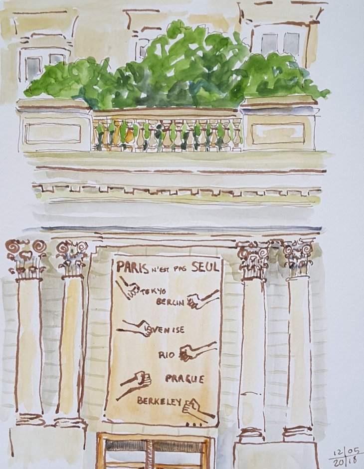
It depends where you come from, but there isn’t much in the way of Greek or Roman sculpture in my neck of the woods. So it has been an absolute blast to visit the Louvre and have a go at sketching some of their collection. Here are some of the sketches I have made in the last few weeks.
First stop was the ‘Winged Victory of Samothrace’ I liked her so much I drew her from both sides.

This is her ‘best’ side, apparently the carving is more detailed than the right hand side.
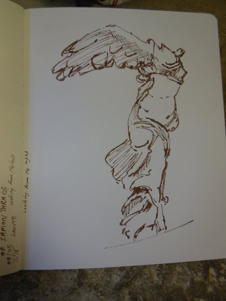
Not her ‘best’ side, or so the museum guide says.

We were thrilled to see another man sketching the Winged Victory as well, so we had a mini ‘show and tell’ of our combined works

‘Winged Victory of Samothrace’, 3rd-1st Century BC, marble
Well the next goddess on the list had to be the ‘Venus de Milo’, that is once we could see her through the crowds. One of our friends told us about the late evening openings (Wednesdays and Fridays) and while there are still people around, most of the large tour groups are well away. I was pleased with my rough sketch, the torso in particular, so I decided to leave the sketch ‘unfinished’.
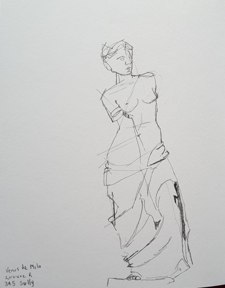
The Venus de Milo, not much more to add.
After braving the hordes staring at Venus I decided to move to a quieter part of the galleries. There I found the Athena Parthenos who, was sent back to Paris from Rome by the artist Ingres, who was head of the Académie de France, in Rome at the time. She sometimes goes under the name of the Ingres’ Minerva for that reason. For a while she hung out with the students at the Ecoles des Beaux Arts, but she moved over the river to the Louvre in 1913. Unluckily for Ingres she wasn’t an original Greek statue, but rather one of several copies of a sculpture by Phidias.
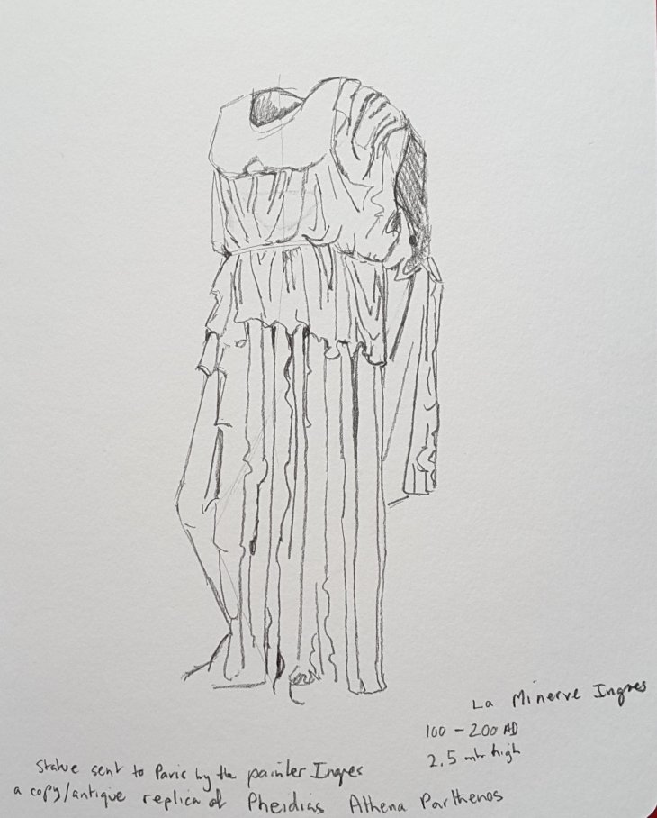
Roman copy of the Athena Parthenos, 100-200 AD, also known as the Ingres’ Minerva
Last but not least there was a delightful torso of the goddess Artemis (Diana). I couldn’t get over how finely carved the pleats around the neck of her dress are. The sheer skill of the sculptors never ceases to amaze me. The drapery covering these bodies flies or flutters in the wind and is ‘transparent’ enough to reveal the shape of underlying limbs.
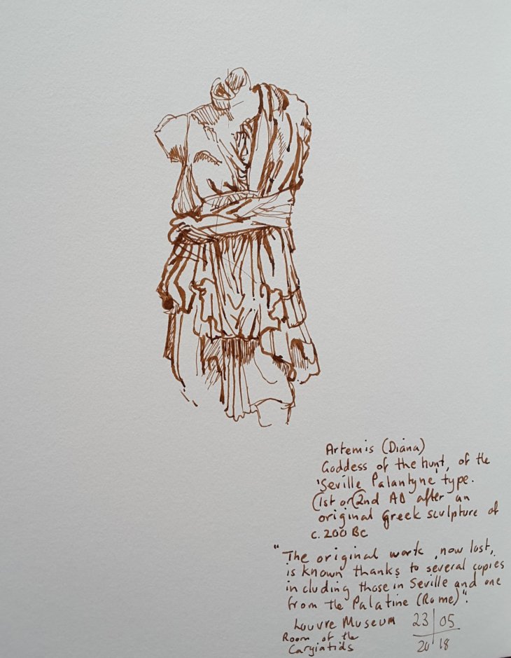
Artemis, goddess of the hunt, 1st or 2nd century AD. One of several copies of an original Greek sculpture, now lost