A few days ago I visited the Musee de l’ Orangerie, for their exhibition ‘Waterlilies: American abstraction and the last Monet’. (And yes I am in Paris). The jumping off point for this exhibition was the ‘rediscovery’ of Monet’s last waterlily paintings and the impact this had, on Abstract Expressionism, when Alfred Barr showed one of the large waterlily paintings in 1955 at the Museum of Modern Art in New York.
To quote one of the information panels, “As the impressionists attempted to deal with the optical effects of nature, … they [American Abstract Impressionists] were interested in the optical effects of spiritual states, thereby giving an old style a new subject”. Elaine de Koenig ‘Subject: What, How or Who?’, 1955.
It’s a challenge with such a show, not personally having done the requisite scholarly research, to asses the merits of the case put forward. Nonetheless the hanging of the exhibition, designed by Eric de Chassey, displays powerful resonances between Monet’s work and those of the other artists represented in the show.
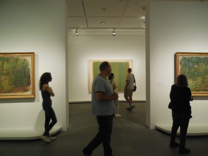
Two of Monet’s versions of the Japanese Bridge, 1918, hang either side of Morris Louis, Vernal, 1960
Flanking the scene above were Jackson Pollock’s, Untitled, circa 1949,
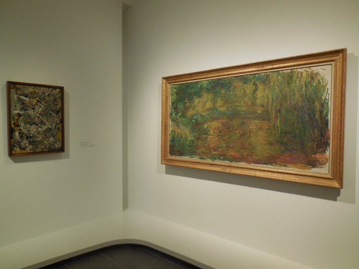
Pollock and Monet

Jackson Pollock, untitled, circa 1949, tissue, paper, cardboard and enamel paint (?) on panel
and Willem de Kooning’s Villa Borghese, 1960.
Willem de Kooning, Villa Borghese, 1960, oil on canvas
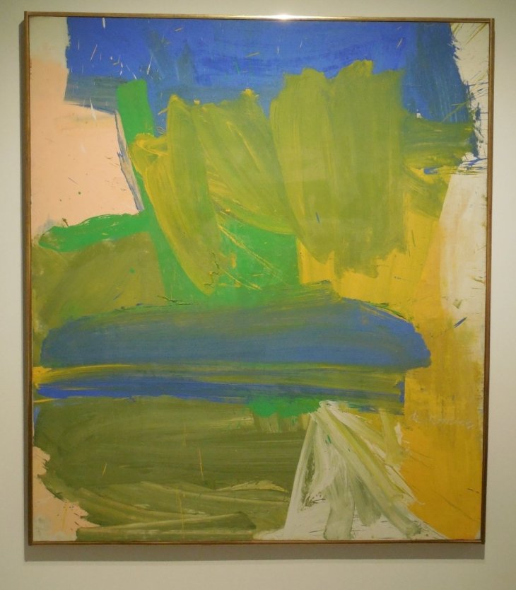
For me it would have been worth going if only to see such works as Helen Frankenthaler’s Riverhead, 1963.
Helen Frankenthaler, Riverhead, 1963, acrylic on canvas
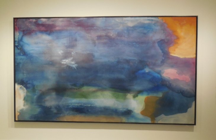
and the work of other Abstract Expressionist artists that we don’t generally see in Australia, such as Sam Francis.
An added bonus was the prentation of a painting and a series of sketches of waterlily leaves by the late Ellsworth Kelly, at the entrance to the Monet galleries. An absolute joy.
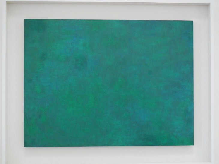
Ellsworth Kelly, Tableau Vert, 1952

Ellsworth Kelly, Waterlily, 1968, and reflections of some random people.
My take on this show was the joyous use of colour. Here is a little summary of some of the works.

Top row, left to right: Kelly, Frankenthaler, Monet. Bottom row: Monet, Louis, Francis

You are right – what color.
LikeLiked by 1 person
Thanks Claudia. In so many galleries I have visited I am sucked straight to the works with saturated colours!
LikeLike
Yes, me too. More than subject or style, it is the colors.
LikeLiked by 1 person
What an interesting concept for an exhibition – some lovely work here. I initially reacted to the “Tableau Vert” painting by thinking “It’s just green” and then I thought it’s got a resonance – I bet it looks a lot better in real life, like a Rothko.
LikeLiked by 1 person
Yes, the painting absolutely ‘hums’ when you are close. On reading the wall text I gather that Kelly studied Monet’s work quite intensely.
LikeLiked by 1 person