This sketch of breakfast at the Bean and Grain cafe, at the Fyshwick fruit and vegetable markets, was done in several stages. I started it several weeks ago but didn’t get a chance to finish it until last week. I decided to add my breakfast plate (after the yummy serve of bakery-made crumpets was gone) for a bit of extra interest.
Tag / watercolour
Colour therapy
I decided to buy some of the Daniel Smith watercolours that I tested last week and a few days later they were in my letterbox. Along with my purchases came yet another sample palette, this time from David Taylor, an Australian watercolour artist. I sat down the other morning to do another test run of this set of colours – but I’ll spare you the details because I realised that I was just having immense fun mixing colours on the page.
What a revelation that I find myself so tied up in drawing and painting specific subjects that I have managed to forget how good it is just to play with colour!

LHS, Cobalt Teal Blue with a flash of Cadmium Red; and RHS, Quinacridone Gold blending with Bloodstone Genuine
I’ve decided to make a book of my colour samples, not only because I can use them as a reference, but also because I’m sure they will bring me great joy simply to look at!
If you would like to indulge in other explorations of colour I can highly recommend I Send You This Cadmium Red… A correspondence between John Berger and John Christie, Actar, (English language edition 1999). This book documents an exchange of colours, ideas and exploration of colour and its meaning and expression between Berger, an art theorist and novelist and Christie, a documentary maker and creator of artist’s books.
Cafe Wednesday – on yer bike
A friend joined us at the cafe this week so there was more chat than drawing. The wind was quite bitter so we huddled under the awning where the cafe blinds gave us some protection.
Thankfully another patron parked their motorbike in a convenient position for me to draw.
Canberra Sketchers Group in Braddon
The first few meetings of the Canberra Sketchers Group were focused on Canberra landmarks, such as the National Gallery of Australia and Lanyon Homestead, but this time we decided to hit the city streets – or more specifically Lonsdale Street in Braddon. In the perfect autumn sunshine of a Canberra Sunday morning, the street was jumping. Cafes full of patrons, people cramming the footpath and more traffic than a busy weekday lunchtime!
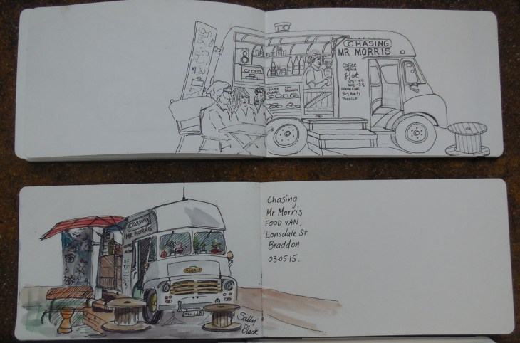
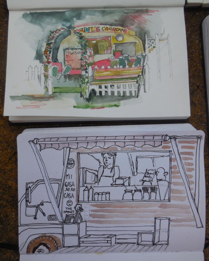
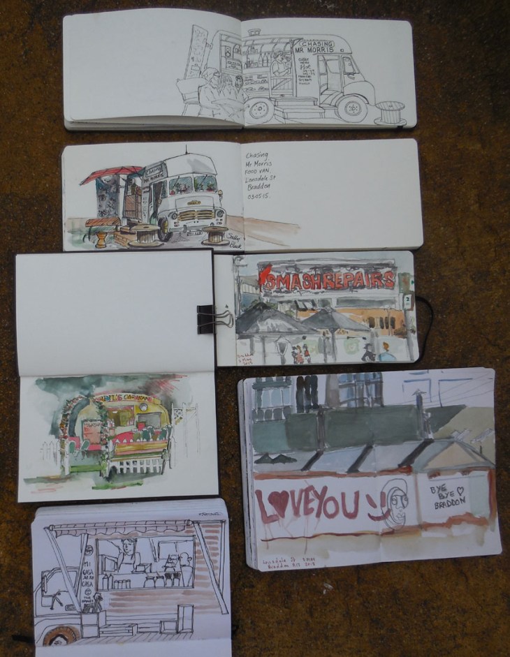
The group was pretty unanimous in heading to ‘The Hamlet’ where a whole pack of food vans are ready to supply hungry people and provide a subject for our group to sketch. There were various food vans to draw which occupied many of the group for the whole of our time on location.
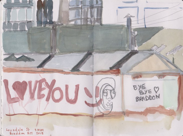
While the food vans and cafes represent the new face of Lonsdale St, I decided to focus on what was rapidly being knocked down and bulldozed away. Prior to it’s rejuvenation, this part of Braddon was home to car yards and mechanics workshops. This sign is about all that’s left of that era now.
While I’m not sad to see the car yards go, I am sad to see that local landmarks such as the Cornucopia Bakery and The Electric Shadows bookshop have ceased to exist. At least I know I’m not quite alone in missing that local history.
Here are some of the day’s efforts.
Testing, testing – Daniel Smith Watercolours
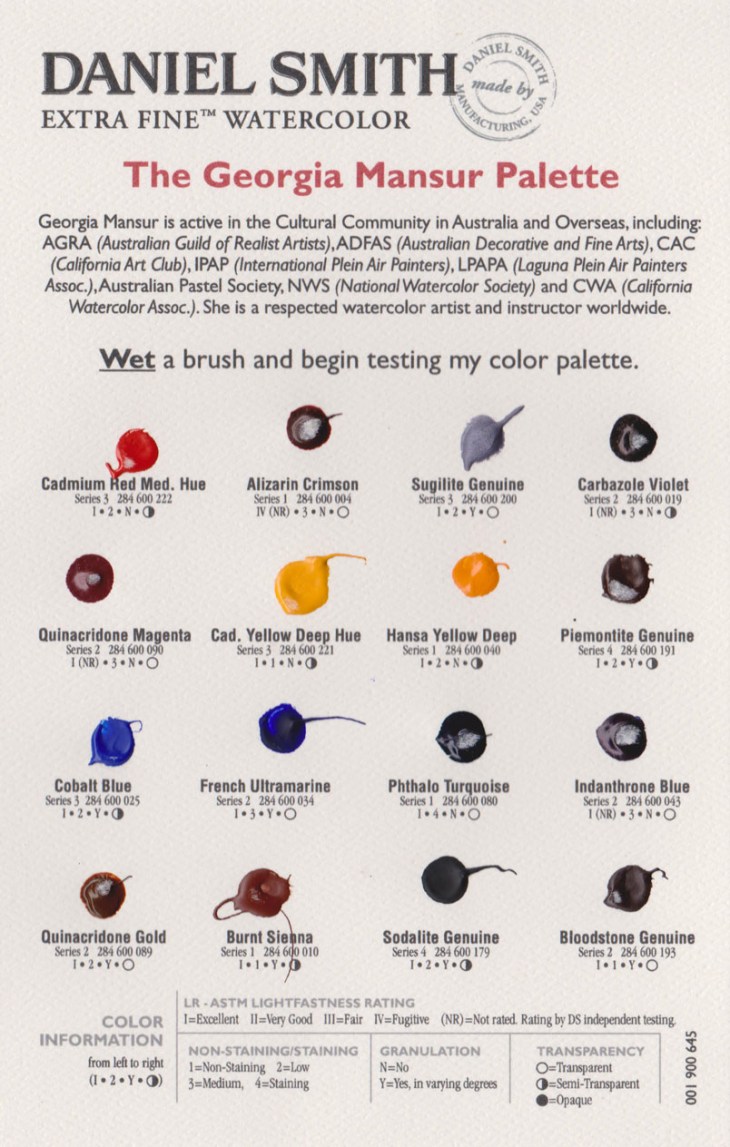
The range of paints on offer to watercolour artists these days makes me feel like I’m stuck between being a ‘kid in a candy store’ or caught in an expensive minefield. With the cost of tubes of paint so high, experimentation can come with a big price tag. I was trained to mix my paints from a standard set of colours so selecting from the 195 colours on offer in the Daniel Smith range, excluding the 48 Luminescent™ watercolors also available, is a daunting prospect. With all that in mind I recently sent for a free sample card of watercolours, The Georgia Mansur Palette, from Daniel Smith Extra Fine Watercolor.
The Georgia Mansur palette, a modest 16 colours, is fairly close to what I normally paint with. Although is does include colours such as Quinacridone Gold, Pthalo Turquoise, Indanthrone Blue and Carbazole Violet that I don’t normally use. I was keen to see how these paints would stack up against my usual Windsor and Newton (W&N) colours.
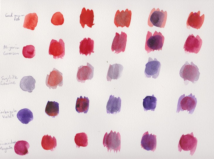
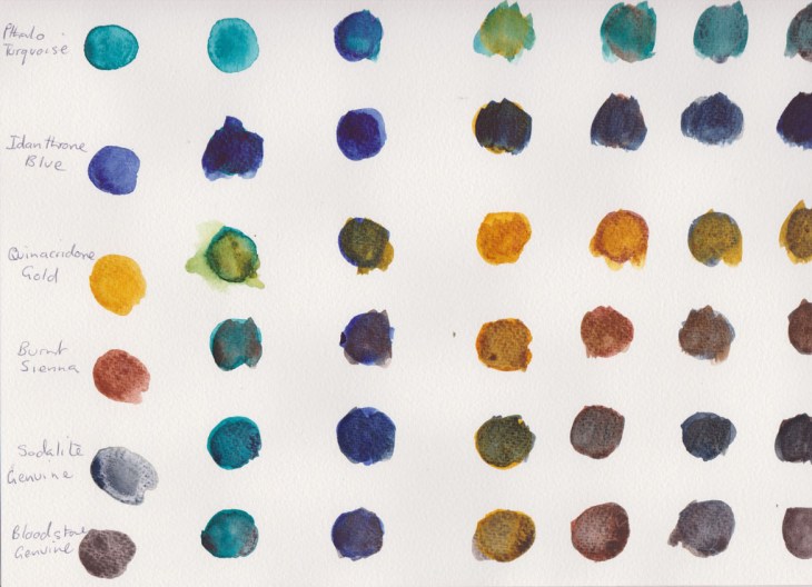
I started by making a series of colour tests, mixing the 16 paint samples in a matrix, just as they came on the sample card.
The paints were painted on a Canson 200gsm cold pressed Montval Aquarelle block.
My initial assessment is that I couldn’t see much difference between the standard colours in the Daniel Smith (DS) range eg Cadmium Red, French Ultramarine etc, to those I use already. The one exception was the DS Burnt Sienna which seems particularly ‘thin’ in comparison to the Windsor and Newton version of the pigment. I have no idea why this is the case.
Many of the painters I’ve seen on online video tutorials and DVDs are using new classes of pigments, such as the quinacridone’s, that provide a greater intensity and lightfastness than more traditional pigments. I wasn’t sure about how these would work in my palette, but I’ve been pleasantly surprised by the Quinacridone Gold that I sampled. It mixed in a beautiful way with many of the other pigments, particularly with the natural pigment paints such as Sodalite and Bloodstone Genuine, (see below).
I found the Pthalo Turquoise and Carbazole Violet to be a very intense colours, that are of little relevance to the landscapes I normally paint. I could see these paints being used in a tropical setting, but at this stage they are not colours that I’d buy.
What did come as a revelation were the four PrimaTek® Colors included in the palette. As the enclosed information said these are “made from naturally occurring pigments. …Most have a natural luminosity and many granulate.” The Sugilite Genuine has a silver sheen that I first mistook for a synthetic additive (it’s the 3rd colour down on the chart of ‘red’ colours), unfortunately I don’t think the scan clearly shows its natural luminosity. I was particularly taken by the Sodalite Genuine and the Bloodstone Genuine, whose ‘aged’ colour really appealed to me. I’m also a girl who loves granulation in a pigment!
Now the good news is that if you’re interested in sampling the Daniel Smith paints you can purchase samples of Paint It Colour Cards, at $A7.95 for 66 colours or the full range of 238 colours at $A33.65. That’s a lot of testing to do! If you are in the market for 15 mml tubes of paint you are looking at prices between $A20-$A40, depending on the pigment you are selecting. I think it’s definitely worth exploring the colour card option to help you decide what you do and do not like.
My top picks from the Georgia Mansur Palette were Quinacridone Gold, Sodalite Genuine and the Bloodstone Genuine. I’ll be adding these to my regular colour palette.


