Today we met up with friends to explore the site of the former Honeysuckle Creek Tracking Station where the first pictures of Neil Armstrong and Buzz Aldrin walking on the Moon were transmitted to the rest of the world. (Yeah-nah, not ‘the Dish’ at Parkes).
The infrastructure is largely gone, but there is now a set of information panels and a series of sculptural elements by Canberra sculptor Michael Harding.

Our intention had been to sketch on site, but it didn’t happen. We went prepared to BBQ our lunch only to discover that the gas in the BBQs had run out.
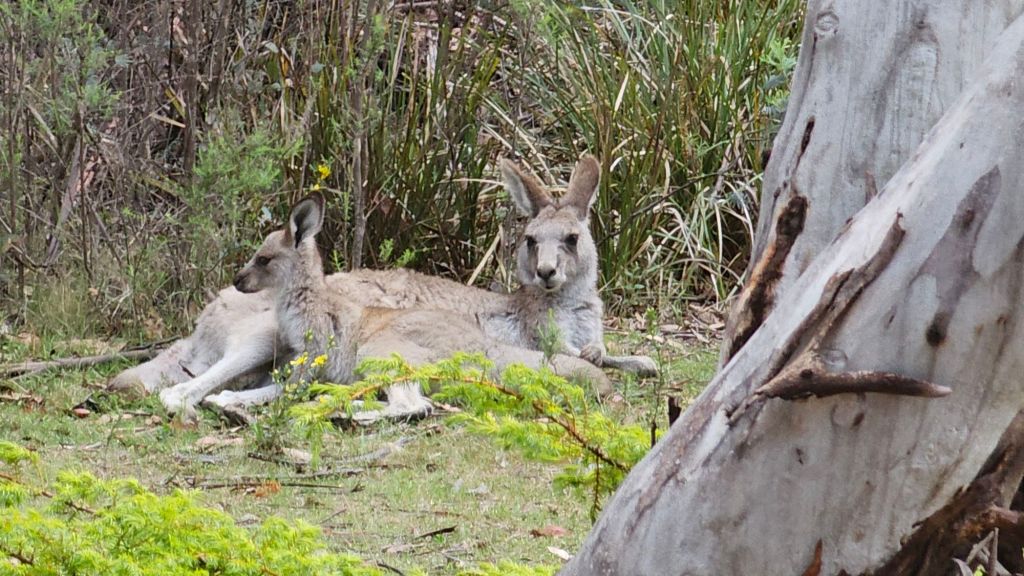
In the end we drove back to the Ranger Station and cooked our meal there. While not quite the view I was planning I did complete a sketch of the nearby rural landscape.

This is the first sketch in my new sketchbook. So you could say “one small sketch” (sorry that’s so lame).