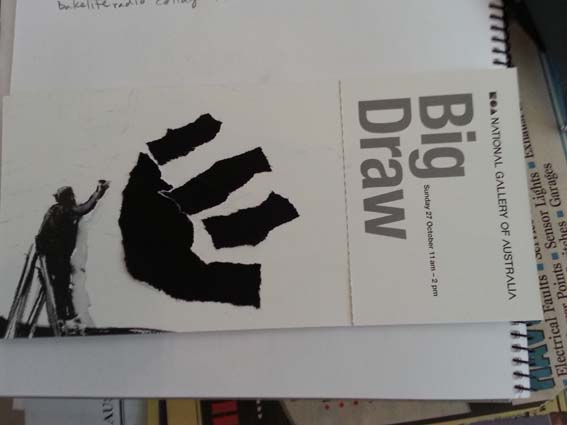
The Big Draw, my postcard for the postcard swap.
The Big Draw was held at the National Gallery of Australia last Sunday. In the very short period of 3 hours participants had the opportunity to explore 10 different areas to work in. I made it to 6.
I started off fairly conventionally with my preferred ‘blind drawing’ of models from the Canberra Institute of Technology, wearing garments designed by current students.
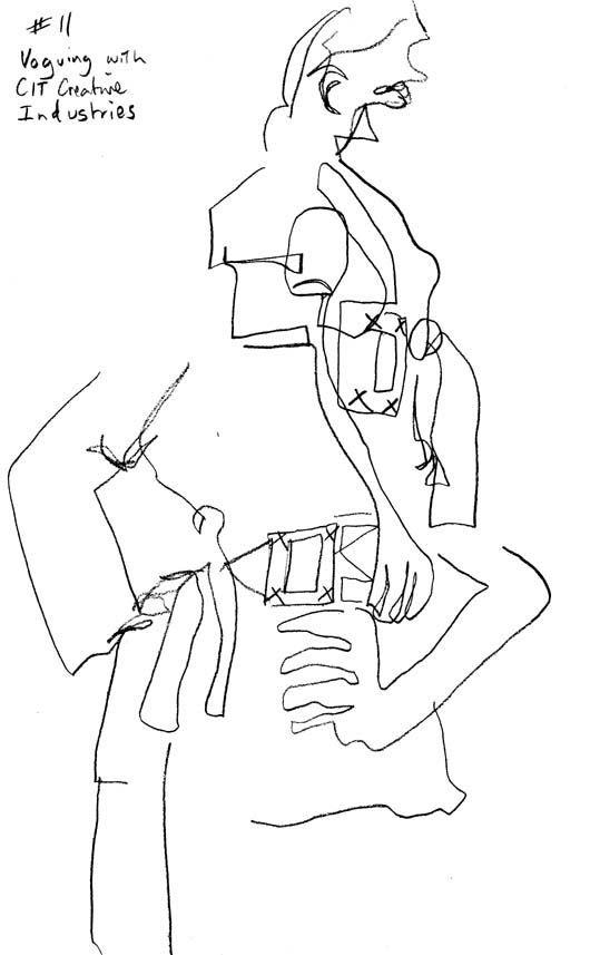
Two sketches ‘Voguing’ with the CIT students.
I then headed around to ‘Altered Books’, outside the William Kentridge exhibition where participants were encouraged to use pages from books as the basis for drawing and collage.

Two drawings, one with collage elements, at ‘Altered Books’.
What I really liked here were the lovely charcoal pencils we were given to draw with. I also discovered that the waxy Lyra pencils we had also provided a great resist to the charcoal. My next drawing took advantage of these properties.

Cat drawn in charcoal over a Lyra pencil background.
I then went into the most exciting station ‘Drawn to Move’, inside the Kentridge show, where I-pads had been set up with a stop animation app that allowed you to capture your image as you drew. You could then send the animation to yourself. Alas my animation never made it home (I’m not sure why), but I’ve since found a similar app for my android phablet that I’ll demonstrate in a future post.
By the time I made it to ‘What do you see?’ a large group participation work on the floor in front of Jackson Pollock’s Blue Poles, I was starting to flag. I moved fairly quickly onto ‘Exquisite Corpses’, that favourite Surrealist parlour game where I ran into my life drawing teacher from university. It was good to see you again Tess!
Time was running out so I made a dash past ‘Balcony Blueprints’ and headed into ‘Stick with it’ and ‘Paperscapes’ in the Aboriginal and Torres Strait Islander galleries. These stations were lots of fun and very inventive and thankfully didn’t require any major effort to participate in. Playing a very clever riff on ‘dot’ painting ‘Stick with it’ used an office-workers trove of coloured adhesive dots to make patterns on a large circle of cardboard taped to the floor. There was plenty of space for everyone to join in.

Part of the ‘Stick to it’ work.
I moved on to ‘Paperscapes’ for my last piece of work. I was all ‘drawn out’ by this stage so I stuck to using large pieces of coloured paper to make a collage inspired by the striping of the Bungle Bungle ranges, very apt in this room of inspired landscapes.

‘Paperscapes’ in the Aboriginal and Torres Strait Islander galleries.
After three hours it was all I could do to stagger to the information desk and hand in my postcard, to be swapped sometime in the future, with one from another participant.
I really enjoyed myself last Sunday, but I came away pondering who the target audience was for this event. The obvious answer was that everyone was the audience and people of all ages were participating. My corollary to that was that I saw few ‘solo’ adults participating in the activities. Most adults appeared to be there as adjuncts to children and weren’t actively engaged on their own behalf, which I thought was a shame. I think this reflects the feeling that art is for ‘artists’ or something only permissable for children to enjoy. I’m reminded of one of my favourite quotes from Art & Fear (David Bayles & Ted Orlando, Capra Press, 1993):
“When my daughter was about seven years old she asked me one day what I did at work. I told her I worked all day at college – that my job was to teach people how to draw.
She stared back at me, incredulous, and said, “You mean they forget?” – Howard Ikemoto”


