On Saturday I had the opportunity to do a one day water colour class with artist Cherry Hood, winner of the 2002 Archibald Prize for her portrait of pianist Simon Tedeschi. While Cherry primarily teaches portrait workshops, the focus of our class was drawing animals – this coincides with the Goulburn Regional Art Gallery’s current exhibition So Much More Than a Big Sheep. For non-locals, the city of Goulburn, in inland NSW has a history as a major centre of merino sheep / wool production. One of it’s most famous tourist ‘attractions’ is a very big concrete merino ram, known to all as Rambo.
I had been rather slack and hadn’t checked out much about Cherry’s work prior to the workshop so when Cherry started talking about her gridding technique for transferring images I wasn’t sure that this was what I was interested in learning. I was soon proven wrong as her shorthand technique for image transfer avoided rulers and an overly tight technical approach. Rather she demonstrated how to transfer from the source material, a photograph, using a simple ratio approach, up to a full sheet of water colour paper.
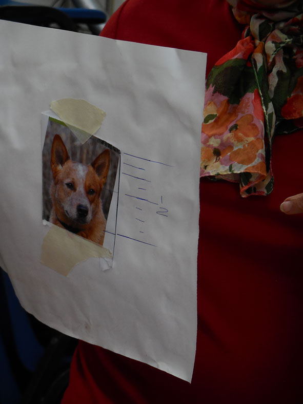
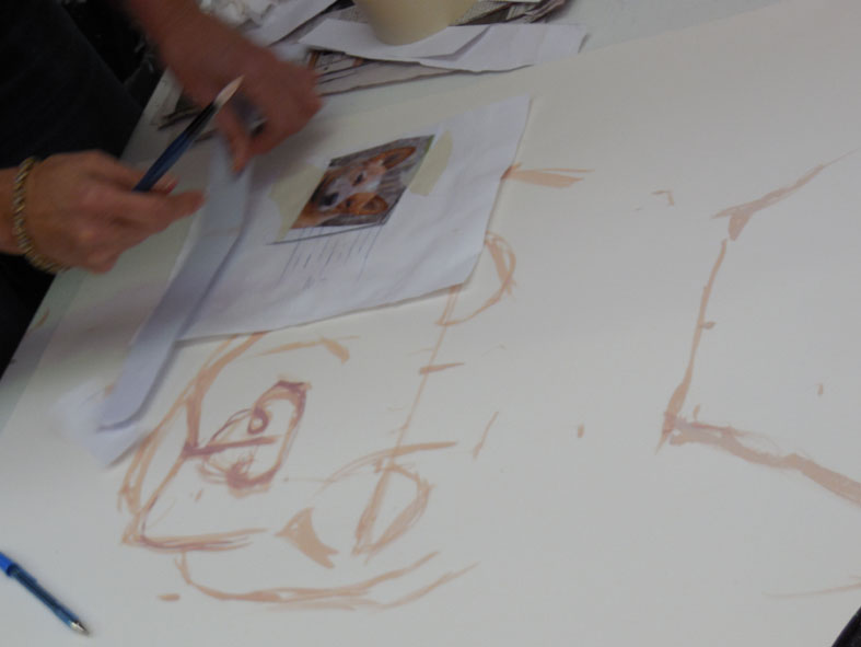
Drawing up an image into sections prior to transferring it to water colour paper.
Once the features of the face to be drawn are located in the various sections they can be transferred to the larger sheet of paper, which has a corresponding number of sections located on it. A similar process is carried out for the width of the face. Cherry emphasised that it is important to measure the width of the face, animal or human, on the basis of the bone structure of the face, not the width of the fur or hair. It was interesting to see that the relative position of features such as eyes on animal faces is the same as for humans. So now I know that my in my dodgy dog drawing of the other week I had placed the poor animal’s eyes way too high on the head.
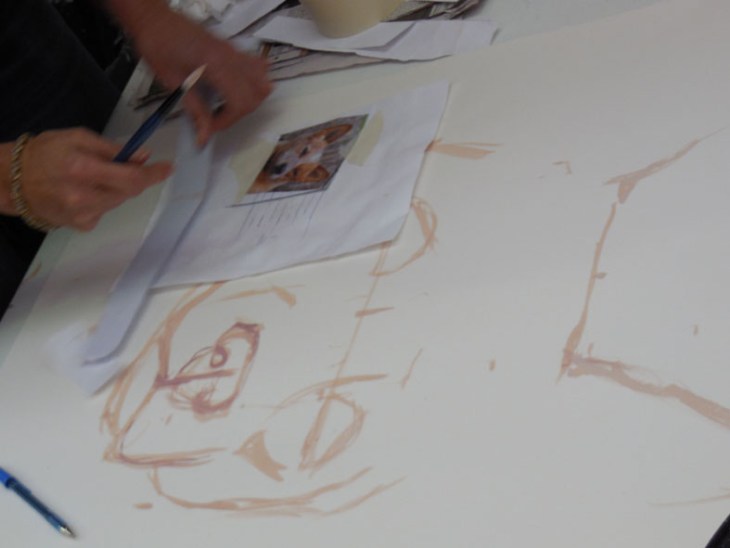
Cherry Hood demonstrating working from her source material and the full sized sheet with key features sketch-painted in.
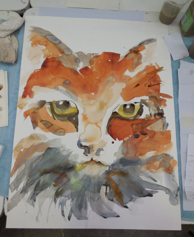
The key features of the subject are marked on the large sheet of paper with a mix of titanium white, tinted with some of the dominant colour of the animals fur. The idea is that these marks are covered by subsequent painting and / or lifting out of any obvious remaining marks. Cherry adds the final colour by way of large washes with wide flat nylon brushes she buys at the ‘$2 shop’. She carefully manages her edges, keeping them wet with a spray bottle or brushing vigourously to avoid hard edges, which gives a more realistic impression of fur. She is happy for blooms of paint to occur and does final emphasis with fine brushes once the work starts to dry.

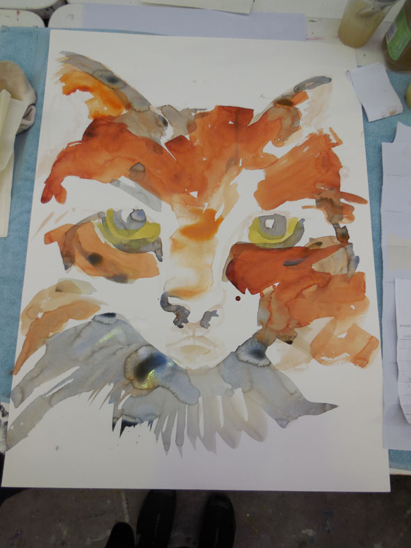
The final version of Cherry’s painting, before it has fully dried.
I was painting an image of my cat, which you can see at the top of my sheet of paper. This was my second go at the painting as where I had originally placed my cat’s head on the paper was well off-centre. Thankfully I could just flip the sheet over and start again (the paper is a full sheet of Cotman cold-pressed 300 gsm water colour paper).

Early stages of painting with some of the underpainted location marks visible.
Here is the middle stage of the work. At this point I was pretty happy with the upper part of the painting, but I was struggling with the lower part of the face.

In the middle stages of my painting the basic colour washes have been added.
I subsequently realised that I had forgotten to locate how wide my cat’s lower face was, hence I washed in a chin that was way too narrow.
This is definitely my cat when I look at those eyes! Final emphasis is in place. (The odd colour on the chin is actually a reflection off the wet paint not accurate colour).
In the end I did manage to bring back a chin more in keeping with how my cat actually looks, but as my partner somewhat cuttlingly observed, “our cat doesn’t have a pantomime beard”. I’m really pleased with how the eyes have worked out and I can definitely see my cat looking out at me. Now I’m off for some more practice.


.jpg")