It started last year and now I’ve done two more sketches of the vegetables we grow in our garden.
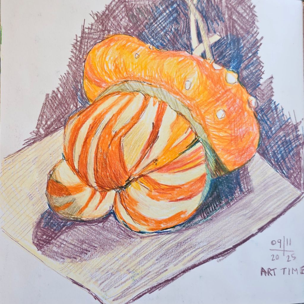
The ‘Turk’s Turban pumpkin was a ‘no brainer’, so visually appealing it just begged to be drawn. Sadly, by the time we decided to eat it, it had rotted on the inside. I did manage to save some seeds so hopefully I’ll have more subjects next year.
‘Turk’s Turban ‘ pumpkin
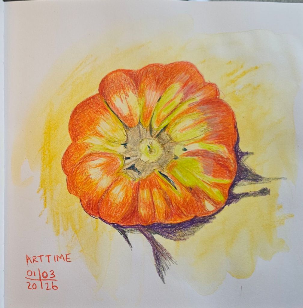
Next up was this ‘Grosse Lisse’ tomato, which weighed in at 554 grams (or 1 pound 2 ounces). It was picked still a bit green, but has subsequently ripened fully.
Tomato ‘Grosse Lisse’
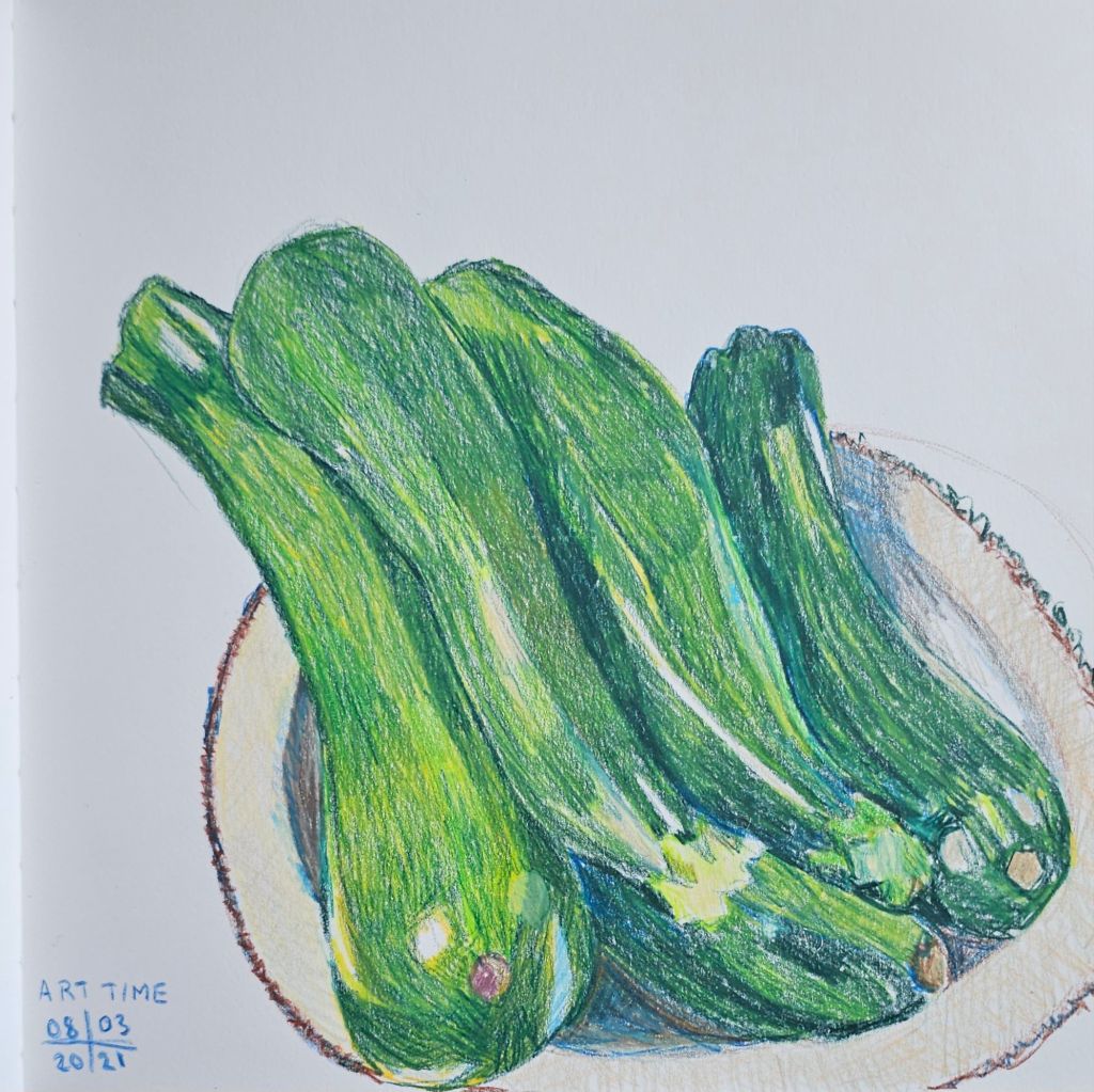
Last but not least are a small bunch of zucchinis (courgettes), some of the 150+ fruits that we have harvested so far this year.
A plateful of zucchinis
All the sketches are made using Caran d’Ache Luminance, light fast, colour pencils. My sketchbook is a Leuchtturm 1917 sketchbook, the combination of the smooth paper with the creamy pencils works particularly well.
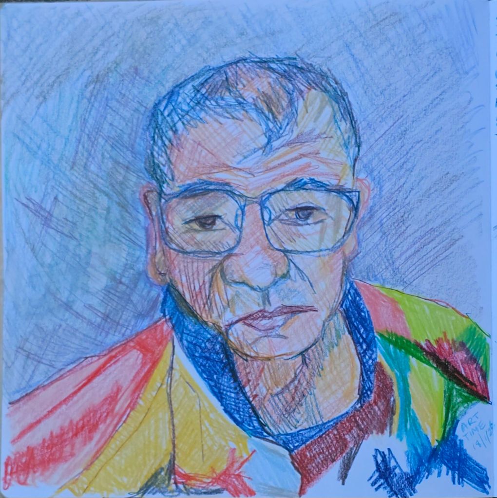
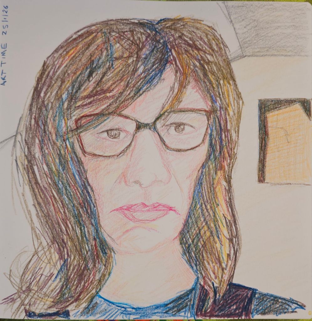
I’m really enjoying drawing portraits of my friends and my partner. I missed posting last week, so now I have two portraits to post.
Last week I did a second portrait of my partner, given that I wasn’t completely happy about the first one I made.
Steve
It’s hard to judge this portrait. It is more realistic in someway, but not the best likeness. I suppose the lesson I need to keep reinforcing is practice and keep doing it.
My second portrait of our friend has quite a few points of resemblance. She looks rather dour, but in reality it’s the downside of sketching people during a zoom meeting. Everyone is fairly intent on their screen which lends a seriousness to their face, which doesn’t necessarily reflect their personality.
I particularly enjoy using multiple colours of pencil to develop the darker tones. As we made our own selection of these pencils, we don’t have all the standard colours. This is way more interesting I think.
I’m keeping on with the exploration of tonal sketches started with my class with Olivia Marcus at the Urban Sketchers Symposium in Poznan. The more I explore, the more my own style preferences are entering the equation.
Sketching in the tiny book I carry on my walks.
One thing I have largely changed is not using black as an emphasis. Because I work predominantly in watercolour, I find the contrast between that and the black felt pen Olivia uses, can overwhelm my sketches. I’m exploring whether I can effectively substitute darker tones.
Sketching at Fyshwick Markets
I’m also testing out all different colour combinations. Some are instantly more appealing, but I don’t want to come to conclusions too soon. As I have a whole lot of new paints from our goody bags from Poznan, there’s still a lot to consider.
At Tutto in Mawson. I also added some pencil to this one to pick out more highlights.
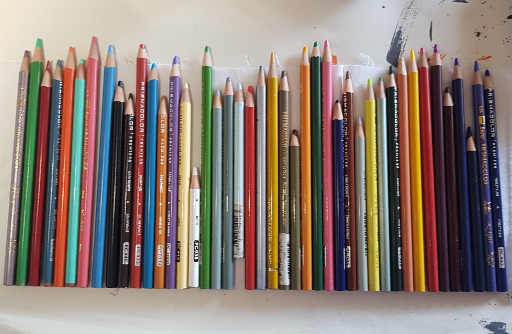
This is not a question that I thought I would be asking, except that I recently read an article talking about the low lightfastness rating of many of my favourite Prismacolor pencils. Given how important I think lightfastness is for watercolours it’s somewhat strange that I haven’t considered this as an issue before.
All my Prismacolors
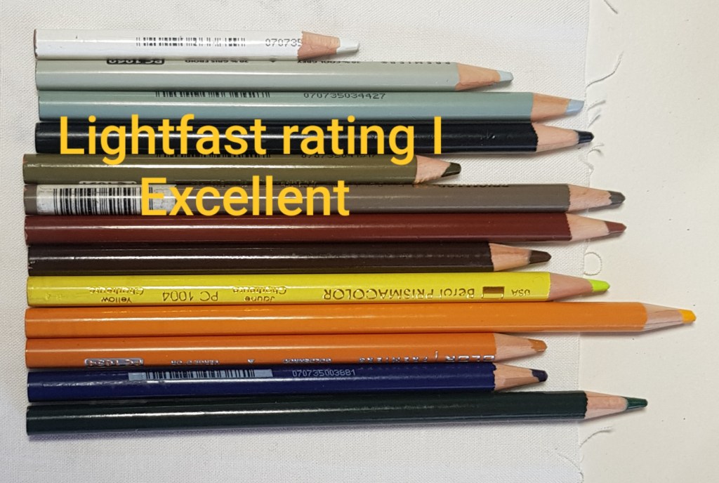
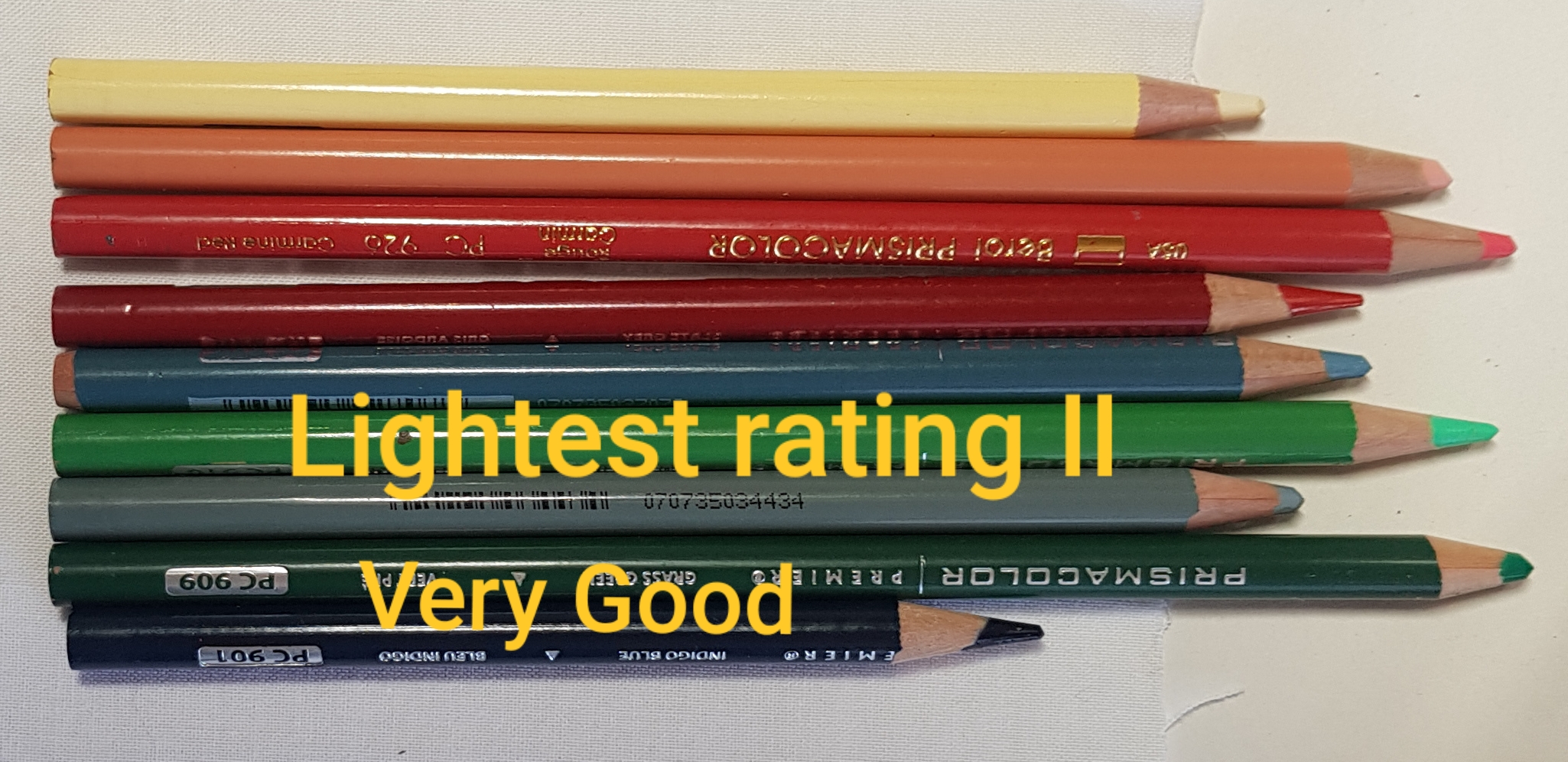
I had a hunt through my pencil box for my Prismacolors and checked them against the lightfastness chart that the company has released. I discovered that just over half of the colours that I own are in the top two lightfastness ratings categories. Phew! Those pencils I can continue to use without worry. The rest are in the bottom three categories. That means I wouldn’t use them for any work that I would be likely to sell, but I can use them on casual projects or for general ‘colouring in’ activities.
What I am confident to use long term.
Presently I am using my pencils to make colour interpretations of photographs of statues taken by the German artist Aglaia Konrad, in her book Schaubuch: Skulptur. (Yep, weird, but so me). As this is an exercise for me and all the drawings are in a sketchbook I will continue with using the lower rates colours, but I won’t replace them.
My colour pencil interpretation of an Aglaia Konrad photo of sculpture fragments in her book Schaubuch: Skulptur
As an aside, when I dived into the depths of the world of colour pencils (I don’t recommend it, it was terrifyingly obsessed), I found out that 4 of my pencils weren’t included on the lightfastness list. It turns out that they are considered ‘rare’ (sadly not rare enough to get me on Antiques Roadshow, or upgrade my lifestyle). They are discontinued colours from a previous incarnation of the company and were made in the late 1980’s. These colours were later discontinued when the company changed hands.
In the end my other half decided to get serious and order a set of lightfast Caran d’Ache Luminance 6901 pencils. I have swatched them out below and I am pleasantly surprised by some of the colours this set of 20 includes.
“roll up your catalogue and view each picture through it. … You will be rewarded with a wonderful suggestion of light and air and sufficient detail, and finish.” So said critic Percy Leason and fellow student of Clarice Beckett (1887- 1935), of her 1931 solo exhibition *.
Tea Gardens, c.1933, oil on canvas on pulpboard, 51.0 cm x 43.7 cm
Clarice Beckett’s work, rather like the artist herself, can be difficult to pin down. Her life story of is the stuff to make movies of and has inspired at least one novel (Night Street, by Kristel Thornell, joint winner of the 2009 Vogel Award). Her work only entered public collections in Australia some 35 years after her death. The vast majority of her output has been lost to both accidental and deliberate destruction. (I have included a very brief bio of her at the end of this post).
This major retrospective at the Art Gallery of South Australia features 130 works by Beckett. I believe that this is the largest exhibition of her work ever shown.
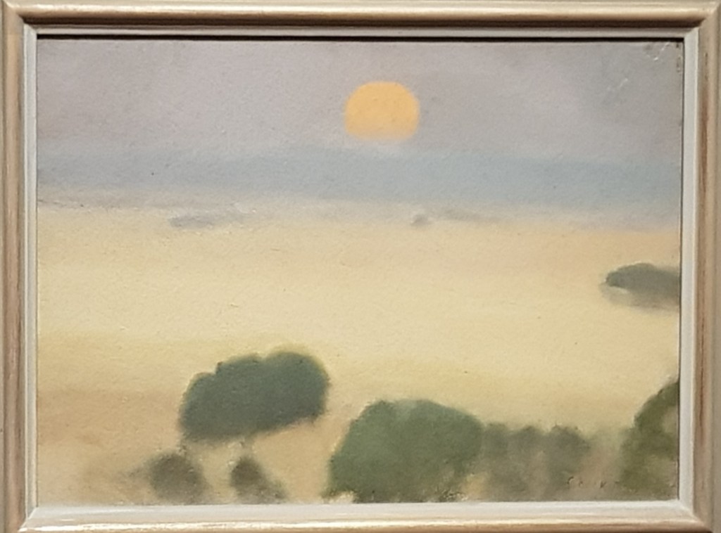
Summer Fields, Naringal, 1926, oil on board, 24.5 cm x 34.5 cm
Clarice Beckett falls under the broad rubric of an Australian Modernist artist. Her control of light and atmospheric effects is equal to that of Turner. She references Whistler in her own painting titles, is frequently compared to Corot and her colour studies (such as still remain) are a precursor of Rothko’s. That pretty much ticks the boxes for me.
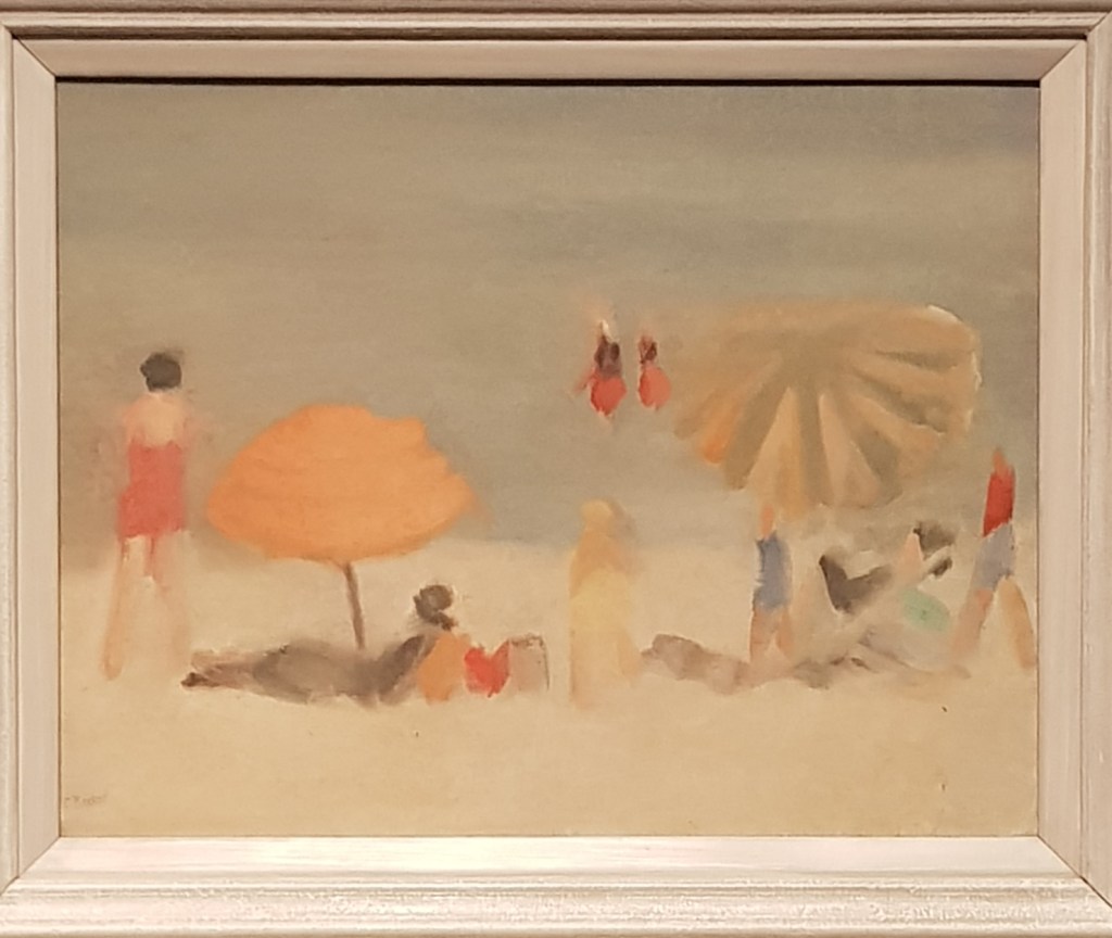
Beach Scene, c. 1932-3, oil on canvas, 52.1 cm x 62.0 cm
The subject matter of the majority of Beckett’s extant work is of Beaumaris, a bayside suburb of the city of Melbourne and the city of Melbourne itself.
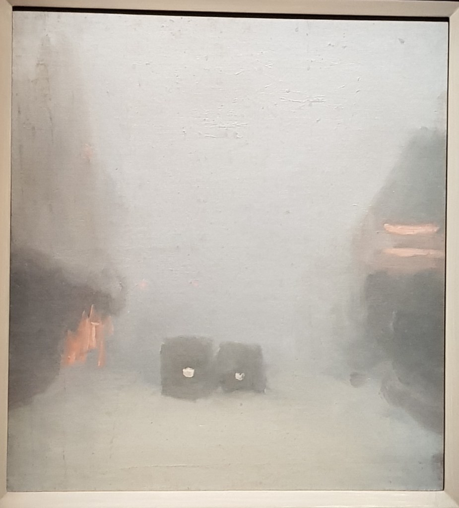
The Bus Stop, c. 1930, oil on board, 41.0 cm x 34.0 cm
It strikes me that you could easily be misled by the deliberate simplicity of the composition of the paintings. Beckett’s approach was a “technique of applying broad areas of finely graded tones produces an image that is slow to come to life”.* While there is weight in the subject matter, this approach allows the focus of her painting to be on the light effects she observes.
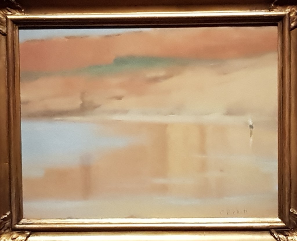
Wet Sand, Anglesea, 1929, oil on board, 29.3 cm x 39.0 cm
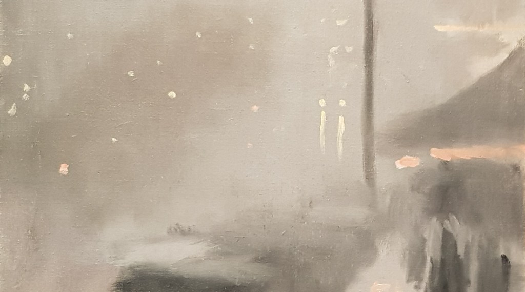
In many works the subject matter is almost an abstracted form, such as Passing Trams, c 1931 and in others, such as Wet Night, Brighton, 1930, an exercise in geometry, and yet there is such intensity in her focus that the results transcend such easy charaterisations.
Passing Trams, c. 1931, oil on board, 48.6 cm x 44.2 cmWet Night, Brighton, 1930, oil on board, 26.6 cm x 38.0cm
Beckett made most of her paintings on location. She wheeled her hand cart with her supplies, walking around a 5 km radius of her house, or travelling into the city. Her paintings are quite small by today’s art extravaganzas, often no more than A3 size, so the intensity of her work is all the more focussed into these small works. I am apologetic as these photographs barely do justice to the intensity of the paint surface. I will share with you some detail shots so hopefully this may become a bit more apparent.
Dusk, c. 1928, oil on canvas on board, detail, 37.5 x 45.5 cmTaxi Rank, c. 1931, oil on canvas on cardboard, detail, 58.5 x 51.0 cm
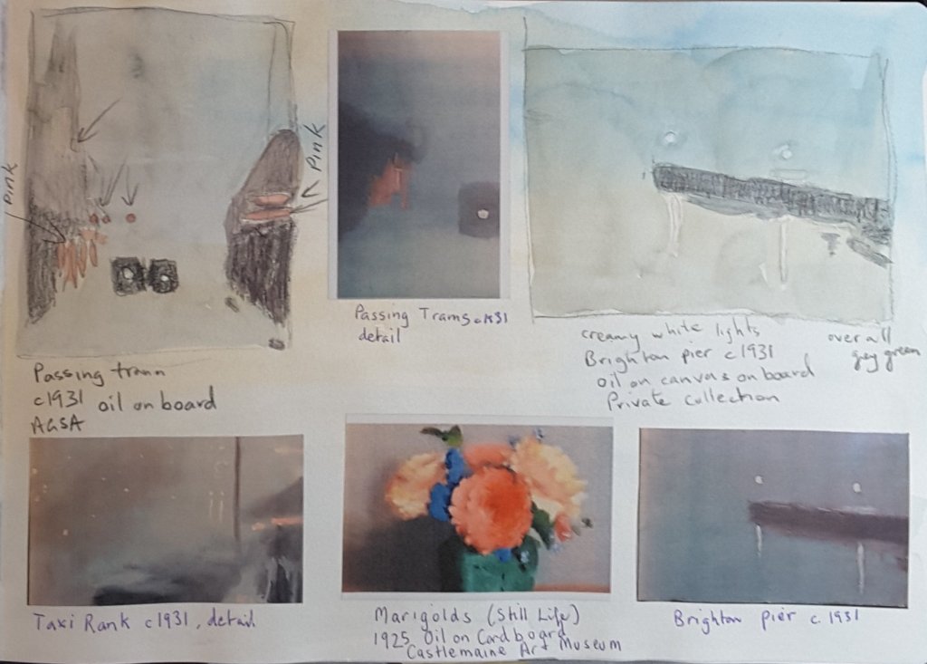
Per usual I took as many painting notes inside the exhibition as time permitted, alas never as much time as I would like. I also did some further studies of her work from the exhibition catalogue.
A page from my gallery sketchbook, focussed on Beckett’s use of high toned pink highlights.A page from my gallery sketchbook. Looking at Beckett’s compositions.
Clarice Beckett: The Present Moment is currently on show in Adelaide at the Art Gallery of South Australia. The exhibition runs until 16 May 2021. The exhibition is ticketed, but there are no timed entry requirements.
All quotes in this post come from the exhibition catalogue The Present Moment: The Art of Clarice Beckett, Tracey Lock, Art Gallery of South Australia, 2020 ; p 104 quoting P. Leason, ‘Current art shows’, Table Talk, 5 December 1931, p14; p 104 Tracey Lock
Biography
Beckett, the eldest daughter of a rural bank manager, studied art at the National Gallery School in Melbourne with Fredrick McCubbin (1914-16) and also for a brief period under the tutelage of Tonalist painter Max Meldrum. Clarice regularly exhibited and her work gathered notice, among a small group of people and was recognised briefly, even as far afield as New York. She exhibited with several groups and held solo exhibitions every year from1923 to 1933. But when she died from pneumonia at age 48 her work was largely forgotten.
After her death some of her work was deliberately burnt by her father. Other major pieces from her time staying with friends in rural Victoria were lost in a house fire. The vast majority of her canvases were put in a shed in rural Victoria where they disintegrated under an onslaught of weather and vermin. The canvases were tracked down in 1970 by Dr Rosalind Hollingrake who had been searching for years to find out more about the work of one C. Beckett. Of those canvases some 369 were saved and 1600 were beyond retrieval.
Beckett’s work was never acquired by a public gallery in her lifetime. Her works first entered the National Gallery of Australia in 1971, after Hollingrake showed the work at her gallery in Melbourne.