Amsterdam

I realise that I need to do a dump of my sketches from Amsterdam now, or l may never find time to share them. So here they are. Almost all of these were done at the Urban Sketchers Symposium which was held here this year.

Sketching the wonky houses along the Herengracht in Amsterdam.

A quick sketch of a bicycle with a child carrying module.

All the goody bags lined up at the registration desk this afternoon for all the Urban Sketchers Symposium workshop participants.

Final, unfinished sketch from the Marion Rivolier workshop on capturing the flow of sky and water with watercolour.
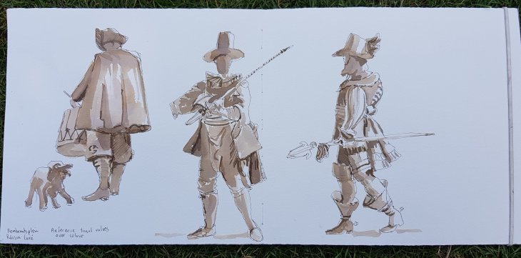
Final sketch of statues based on Rembrandt’s The Night Watch, Róisin Curé workshop using sepia ink.
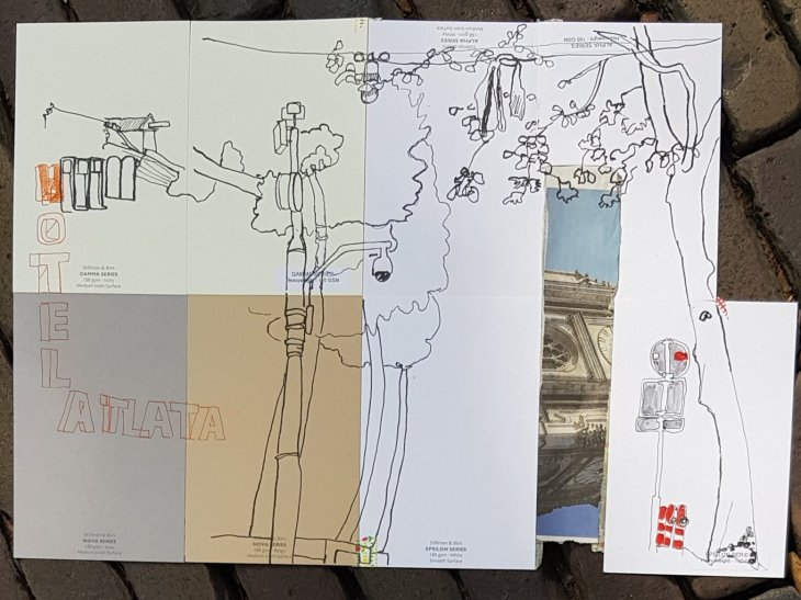
Extending your page to include the images that are important to you in a scene. Karen Sung workshop, 1st piece.

Creative use of line and including people, Karen Sung workshop, 2nd piece.

My favourite bit of graffiti on the way to Rokin Metro station (sorry I was very bad at writing down location names).

Sketching from the ‘Drink and Draw’ location on Amstelhoek
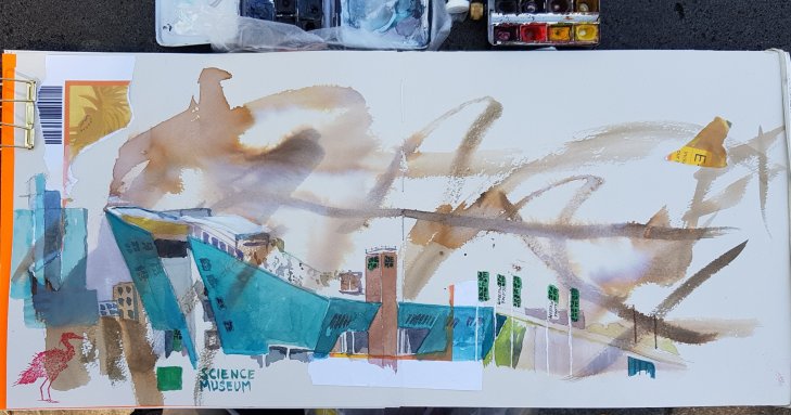
NEMO, the science museum, final Sketchwalk of Symposium.

The canal next to our hotel, sketched at night, trying to capture the light reflections.

The Pandhof Dom in Utrecht

On our last day in Utrecht we were able to visit the Pandhof, or cloister gardens of the Dom (cathedral, dedicated to Saint Martin of Tours). We were lucky as fellow Urban Sketchers @kittyvdheuvel and @imonkie had only been able to see the gardens from the Dom cafe the day before.

A panoramic view of the gardens.

Built in the 1400’s as a cloister connecting the cathedral and chapter house, the Pandhof was only used by the church for about 100 years before local residents took it over. The garden became part of Utrecht University in 1636 and gets closed for university functions every so often.

The beautiful stone arches of the cloister.

I loved that each archway had a different design at the top and every gargoyle was an individual.

Some of the gargoyles in the cloister.

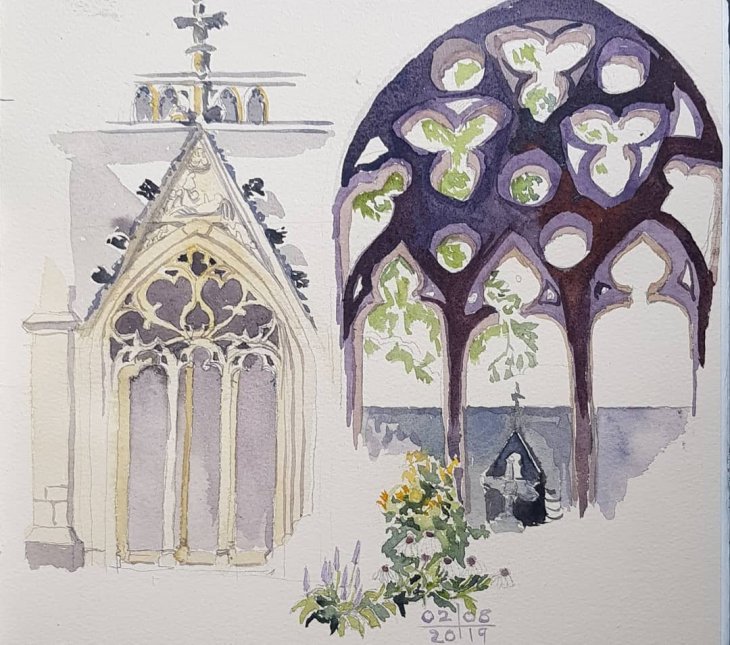
I sketched the central archway in the photo above, which also features a sculpture of the death of Saint Martin, left side of the page. I was sitting inside the cloister as heavy rain was falling. It gave me the idea to paint the right hand side view, which is of the archway I was sitting behind from the inside. I added the flowers for the garden, which was initially created in 1962 and then redesigned and replanted in 1975.

Archway with the death of Saint Martin, left side; view from inside the cloister, right side.

Rotterdam

A quick-ish hop around the world via Singapore and now I find myself sketching in Rotterdam.

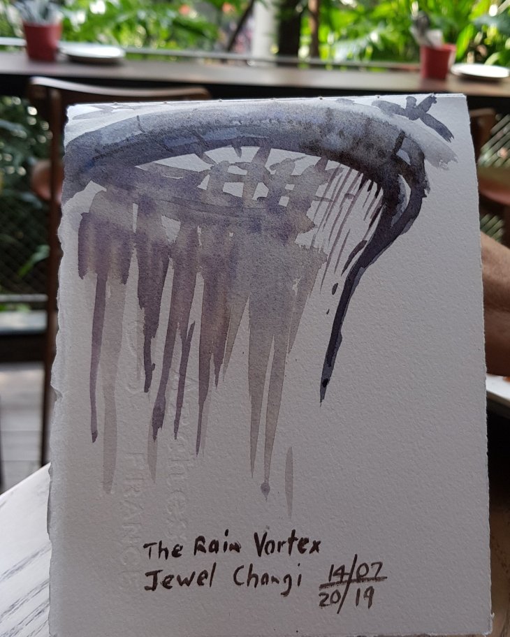
Rain Vortex at Jewel Changi. Watch our for large numbers of people dragging their luggage around while looking at their smartphones.

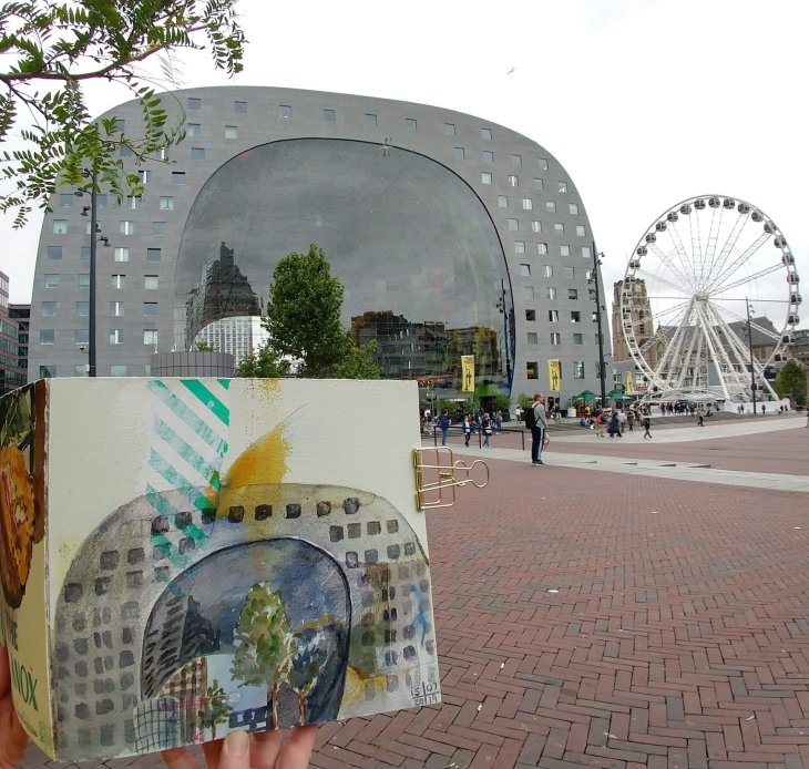
First sketch in Rotterdam the Markthal (Market Hall) by MVRDV architects, (2014).

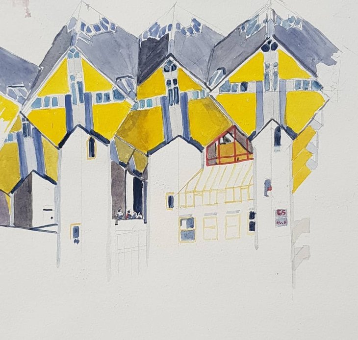
Next the Kubuswoningen (Cube Houses) by Pier Blom (1984).

This is an earlier version which I wish I had left at this stage instead of turning it into a turgidly overworked mess.

Then part of Auke de Vries sculpture ‘Maasbeeld’, with De Rotterdam, by Rem Koolhaas (2013) and the Erasmus Bridge in the background.

Today even further challenges with De Hef, (Koninginnebrug) a now defunct, lifting railway bridge.

Matthew Evans at the National Library of Australia

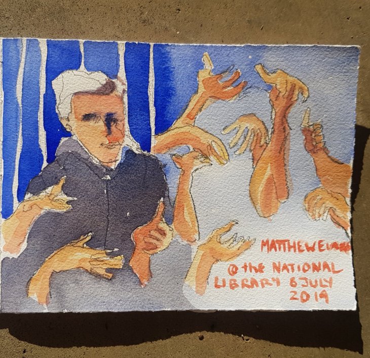
Two quick sketches of Matthew Evans, TV presenter and author, who was speaking last night at the National Library of Australia on his latest book On Eating Meat.

Matthew in conversation with Karen Hardy from the Canberra Times

Matthew is as eloquent with his hands as he is with words.

Pencil sketches were made during the event and watercolours were added when we got home.

Shopping bag soft cover sketchbooks

Inspiration for this project came my way via a video by Peter Baumgartner on how to make a simple sewn binding book, with a soft cover. I didn’t take step by step photos, as Peter’s is one of the most clearly demonstrated instructional videos I have seen.

I have 10 sheets of coloured watercolour paper (2×5 of each) to play with. For the paper nerds out there this is Bockingford Tinted watercolour paper, 300gsm, cold press, which comes in 5 different colours, oatmeal, cream, grey, eggshell and blue. Being me I’m trying all five colours in the one book.

I have had a bit of an obsession with tinted watercolour paper since I found out that my watercolour hero JMW Turner, regularly painted on blue paper.

It has taken me a while to track some tinted paper down. I tried to get some from Sennelier when I was in Paris last year, but they were out of stock. In the end it turned out that all I needed to do was look online and I found a supplier in Australia! Duh!

As these are soft cover books I have been taking the opportunity to use up all sorts of leftover bits of thinner cardboard and papers to provide inner covers, covers and end papers.

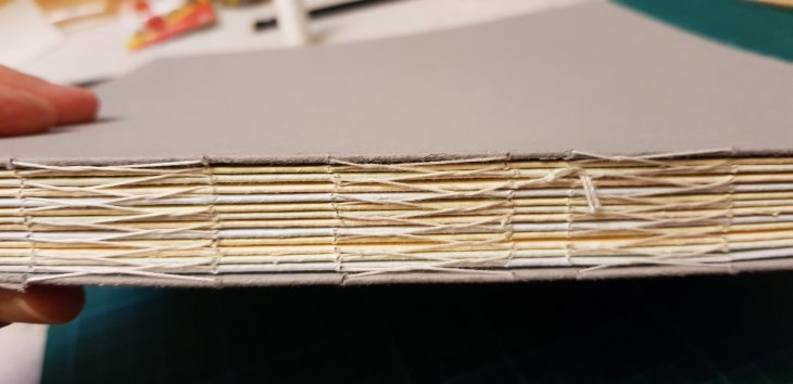
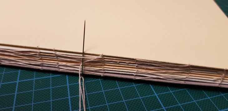
I have included some close-up photos of the spine, as I wasn’t familiar with this stitch. In short you take your thread in and out through the holes in the pages and then back under the stitch below on the outside spine of the book. This results in the ‘cross’ pattern on the book’s spine. I have secured both ends with a coptic binding stitch.

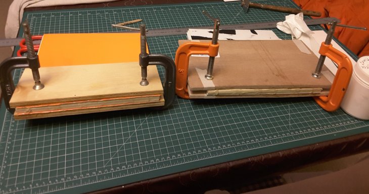
Another critical step is pasting the spine with several layers of acid free PVA to support and consolidate the spine and stitching.

Two more books clamped while the PVA dries on their spines.

Having got to the final stages of adding a cover I raided my stash of Japanese shopping bags (a dark secret from my first trip to Japan over a decade ago), to find something sturdy to use. In this case a paper carrier bag from the Isetan ‘departo’ (department store).

I have now made two further books, extending the paper with the addition of some Arches 300 gsm cold press paper. Even more shopping bags have been used for the latest covers, including one from Jim Thompson and one from Daimaru.

Of course the big test will be how well this construction technique holds up in the field. Fingers crossed.