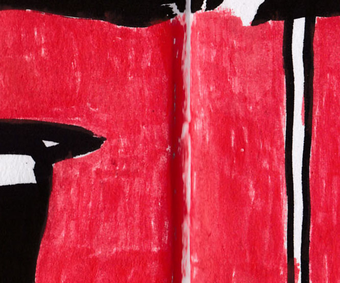
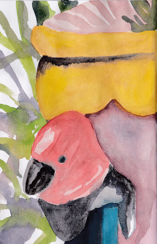
Back to the new sketchbook, but first I must make a correction. I’ve now realised that the paper in this book is actually 150 gsm, not 110 gsm as I’d previously written, so perhaps the results I’ve been getting are not so unexpected. However the best test of the paper quality is water colour. I have made two basic paintings using subjects close to hand. This is the first work and it has another water colour on the reverse side of the page.

Watercolour on the new sketchbook.
You can see from the painting below that each work stands by itself and there is no bleed through from either side of the page. I used quite a bit of water on each side of the page, but I did allow the page did dry thoroughly between paintings. So I’m quite impressed with how this test has gone – I didn’t expect, even at the heavier weight of paper, that the result would be this good.
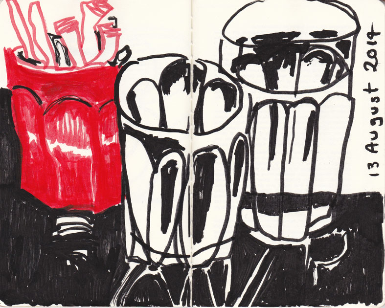
Watercolour on the reverse side of the page above.
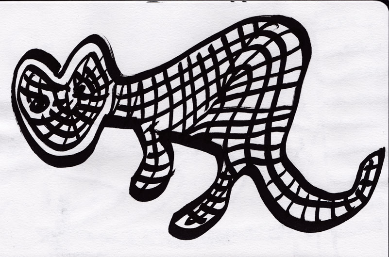
I’m now working on testing my own skills. I have been trying to integrate the different pen and ink and acrylic paint markers I’ve been working with, into a more style. It’s not as easy as I had hoped. I’ve struggled with not letting the heavier acrylic paint markers dominate the finer pen and ink lines. I’ve also had problems getting carried away and ‘colouring in’ with the paint markers. Because it’s so easy to go over the top I’ve decided to limit my palette to my black markers and one colour only.
Today I think I have made some positive progress with my sketches in mixed media. Any ideas or thoughts from your experience on how to proceed would be welcome.
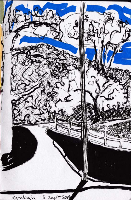
Path and trees, acrylic paint marker, pen and ink, 3 September 2014.