DESIGN Canberra Festival is currently on and our local chapter of Urban Sketchers has been actively partcipating for the first time.
We ran a Drop in and Draw session in Civic Square on Thursday and a Sunday sketching event at Callam Offices on the weekend.
Our first event was marred by strong winds. I found this out the hard way when I got slapped with a big spray of water from the fountain I was sitting next to.
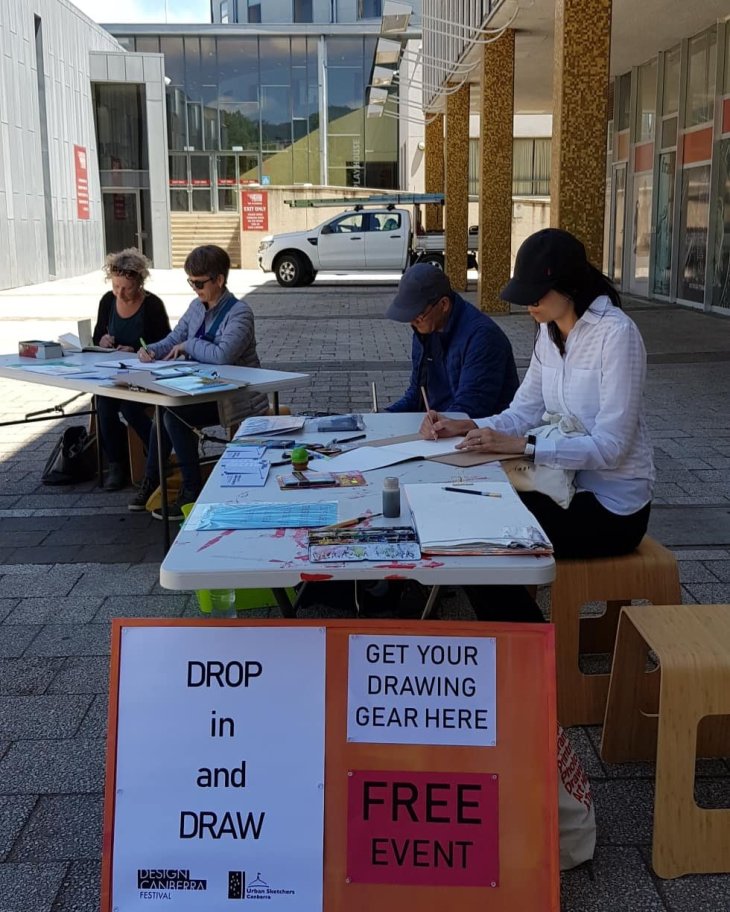
Some of the brave few that turned out to sketch.

The University of Canberra’s temporary architectural installation in Civic Square.

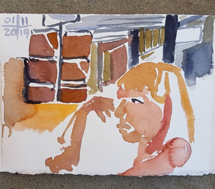
The statue of Ethos, by Tom Bass, at the entrance to the ACT Assembly building, with fountain (notice the water splotch in the dark grey section of the paint).
Sunday was marginally better weather wise. Callam Offices looks like a futuristic space module dropped into the Woden Town centre.

It was designed, amongst other things to demonstrate construction to survive potential floods. Hence it is set above the ground suspended around a series of concrete cores.
Designed by architect John Andrews and built in the late 1970’s these buildings are currently used as local government offices. It was originally intended that 26 modules be built, but only 3 were completed. Sadly one of Andrew’s other major Brutalist buildings in our city, the Cameron Offices has largely been demolished, which is pretty awful, but par for the course as far as our local lack of interest in heritage buildings goes.
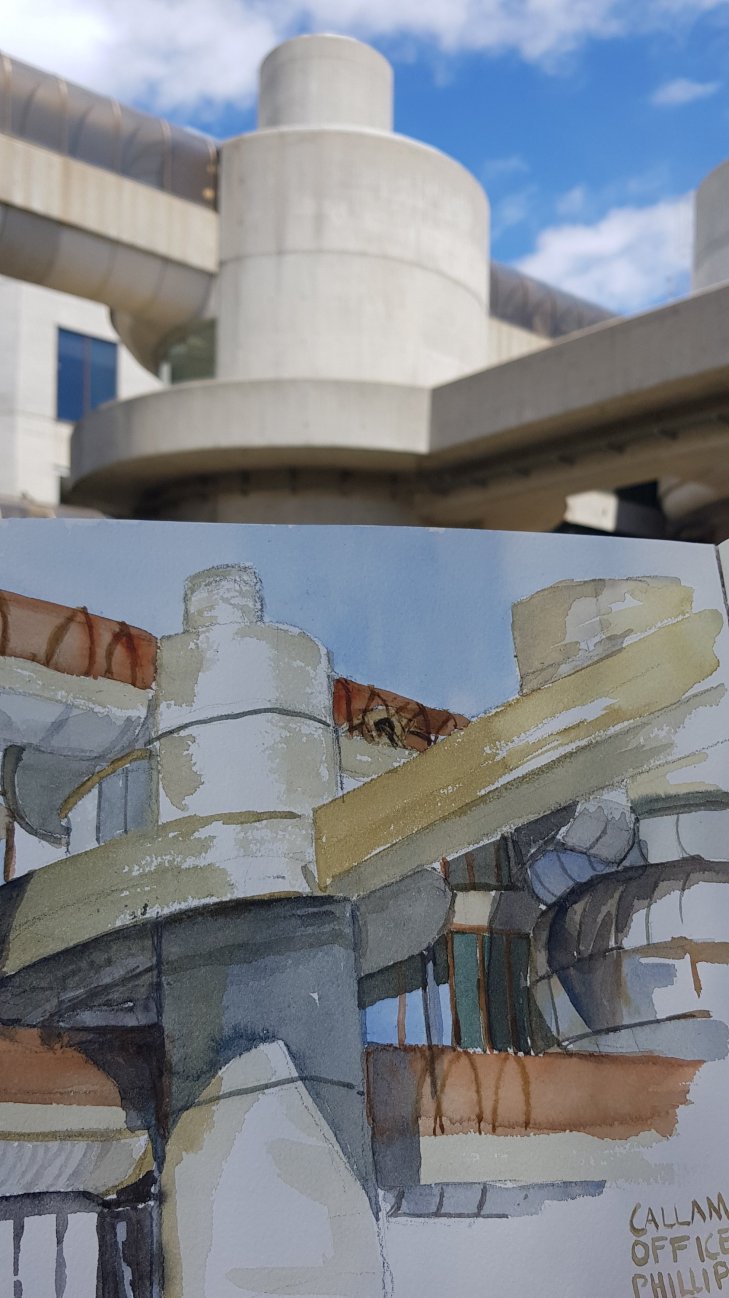
My watercolour of one of the building cores.
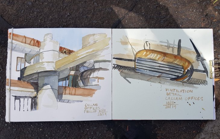
Along with my main sketch I painted a detail of this ventilation outlet.
Tonight we are off to hear a conversation between the architect John Andrews and Tim Ross (a great promoter and documentor of Australia’s modernist heritage). I am really looking forward to hearing more about Andrews ‘ work.