Wherever I travel I like to find art materials as momentoes of my trip. As I was going to an Urban Sketchers Symposium I was well aware that an art supply goody bag would be waiting for me there. The market stalls at Symposium are also great places to find well-priced items. None the less I still managed to find some items that I knew wouldn’t be in the bag.
It turned out that I had set myself up to buy, without even really trying. Our hotel in Rotterdam, where we spent the first week of our trip, was directly across the road from two art shops!
To make it easy for myself I have made a visual record of my purchases.
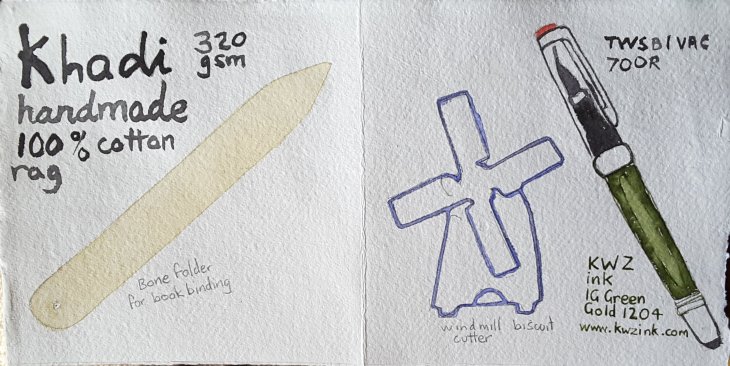
First purchases handmade Khadi paper, a bone folder used in bookbinding, a new fountain pen (of course I need another one!) and some new ink to go with it. And a ring in , my windmill-shaped biscuit cutter.
By way of explanation this fountain pen has one of the biggest reservoirs on the market, which makes it very useful for lots of sketching without having to frequently refill it. This KWZ ink was purchased on the basis that it was waterproof. Unfortunately there was a mis-understanding and it turns out that the green-gold ink is not waterproof. The company makes another green which is water- resistant, but this isn’t it.
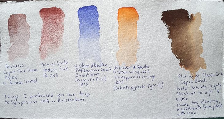
My new paints, with the exception of Potters Pink which was only a replacement. A second new ink also with some odd properties.
I seem to be attracted to the blues these days. I was intrigued by the Smalt Blue (AKA Dumont’s Blue). This is a very old form of blue pigment made by grinding glass coloured by smaltite, a cobalt salt, into a fine powder. I assume it was one of the less expensive options than ground lapis lazuli. From some of the reading I have done it has, in oil paint, tended to fade over time, but not all paintings show this fault. It has a purplish tinge which I really like. I expect it will be appearing in my ‘skies’ in the not too distant future.
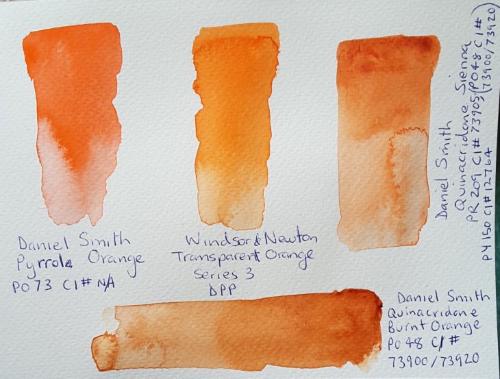
Much as I am a devotee of Pyrrol Orange (it is one of those irreproducible colours), I do sometimes find it a bit pink. This Transparent Orange, above, is a synthetic pigment with an industrial automotive history, it looks like it fits the bill for a truly orange, orange. I swatched it out, below, with some of my other orange-y paints for a comparison.
As you might decipher in my notes on the page above my Platinum Classic ink (an iron gall ink), is listed as both water soluble and resistent to water. Mmmmm?? A bit of research indicates that while some of the ‘apparent’ colour of the ink may be water soluble, over time the ink gall element should not only resist water, but darken with age. I’m not sure that I will be happy with this latter development, as the solubility of the ink has resulted in some quite pleasing effects. I used it in my workshop with Ròisin Curé, where were were channelling Rembrandt’s use of sepia ink. Here is a sample.

Sepia Black ink, line and diluted ink, part of the sculpture version of the Night Watch on the Rembrantplein in Amsterdam.

Love reading about your selected art items to own and use. And a great place to go for it!
LikeLiked by 1 person
Any excuse Carol. BTW one of my other blog friends just alerted me that her comments weren’t appearing on my posts. I found them in my spam folder, along with one of your comments. Hopefully this won’t be the case again.
LikeLiked by 1 person
Odd things happen! I am a devoted ally of yours, whatever. I am glad to learn more about your art adventures just lately!
LikeLike
I love reading about art supplies and that you found such fitting souvenirs.
LikeLiked by 1 person
😁I did.
LikeLiked by 1 person
I like nothing better than art supplies and stationery in general!
LikeLiked by 1 person
I wholeheartedly agree!
LikeLiked by 1 person
That is such a nice idea, documenting your purchases. I find its irresistible to go into an unknown art supplies shop, I always have to buy something. It does mean I buy stuff I already have, but nevertheless I can look at things, such as fat pencil and think ‘That came from Oslo!’ And there are times when you do get something unique!
LikeLiked by 1 person
Thanks Anna. I think I’m just looking for a reason!😁 However I must say that the Dutch art shops were pretty good. For the first time ever I saw shops that had blocks of stone for sculptures on sale (not that I needed any – thank heavens).
LikeLiked by 1 person
That could be tricky to bring home …
LikeLiked by 1 person
Yes!😁
LikeLike
ooooh I could bankrupt myself!!!
LikeLiked by 1 person
A distinct possibility! 😂
LikeLike